我最近一直在使用新的 Unity UI 工具包 (Unity 2021.1),但注意到 UI Builder 不包含进度条的定义。这似乎是游戏的一个标准部分(健康统计等),我很震惊地意识到没有内置组件并且我找不到关于它的指南。我确信我一定是找错了地方,希望有人能给我指明正确的方向。
我目前的方法是使用 Slider 组件并尝试通过自定义 USS 工作表设置样式。但是,我注意到新的 UI 系统与旧的不同,无法指定“覆盖”颜色。关于如何处理这个的任何建议?我看过 UI Toolkit 示例的屏幕截图,其中示例中包含一个进度条;然而,目前的样本没有。
最佳答案
编辑:Unity 的最新版本终于包含了一个运行时进度条。请参阅@tenuki 的回答。
UI Toolkit 将在 Unity 2021.2 中包含更多内置控件(届时它将包含在 Unity“核心”中)。
与此同时,您最好不要使用 Slider 组件,它不符合“进度条”用例。
实现此目的的最简单方法是使用“背景”和“覆盖”元素。叠加层将是背景元素的子元素。
然后,您可以以百分比为单位设置 Overlay 元素的宽度。
在 UI Builder 中会这样:
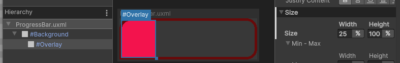
ProgressBar.uxml:
<ui:UXML xmlns:ui="UnityEngine.UIElements" xmlns:uie="UnityEditor.UIElements" xsi="http://www.w3.org/2001/XMLSchema-instance" engine="UnityEngine.UIElements" editor="UnityEditor.UIElements" noNamespaceSchemaLocation="../../../UIElementsSchema/UIElements.xsd" editor-extension-mode="False">
<Style src="ProgressBar.uss" />
<ui:VisualElement name="Background" class="progressBar--background" style="flex-grow: 1;">
    <ui:VisualElement name="Overlay" class="progressBar--overlay" style="width: 50%; height: 100%;" />
</ui:VisualElement>
</ui:UXML>
ProgressBar.uss:
.progressBar--overlay {
    background-color: rgba(243, 19, 77, 255);
}

/* optional */
.progressBar--background {
    border-left-color: rgba(103, 10, 10, 255);
    border-right-color: rgba(103, 10, 10, 255);
    border-top-color: rgba(103, 10, 10, 255);
    border-bottom-color: rgba(103, 10, 10, 255);
    border-left-width: 5px;
    border-right-width: 5px;
    border-top-width: 5px;
    border-bottom-width: 5px;
    border-top-right-radius: 20px;
    border-bottom-right-radius: 20px;
    overflow: hidden;
    border-top-left-radius: 20px;
}
最后,在您的代码中,您可以设置覆盖元素的宽度:
VisualElement progressBarOverlayElement = somePartOfYourUIHierarchy.Q("Overlay");
progressBarOverlayElement.style.width = new StyleLength(Length.Percent(30));
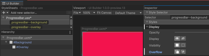
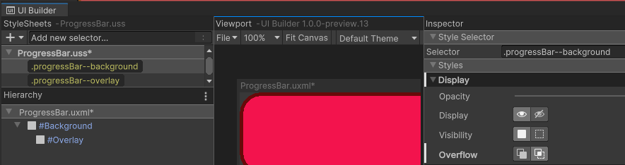
小提示:您可以通过禁用顶部元素的溢出来实现基本的屏蔽。
这是我们进度条的背景元素,启用了溢出:
现在将溢出设置为隐藏:
这可能会激发您在进度条的根元素内做更复杂的事情。
There's a thread here在 UI Toolkit 论坛中讨论可用的多种解决方案。似乎仍然没有达成共识的方法来实现这一目标,但您可能会在那里找到更多有趣的技巧(例如,使用 SVG Assets 的复杂形状 mask )。
关于c# - Unity 新的 UI Toolkit 进度条,我们在Stack Overflow上找到一个类似的问题: https://stackoverflow.com/questions/66936669/