我想在 ggplot2 中创建一个图表,显示议会席位的大小,如下图所示。我的主要问题本质上是如何将圆环图变成半圆环图(半圆弧)?

以上图为例,不知从何说起:
df <- data.frame(Party = c("GUE/NGL", "S&D", "Greens/EFA", "ALDE", "EPP", "ECR", "EFD", "NA"),
                             Number = c(35, 184, 55, 84, 265, 54, 32, 27))
df$Party <- factor(df$Party)
df$Share <- df$Number / sum(df$Number)
df$ymax <- cumsum(df$Share)
df$ymin <- c(0, head(df$ymax, n= -1))

ggplot(df, aes(fill = Party, ymax = ymax, ymin = ymin, xmax = 2, xmin = 1)) + geom_rect() +
coord_polar(theta = "y") + xlim(c(0, 2))

最佳答案
要获取标签等,您可以使用单位圆属性!我写了一个小函数,试图在你的问题中重新创建情节的风格:)
library(ggforce)
parlDiag <- function(Parties, shares, cols = NULL, repr=c("absolute", "proportion")) {
repr = match.arg(repr)
stopifnot(length(Parties) == length(shares))
if (repr == "proportion") {
stopifnot(sum(shares) == 1)
}
if (!is.null(cols)) {
names(cols) <- Parties
}
# arc start/end in rads, last one reset bc rounding errors
cc <- cumsum(c(-pi/2, switch(repr, "absolute" = (shares / sum(shares)) * pi, "proportion" = shares * pi)))
cc[length(cc)] <- pi/2
# get angle of arc midpoints
meanAngles <- colMeans(rbind(cc[2:length(cc)], cc[1:length(cc)-1]))
# unit circle
labelX <- sin(meanAngles)
labelY <- cos(meanAngles)
# prevent bounding box < y=0
labelY <- ifelse(labelY < 0.015, 0.015, labelY)
p <- ggplot() + theme_no_axes() + coord_fixed() +
expand_limits(x = c(-1.3, 1.3), y = c(0, 1.3)) +
theme(panel.border = element_blank()) +
theme(legend.position = "none") +
geom_arc_bar(aes(x0 = 0, y0 = 0, r0 = 0.5, r = 1,
start = cc[1:length(shares)],
end = c(cc[2:length(shares)], pi/2), fill = Parties)) +
switch(is.null(cols)+1, scale_fill_manual(values = cols), NULL) +
# for label and line positions, just scale sin & cos to get in and out of arc
geom_path(aes(x = c(0.9 * labelX, 1.15 * labelX), y = c(0.9 * labelY, 1.15 * labelY),
group = rep(1:length(shares), 2)), colour = "white", size = 2) +
geom_path(aes(x = c(0.9 * labelX, 1.15 * labelX), y = c(0.9 * labelY, 1.15 * labelY),
group = rep(1:length(shares), 2)), size = 1) +
geom_label(aes(x = 1.15 * labelX, y = 1.15 * labelY,
label = switch(repr,
"absolute" = sprintf("%s\n%i", Parties, shares),
"proportion" = sprintf("%s\n%i%%", Parties, round(shares*100)))), fontface = "bold",
label.padding = unit(1, "points")) +
geom_point(aes(x = 0.9 * labelX, y = 0.9 * labelY), colour = "white", size = 2) +
geom_point(aes(x = 0.9 * labelX, y = 0.9 * labelY)) +
geom_text(aes(x = 0, y = 0, label = switch(repr,
"absolute" = (sprintf("Total: %i MPs", sum(shares))),
"proportion" = "")),
fontface = "bold", size = 7)
return(p)
}
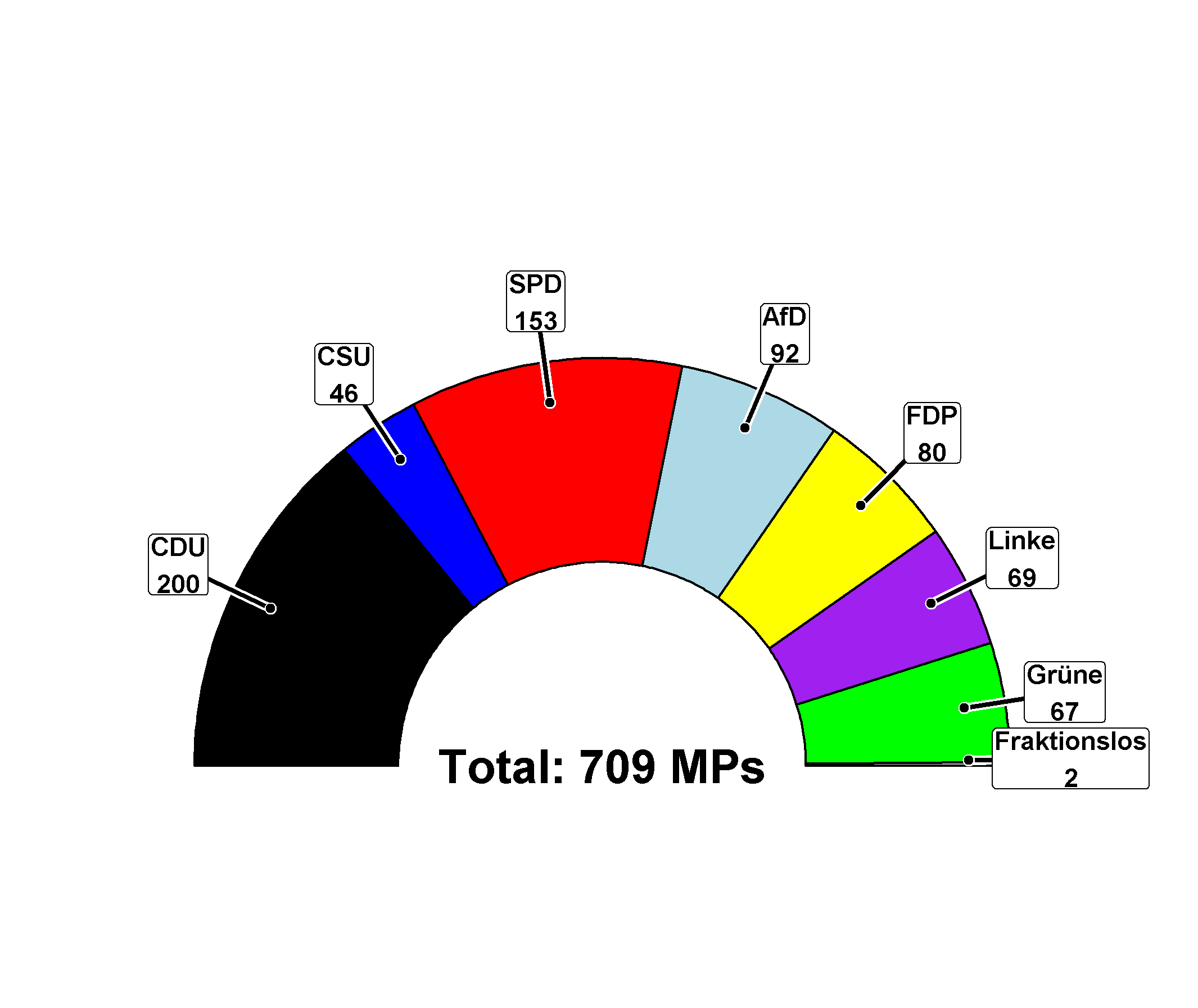
bt <- data.frame(parties = c("CDU", "CSU", "SPD", "AfD", "FDP", "Linke", "Grüne", "Fraktionslos"),
seats = c(200, 46, 153, 92, 80, 69, 67, 2),
cols = c("black", "blue", "red", "lightblue", "yellow", "purple", "green", "grey"),
stringsAsFactors = FALSE)
parlDiag(bt$parties, bt$seats, cols = bt$cols)
关于r - 创建半 donut 或议会席位图表,我们在Stack Overflow上找到一个类似的问题: https://stackoverflow.com/questions/42729174/