问题很简单,您如何阅读这些图表?我读了他们的解释,这对我来说没有意义。
我正在阅读 TensorFlow 的 newly updated readme file for TensorBoard并在其中试图解释什么是“直方图”。首先,它澄清了它并不是真正的直方图:
Right now, its name is a bit of a misnomer, as it doesn't show histograms; instead, it shows some high-level statistics on a distribution.
我试图弄清楚他们的描述实际上想要表达什么。
现在我正在尝试解析特定的句子:
Each line on the chart represents a percentile in the distribution over the data: for example, the bottom line shows how the minimum value has changed over time, and the line in the middle shows how the median has changed.
我的第一个问题是,“每一行”是什么意思。有水平轴,有一些线在图表上形成一个方形网格,或者可能是绘制的线,它们本身。考虑 the TensorBoard example 的屏幕截图:
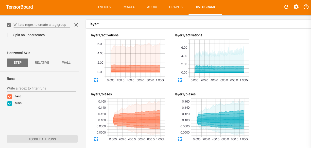
他们用“线条”指的是什么?在上面的例子中,他们所说的行和百分位数是什么?
然后自述文件尝试通过示例提供更多详细信息:
Reading from top to bottom, the lines have the following meaning: [maximum, 93%, 84%, 69%, 50%, 31%, 16%, 7%, minimum]
但是,我不清楚他们在说什么。什么是线条,什么是百分位数?
他们似乎正在尝试在未来替换它,但与此同时,我被这个卡住了。有人可以帮助我了解如何使用它吗?
最佳答案
他们正在谈论的台词如下所述:

百分位数的含义,查看wikipedia article , 基本上,第 93 个百分位意味着 93% 的值位于第 93 个百分位线以下
关于python - 什么是如何阅读 TensorBoard 的直方图特征的一个很好的解释?,我们在Stack Overflow上找到一个类似的问题: https://stackoverflow.com/questions/38149622/