我正在尝试使用plotly 包来创建印度泰米尔纳德邦地区数据的可视化效果。
我能够创建如下来自 here 的数据:
 其代码如下
其代码如下
library(plotly)
df <- tamil_nadu__.india_._lat.long.alt
df$hover <- paste(df$name, "Altitude", df$Altitude_in_ft, "Altitude in Feet")

df$q <- with(df, cut(Altitude_in_ft, quantile(Altitude_in_ft)))
levels(df$q) <- paste(c("1st", "2nd", "3rd", "4th", "5th"), "Quantile")
df$q <- as.ordered(df$q)

g <- list(
  scope = "asia",
  showland = TRUE,
  landcolor = toRGB("gray85"),
  subunitwidth = 1,
  countrywidth = 1,
  subunitcolor = toRGB("white"),
  countrycolor = toRGB("white")
)

plot_ly(df, lon = Lon, lat = Lat, text = hover,color = q, type = 'scattergeo') %>%
  layout(geo = g)
`
但是,我没有可用的地区/城市或州概要。 Plotly 仅针对美国提供此功能。
我确实可以访问 http://www.gadm.org/country 中的 Shape 文件
是否可以导入形状文件并使用绘图中的 map ?
最佳答案
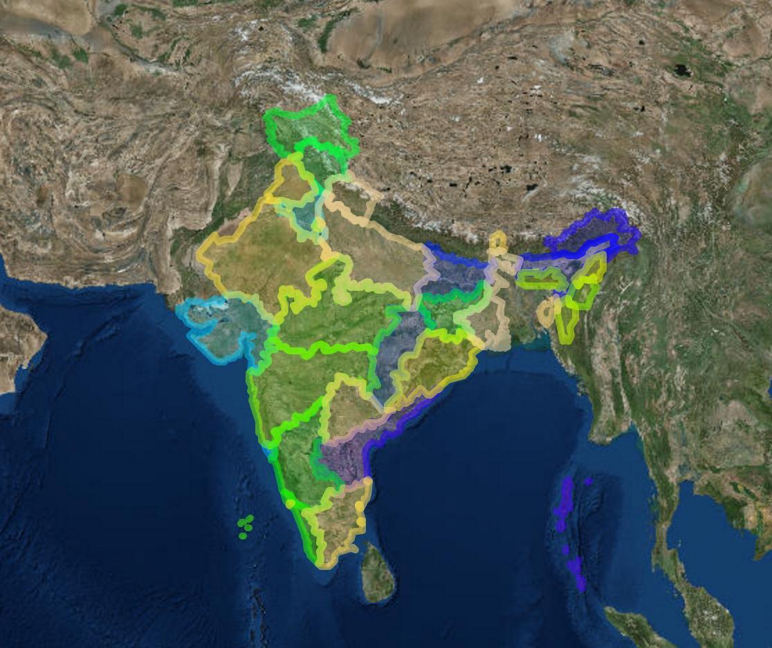
为了跟进我的评论,这里有一个替代方案(我不知道是否可以用plotly实现),它可以给你想要的。我从您的链接下载了形状文件,设置了投影和绘图。我无权访问您的数据集,但您只需将 addCircles() 或 addMarkerCircles() 添加到下面的表达式中。
library(maptools)
library(leaflet)
library(htmltools)
library(htmlwidgets)

IND_adm1 <- readShapeSpatial("pathtoyour/IND_adm1.shp")
proj4string(IND_adm1) <- CRS("+proj=longlat +ellps=WGS84 +datum=WGS84")

str(IND_adm1@data)
factpal <- colorFactor(topo.colors(36), IND_adm1$NAME_1)

leaflet() %>% addProviderTiles("Esri.WorldImagery") %>%
addPolygons(data=IND_adm1, color= ~factpal(NAME_1))
关于R:plotly:如何自定义 map 上的范围?,我们在Stack Overflow上找到一个类似的问题: https://stackoverflow.com/questions/34851808/