我希望能够使用附加信息来扩展我的箱线图。这是 ggplot2 的一个工作示例:
library(ggplot2)

ToothGrowth$dose <- as.factor(ToothGrowth$dose)

# Basic box plot
p <- ggplot(ToothGrowth, aes(x=dose, y=len)) +
  geom_boxplot()
# Rotate the box plot
p + coord_flip()
我想从单独的数据框中添加附加信息。例如:
extra <- data.frame(dose=factor(c(0.5,1,2)), label=c("Label1", "Label2", "Label3"), n=c("n=42","n=52","n=35"))

> extra
  dose  label    n
1  0.5 Label1 n=42
2    1 Label2 n=52
3    2 Label3 n=35
我想创建下图,其中每个剂量(因子)的信息位于图之外并与每个剂量水平对齐(我在 powerpoint 中作为示例):

编辑: 我想就最初问题的扩展寻求建议。
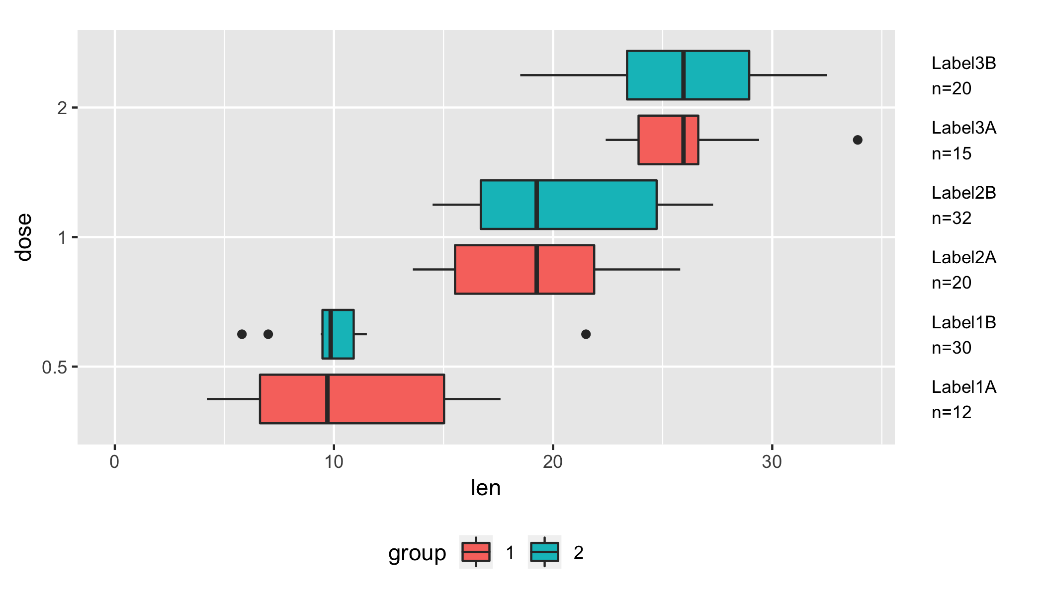
我使用 fill 将剂量分成两组的扩展怎么样?
ToothGrowth$dose <- as.factor(ToothGrowth$dose)
ToothGrowth$group <- head(rep(1:2, 100), dim(ToothGrowth)[1])
ToothGrowth$group <- factor(ToothGrowth$group)

 p <- ggplot(ToothGrowth, aes(x=dose, y=len, fill=group)) +
     geom_boxplot()
 # Rotate the box plot
 p + coord_flip()

extra <- data.frame(
  dose=factor(rep(c(0.5,1,2), each=2)),
  group=factor(rep(c(1:2), 3)),
  label=c("Label1A", "Label1B", "Label2A", "Label2B", "Label3A", "Label3B"),
  n=c("n=12","n=30","n=20", "n=32","n=15","n=20")
)
是否可以将新数据框(额外的 6 行)中的数据与每个剂量/组组合对齐?
最佳答案
我们可以在 coord_flip 中使用 geom_text 和 clip = "off":
ggplot(ToothGrowth, aes(x=dose, y=len)) +
    geom_boxplot() +
    geom_text(
        y = max(ToothGrowth$len) * 1.1,
        data = extra,
        aes(x = dose, label = sprintf("%s\n%s", label, n)),
        hjust = 0) +
    coord_flip(clip = "off") +
    theme(plot.margin = unit(c(1, 5, 0.5, 0.5), "lines"))
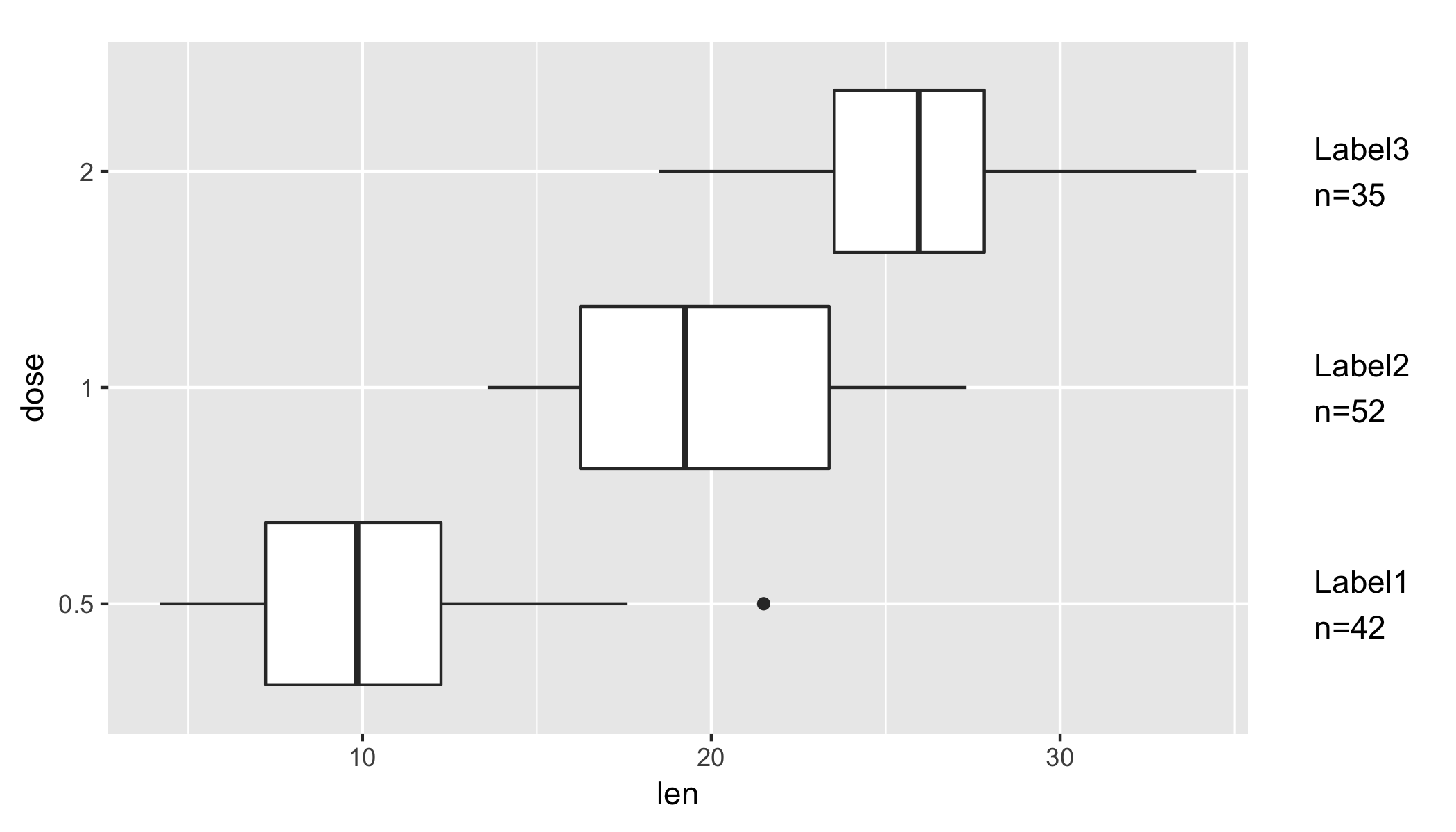
说明:我们使用 geom_text 将文本放置在绘图区域之外,并使用 coord_flip 内的 clip = "off" 禁用剪切。最后,我们增加绘图边距以容纳额外的标签。您可以通过更改 y = max(ToothGrowth$len) * 1.1< 中的系数来调整边距中的垂直 .y 位置(因此由于坐标翻转而导致绘图中的水平位置)/
为了回应您的编辑,这里有一种可能性
extra <- data.frame(
  dose=factor(rep(c(0.5,1,2), each=2)),
  group=factor(rep(c(1:2), 3)),
  label=c("Label1A", "Label1B", "Label2A", "Label2B", "Label3A", "Label3B"),
  n=c("n=12","n=30","n=20", "n=32","n=15","n=20")
)

library(tidyverse)
ToothGrowth %>%
    mutate(
        dose = as.factor(dose),
        group = as.factor(rep(1:2, nrow(ToothGrowth) / 2))) %>%
    ggplot(aes(x = dose, y = len, fill = group)) +
    geom_boxplot(position = position_dodge(width = 1)) +
    geom_text(
        data = extra %>%
            mutate(
                dose = as.factor(dose),
                group = as.factor(group),
                ymax = max(ToothGrowth$len) * 1.1),
        aes(x = dose, y = ymax, label = sprintf("%s\n%s", label, n)),
        position = position_dodge(width = 1),
        size = 3,
        hjust = 0) +
    coord_flip(clip = "off", ylim = c(0, max(ToothGrowth$len))) +
    theme(
        plot.margin = unit(c(1, 5, 0.5, 0.5), "lines"),
        legend.position = "bottom")
一些评论:
- 我们通过在
geom_text和geom_boxplot中使用position_dodge(with = 1)来确保标签与躲避的条形匹配。 - 似乎
position_dodge不喜欢全局y(在aes之外)。因此,我们将标签的 y 位置包含在extra中,并在aes中使用它。因此,我们需要明确限制 y 轴的范围。我们可以在coord_flip中使用ylim = c(0, max(ToothGrowth$len))来完成此操作。
关于r - ggplot2 从绘图旁边的附加数据框中添加数据,我们在Stack Overflow上找到一个类似的问题: https://stackoverflow.com/questions/51757953/