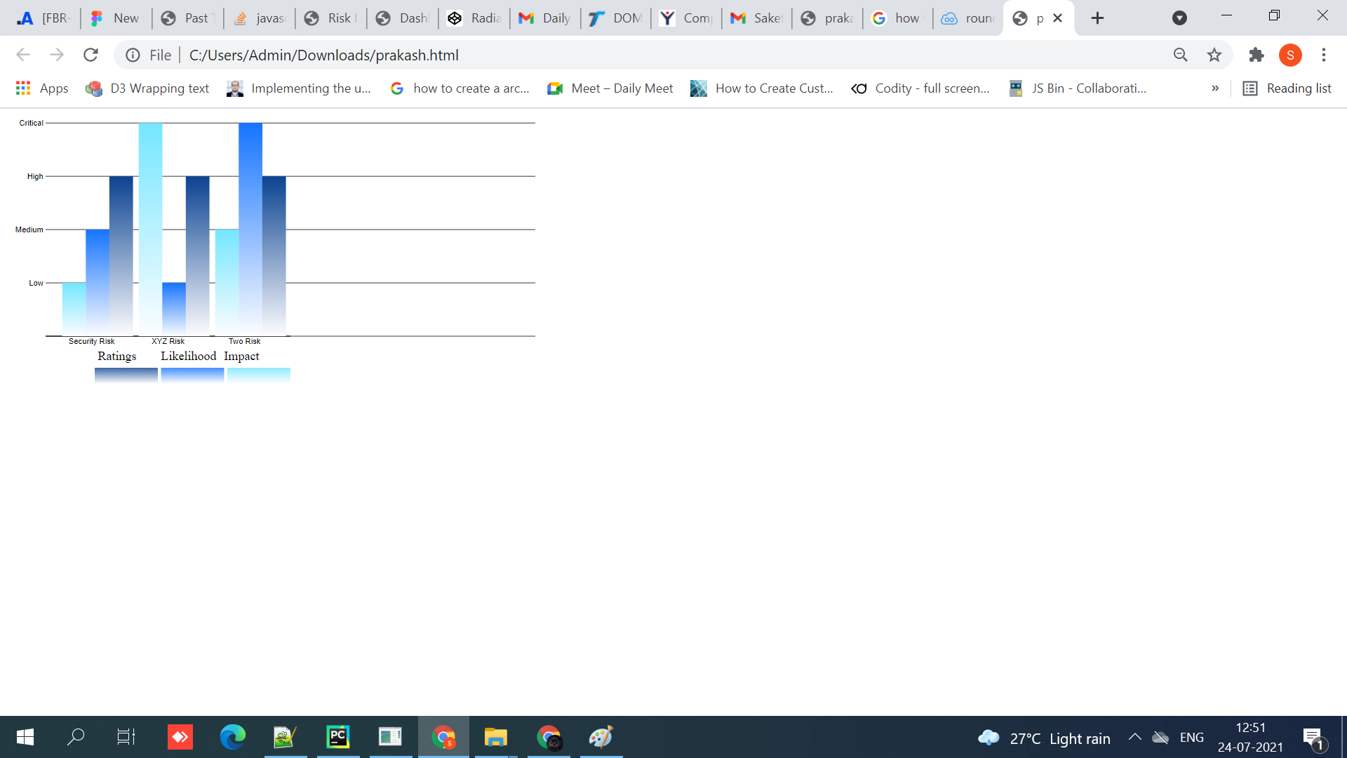
我正在尝试从条形图中删除 y 轴,但是我想在条形图中保留 y 轴标签和网格线我想将 cicle 右侧添加到标签(低、中、高、关键),其中也有不同的颜色
<!DOCTYPE html>
<meta charset="utf-8">

<style>
.grid .tick {
    stroke: lightgrey;
    opacity: 0.7;
}
.grid path {
      stroke-width: 0;
}
</style>

<!-- Load d3.js -->
<script src="https://d3js.org/d3.v6.js"></script>

<!-- Create a div where the graph will take place -->
<div id="my_dataviz"></div>
<script>

// set the dimensions and margins of the graph
const margin = {top: 10, right: 30, bottom: 20, left: 50},
    width = 800 - margin.left - margin.right-100,
    height = 400 - margin.top - margin.bottom-100;

// append the svg object to the body of the page
const svg = d3.select("#my_dataviz")
  .append("svg")
    .attr("width", width + margin.left + margin.right+100)
    .attr("height", height + margin.top + margin.bottom+100)
  .append("g")
    .attr("transform",`translate(${margin.left},${margin.top})`);

// Parse the Data


    const defs = svg.append('defs');

    const bgGradient = defs
      .append('linearGradient')
      .attr('id', 'bg-gradient')
      .attr('gradientTransform', 'rotate(90)');
    bgGradient
      .append('stop')
      .attr('stop-color', '#74E6FF')
      .attr('offset', '0%');
    bgGradient
      .append('stop')
      .attr('stop-color', '#FDFDFF')
      .attr('offset', '100%');

    const bgGradient1 = defs
      .append('linearGradient')
      .attr('id', 'bg-gradient1')
      .attr('gradientTransform', 'rotate(90)');
    bgGradient1
      .append('stop')
      .attr('stop-color', '#1574FF')
      .attr('offset', '0%');
    bgGradient1
      .append('stop')
      .attr('stop-color', '#FDFDFF')
      .attr('offset', '100%');


    const bgGradient2 = defs
      .append('linearGradient')
      .attr('id', 'bg-gradient2')
      .attr('gradientTransform', 'rotate(90)');
    bgGradient2
      .append('stop')
      .attr('stop-color', '#0B4291')
      .attr('offset', '0%');
    bgGradient2
      .append('stop')
      .attr('stop-color', '#FDFDFF')
      .attr('offset', '100%');

   var data = [
    {
      "Risk": "Security Risk",
      "Impact": 2,
      "Likelihood": 4,
      "Rating": 6,
    },
    {
      "Risk": "XYZ Risk",
      "Impact": 8,
      "Likelihood": 6,
      "Rating": 4,
    },
    {
      "Risk": "Two Risk",
      "Impact": 2,
      "Likelihood": 4,
      "Rating": 6,
    }


  ]


  const groups=["Security Risk","XYZ Risk","Two Risk"]
  const subgroups=["Impact","Likelihood","Rating"]


    // Add X axis
    var x = d3.scaleBand().domain(groups).range([0, width/2]).padding(0.2);
    svg
        .append("g")
        .attr("transform", "translate(0," + height + ")")
        .call(d3.axisBottom(x).tickSize(0));

    // Add Y axis
    var y = d3.scaleLinear().domain([0, 8]).range([height, 0]);
    function draw_yAxis_gridlines() {
          return d3.axisLeft(y)
            .tickValues(3);
        }

    svg.append("g")

    .call(
        d3
            .axisLeft(y).tickSize(0)

            // .tickValues(["Low", "Medium", "High", "Critical"])
            .ticks(3)
            .tickFormat((d, i) => ["","Low", "Medium", "High", "Critical"][i])
    )
    ;
    svg.append("g")
      .attr("class", "grid")
      .call(make_y_gridlines()
          .tickSize(-width)
          .tickFormat("")
      )

    // gridlines in y axis function
    function make_y_gridlines() {
        return d3.axisLeft(y)
            .ticks(3)
            .tickFormat((d, i) => ["Low", "Medium", "High", "Critical"][i])
    }


    // Another scale for subgroup position?
    var xSubgroup = d3
        .scaleBand()
        .domain(subgroups)
        .range([0, 91])
        .padding(0.05);


    // color palette = one color per subgroup
    var color = d3
        .scaleOrdinal()
        .domain(subgroups)
        .range(["#74E6FF", "#1574FF", "#0B4290"]);

    const rx=12;
    const ry=12;

  // Show the bars
  svg.append("g")
    .selectAll("g")
    // Enter in data = loop group per group
    .data(data)

    .join("g")
      .attr("transform", d => `translate(${x(d.Risk)}, 0)`)
    .selectAll("rect")
    .data(function(d) { return subgroups.map(function(key) { return {key: key, value: d[key]}; }); })
    .join("rect")
      .attr("x", d => xSubgroup(d.key))
      .attr("y", d => y(d.value))

      .attr("width", 30)
      .attr("height", d => height - y(d.value))
      .attr("fill", function (d) {
      console.log("d",d["key"]);
      if(d["key"]=="Impact") {
        return "url(#bg-gradient)"

      }
      else if(d["key"]=="Likelihood") {
        return "url(#bg-gradient1)"

      }
      else if(d["key"]=="Rating") {
        return "url(#bg-gradient2)"

      }
      })
      .attr("d", (item) => {
        console.log(item);
        return `
        M xSubgroup(item.key) ,y(item.value) + ry
        a rx ,ry 0 0 1 rx,-ry
        h xSubgroup.bandwidth() - 2 * rx
        a rx, ry 0 0 1 rx,ry
        v height - y(item.value) - ry
        h -xSubgroup.bandwidth()Z
      `;
      });


  var color_domain = [50, 150, 350]
  var ext_color_domain = [0, 50, 150 ]
  var legend_labels = ["Impact", "Likelihood", "Ratings"]

var legend = svg.selectAll("g.legend")
.data(ext_color_domain)
.enter().append("g")
.attr("class", "legend");

var ls_w = 80, ls_h = 20;

legend.append("rect")
.attr("x", function(d, i){ return width/2 - (i*ls_w) - ls_w - 4*i;})
.attr("y", 310)
.attr("width", ls_w)
.attr("height", ls_h)
.style("fill", function (d,i) {
      console.log("d",d["key"]);
      if(i==0) {
        return "url(#bg-gradient)"

      }
      else if(i==1) {
        return "url(#bg-gradient1)"

      }
      else if(i==2) {
        return "url(#bg-gradient2)"

      }
      })
.style("opacity", 0.8);

legend.append("text")
.attr("x", function(d, i){ return width/2 - (i*ls_w) - ls_w - 4;})
.attr("y", 300)
.text(function(d, i){ return legend_labels[i]; });

</script>
这是我当前的输出

预期输出

任何帮助或指导都会有很大帮助。 提前致谢。如果有任何不清楚的地方,请在下面评论
编辑1
下面的编辑没有解决任何问题,但我删除了不必要的代码,我认为这没有多大帮助。
<!DOCTYPE html>
<meta charset="utf-8">

<style>
.grid .tick {
    stroke: lightgrey;
    opacity: 0.7;
}
.grid path {
      stroke-width: 0;
}
</style>

<!-- Load d3.js -->
<script src="https://d3js.org/d3.v6.js"></script>

<!-- Create a div where the graph will take place -->
<div id="my_dataviz"></div>
<script>

// set the dimensions and margins of the graph
const margin = {top: 10, right: 30, bottom: 20, left: 50},
    width = 800 - margin.left - margin.right-100,
    height = 400 - margin.top - margin.bottom-100;

// append the svg object to the body of the page
const svg = d3.select("#my_dataviz")
  .append("svg")
    .attr("width", width + margin.left + margin.right+100)
    .attr("height", height + margin.top + margin.bottom+100)
  .append("g")
    .attr("transform",`translate(${margin.left},${margin.top})`);

// Parse the Data


    const defs = svg.append('defs');

    const bgGradient = defs
      .append('linearGradient')
      .attr('id', 'bg-gradient')
      .attr('gradientTransform', 'rotate(90)');
    bgGradient
      .append('stop')
      .attr('stop-color', '#74E6FF')
      .attr('offset', '0%');
    bgGradient
      .append('stop')
      .attr('stop-color', '#FDFDFF')
      .attr('offset', '100%');

    const bgGradient1 = defs
      .append('linearGradient')
      .attr('id', 'bg-gradient1')
      .attr('gradientTransform', 'rotate(90)');
    bgGradient1
      .append('stop')
      .attr('stop-color', '#1574FF')
      .attr('offset', '0%');
    bgGradient1
      .append('stop')
      .attr('stop-color', '#FDFDFF')
      .attr('offset', '100%');


    const bgGradient2 = defs
      .append('linearGradient')
      .attr('id', 'bg-gradient2')
      .attr('gradientTransform', 'rotate(90)');
    bgGradient2
      .append('stop')
      .attr('stop-color', '#0B4291')
      .attr('offset', '0%');
    bgGradient2
      .append('stop')
      .attr('stop-color', '#FDFDFF')
      .attr('offset', '100%');

   var data = [
    {
      "Risk": "Security Risk",
      "Impact": "Low",
      "Likelihood": "Medium",
      "Rating": "High",
    },
    {
      "Risk": "XYZ Risk",
      "Impact": "Critical",
      "Likelihood": "Low",
      "Rating": "High",
    },
    {
      "Risk": "Two Risk",
      "Impact": "Medium",
      "Likelihood": "Critical",
      "Rating": "High",
    }


  ]


  const groups=["Security Risk","XYZ Risk","Two Risk"]
  const subgroups=["Impact","Likelihood","Rating"]


    // Add X axis
    var x = d3.scaleBand().domain(groups).range([0, width/2]).padding(0.2);
    svg
        .append("g")
        .attr("transform", "translate(0," + height + ")")
        .call(d3.axisBottom(x).tickSize(0));

    // Add Y axis
    var y = d3.scalePoint()
            .domain(["","Low", "Medium", "High", "Critical"]).range([height, 0]);
    function draw_yAxis_gridlines() {
          return d3.axisLeft(y)
            .tickValues(3);
        }

    svg.append("g")

    .call(
        d3
            .axisLeft(y).tickSize(0)

    )
    ;
    svg.append("g")
      .attr("class", "grid")
      .call(make_y_gridlines()
          .tickSize(-width)
          .tickFormat("")
      )

    // gridlines in y axis function
    function make_y_gridlines() {
        return d3.axisLeft(y)
            .ticks(3)
    }


    // Another scale for subgroup position?
    var xSubgroup = d3
        .scaleBand()
        .domain(subgroups)
        .range([0, 91])
        .padding(0.05);


    // color palette = one color per subgroup
    var color = d3
        .scaleOrdinal()
        .domain(subgroups)
        .range(["#74E6FF", "#1574FF", "#0B4290"]);

    const rx=12;
    const ry=12;

  // Show the bars
  svg.append("g")
    .selectAll("g")
    // Enter in data = loop group per group
    .data(data)

    .join("g")
      .attr("transform", d => `translate(${x(d.Risk)}, 0)`)
    .selectAll("rect")
    .data(function(d) { return subgroups.map(function(key) { return {key: key, value: d[key]}; }); })
    .join("rect")
      .attr("x", d => xSubgroup(d.key))
      .attr("y", d => y(d.value))

      .attr("width", 30)
      .attr("height", d => height - y(d.value))
      .attr("fill", function (d) {
      console.log("d",d["key"]);
      if(d["key"]=="Impact") {
        return "url(#bg-gradient)"

      }
      else if(d["key"]=="Likelihood") {
        return "url(#bg-gradient1)"

      }
      else if(d["key"]=="Rating") {
        return "url(#bg-gradient2)"

      }
      })
      .attr("d", (item) => {
        console.log(item);
        return `
        M xSubgroup(item.key) ,y(item.value) + ry
        a rx ,ry 0 0 1 rx,-ry
        h xSubgroup.bandwidth() - 2 * rx
        a rx, ry 0 0 1 rx,ry
        v height - y(item.value) - ry
        h -xSubgroup.bandwidth()Z
      `;
      });


  var color_domain = [50, 150, 350]
  var ext_color_domain = [0, 50, 150 ]
  var legend_labels = ["Impact", "Likelihood", "Ratings"]

var legend = svg.selectAll("g.legend")
.data(ext_color_domain)
.enter().append("g")
.attr("class", "legend");

var ls_w = 80, ls_h = 20;

legend.append("rect")
.attr("x", function(d, i){ return width/2 - (i*ls_w) - ls_w - 4*i;})
.attr("y", 310)
.attr("width", ls_w)
.attr("height", ls_h)
.style("fill", function (d,i) {
      console.log("d",d["key"]);
      if(i==0) {
        return "url(#bg-gradient)"

      }
      else if(i==1) {
        return "url(#bg-gradient1)"

      }
      else if(i==2) {
        return "url(#bg-gradient2)"

      }
      })
.style("opacity", 0.8);

legend.append("text")
.attr("x", function(d, i){ return width/2 - (i*ls_w) - ls_w - 4;})
.attr("y", 300)
.text(function(d, i){ return legend_labels[i]; });

</script>
编辑3 我能够成功删除 y 轴,但获取标签旁边的圆圈(“低”、“高”、“中”、“关键”)的问题仍然存在。 下面是我编辑的代码
<!DOCTYPE html>
<meta charset="utf-8">

<style>
.grid .tick {
    stroke: lightgrey;
    opacity: 0.7;
}
.grid path {
      stroke-width: 0;
}
</style>

<!-- Load d3.js -->
<script src="https://d3js.org/d3.v6.js"></script>

<!-- Create a div where the graph will take place -->
<div id="my_dataviz"></div>
<script>

// set the dimensions and margins of the graph
const margin = {top: 10, right: 30, bottom: 20, left: 50},
    width = 800 - margin.left - margin.right-100,
    height = 400 - margin.top - margin.bottom-100;

// append the svg object to the body of the page
const svg = d3.select("#my_dataviz")
  .append("svg")
    .attr("width", width + margin.left + margin.right+100)
    .attr("height", height + margin.top + margin.bottom+100)
  .append("g")
    .attr("transform",`translate(${margin.left},${margin.top})`);

// Parse the Data


    const defs = svg.append('defs');

    const bgGradient = defs
      .append('linearGradient')
      .attr('id', 'bg-gradient')
      .attr('gradientTransform', 'rotate(90)');
    bgGradient
      .append('stop')
      .attr('stop-color', '#74E6FF')
      .attr('offset', '0%');
    bgGradient
      .append('stop')
      .attr('stop-color', '#FDFDFF')
      .attr('offset', '100%');

    const bgGradient1 = defs
      .append('linearGradient')
      .attr('id', 'bg-gradient1')
      .attr('gradientTransform', 'rotate(90)');
    bgGradient1
      .append('stop')
      .attr('stop-color', '#1574FF')
      .attr('offset', '0%');
    bgGradient1
      .append('stop')
      .attr('stop-color', '#FDFDFF')
      .attr('offset', '100%');


    const bgGradient2 = defs
      .append('linearGradient')
      .attr('id', 'bg-gradient2')
      .attr('gradientTransform', 'rotate(90)');
    bgGradient2
      .append('stop')
      .attr('stop-color', '#0B4291')
      .attr('offset', '0%');
    bgGradient2
      .append('stop')
      .attr('stop-color', '#FDFDFF')
      .attr('offset', '100%');

   var data = [
    {
      "Risk": "Security Risk",
      "Impact": "Low",
      "Likelihood": "Medium",
      "Rating": "High",
    },
    {
      "Risk": "XYZ Risk",
      "Impact": "Critical",
      "Likelihood": "Low",
      "Rating": "High",
    },
    {
      "Risk": "Two Risk",
      "Impact": "Medium",
      "Likelihood": "Critical",
      "Rating": "High",
    }


  ]


  const groups=["Security Risk","XYZ Risk","Two Risk"]
  const subgroups=["Impact","Likelihood","Rating"]


    // Add X axis
    var x = d3.scaleBand()
                    .domain(groups) // This is what is written on the Axis: from 0 to 100
                    .range([0, width/2])  // This is where the axis is placed: from 100 px to 800px
                    .padding(0.2);  // Goes between 0 and 1. Default is 0
    svg
        .append("g")
        .attr("transform", "translate(0," + height + ")")
        .call(d3.axisBottom(x).tickSize(0));

    // Add Y axis
    var y = d3.scalePoint()
            .domain(["","Low", "Medium", "High", "Critical"]).range([height, 0]);
    function draw_yAxis_gridlines() {
          return d3.axisLeft(y)
            .tickValues(3);
        }

    svg.append("g")

    .call(
        d3
            .axisLeft(y).tickSize(0)

    )
    .select(".domain").remove()
    ;
    svg.append("g")
      .attr("class", "grid")
      .call(make_y_gridlines()
          .tickSize(-width)
          .tickFormat("")
      )

    // gridlines in y axis function
    function make_y_gridlines() {
        return d3.axisLeft(y)
            .ticks(3)
    }


    // Another scale for subgroup position?
    var xSubgroup = d3
        .scaleBand()
        .domain(subgroups)
        .range([0, 91])
        .padding(0.05);


    // color palette = one color per subgroup
    var color = d3
        .scaleOrdinal()
        .domain(subgroups)
        .range(["#74E6FF", "#1574FF", "#0B4290"]);

    const rx=12;
    const ry=12;

  // Show the bars
  svg.append("g")
    .selectAll("g")
    // Enter in data = loop group per group
    .data(data)

    .join("g")
      .attr("transform", d => `translate(${x(d.Risk)}, 0)`)
    .selectAll("rect")
    .data(function(d) { return subgroups.map(function(key) { return {key: key, value: d[key]}; }); })
    .join("rect")
      .attr("x", d => xSubgroup(d.key))
      .attr("y", d => y(d.value))

      .attr("width", 30)
      .attr("height", d => height - y(d.value))
      .attr("fill", function (d) {
      console.log("d",d["key"]);
      if(d["key"]=="Impact") {
        return "url(#bg-gradient)"

      }
      else if(d["key"]=="Likelihood") {
        return "url(#bg-gradient1)"

      }
      else if(d["key"]=="Rating") {
        return "url(#bg-gradient2)"

      }
      })
      .attr("d", (item) => {
        console.log(item);
        return `
        M xSubgroup(item.key) ,y(item.value) + ry
        a rx ,ry 0 0 1 rx,-ry
        h xSubgroup.bandwidth() - 2 * rx
        a rx, ry 0 0 1 rx,ry
        v height - y(item.value) - ry
        h -xSubgroup.bandwidth()Z
      `;
      });


  var color_domain = [50, 150, 350]
  var ext_color_domain = [0, 50, 150 ]
  var legend_labels = ["Impact", "Likelihood", "Ratings"]

var legend = svg.selectAll("g.legend")
.data(ext_color_domain)
.enter().append("g")
.attr("class", "legend");

var ls_w = 80, ls_h = 20;

legend.append("rect")
.attr("x", function(d, i){ return width/2 - (i*ls_w) - ls_w - 4*i;})
.attr("y", 310)
.attr("width", ls_w)
.attr("height", ls_h)
.style("fill", function (d,i) {
      console.log("d",d["key"]);
      if(i==0) {
        return "url(#bg-gradient)"

      }
      else if(i==1) {
        return "url(#bg-gradient1)"

      }
      else if(i==2) {
        return "url(#bg-gradient2)"

      }
      })
.style("opacity", 0.8);

legend.append("text")
.attr("x", function(d, i){ return width/2 - (i*ls_w) - ls_w - 4;})
.attr("y", 300)
.text(function(d, i){ return legend_labels[i]; });

</script>
电流输出:
最佳答案
这是一个带有彩色项目符号的示例:
// set the dimensions and margins of the graph
const margin = {top: 10, right: 30, bottom: 20, left: 50},
    width = 800 - margin.left - margin.right-100,
    height = 400 - margin.top - margin.bottom-100;

const colors = ['red', 'orange', 'yellow', 'green'];

// append the svg object to the body of the page
const svg = d3.select("#my_dataviz")
  .append("svg")
    .attr("width", width + margin.left + margin.right+100)
    .attr("height", height + margin.top + margin.bottom+100)
  .append("g")
    .attr("transform",`translate(${margin.left},${margin.top})`);

// Parse the Data


    const defs = svg.append('defs');

    const bgGradient = defs
      .append('linearGradient')
      .attr('id', 'bg-gradient')
      .attr('gradientTransform', 'rotate(90)');
    bgGradient
      .append('stop')
      .attr('stop-color', '#74E6FF')
      .attr('offset', '0%');
    bgGradient
      .append('stop')
      .attr('stop-color', '#FDFDFF')
      .attr('offset', '100%');

    const bgGradient1 = defs
      .append('linearGradient')
      .attr('id', 'bg-gradient1')
      .attr('gradientTransform', 'rotate(90)');
    bgGradient1
      .append('stop')
      .attr('stop-color', '#1574FF')
      .attr('offset', '0%');
    bgGradient1
      .append('stop')
      .attr('stop-color', '#FDFDFF')
      .attr('offset', '100%');


    const bgGradient2 = defs
      .append('linearGradient')
      .attr('id', 'bg-gradient2')
      .attr('gradientTransform', 'rotate(90)');
    bgGradient2
      .append('stop')
      .attr('stop-color', '#0B4291')
      .attr('offset', '0%');
    bgGradient2
      .append('stop')
      .attr('stop-color', '#FDFDFF')
      .attr('offset', '100%');

   var data = [
    {
      "Risk": "Security Risk",
      "Impact": 2,
      "Likelihood": 4,
      "Rating": 6,
    },
    {
      "Risk": "XYZ Risk",
      "Impact": 8,
      "Likelihood": 6,
      "Rating": 4,
    },
    {
      "Risk": "Two Risk",
      "Impact": 2,
      "Likelihood": 4,
      "Rating": 6,
    }


  ]


  const groups=["Security Risk","XYZ Risk","Two Risk"]
  const subgroups=["Impact","Likelihood","Rating"]


    // Add X axis
    var x = d3.scaleBand().domain(groups).range([0, width/2]).padding(0.2);
    svg
        .append("g")
        .attr("transform", "translate(0," + height + ")")
        .call(d3.axisBottom(x).tickSize(0));

    // Add Y axis
    var y = d3.scaleLinear().domain([0, 8]).range([height, 0]);
    function draw_yAxis_gridlines() {
          return d3.axisLeft(y)
            .tickValues(3);
        }


    svg.append("g")
      .attr("class", "grid")
      .call(make_y_gridlines()
          .tickSize(-width)
          .tickFormat("")
      )

    // gridlines in y axis function
    function make_y_gridlines() {
        return d3.axisLeft(y)
            .ticks(3)
            .tickFormat((d, i) => ["Low", "Medium", "High", "Critical"][i])
    }


    // Another scale for subgroup position?
    var xSubgroup = d3
        .scaleBand()
        .domain(subgroups)
        .range([0, 91])
        .padding(0.05);


    // color palette = one color per subgroup
    var color = d3
        .scaleOrdinal()
        .domain(subgroups)
        .range(["#74E6FF", "#1574FF", "#0B4290"]);

    const rx=12;
    const ry=12;

  // Show the bars
  svg.append("g")
    .selectAll("g")
    // Enter in data = loop group per group
    .data(data)

    .join("g")
      .attr("transform", d => `translate(${x(d.Risk)}, 0)`)
    .selectAll("rect")
    .data(function(d) { return subgroups.map(function(key) { return {key: key, value: d[key]}; }); })
    .join("rect")
      .attr("x", d => xSubgroup(d.key))
      .attr("y", d => y(d.value))

      .attr("width", 30)
      .attr("height", d => height - y(d.value))
      .attr("fill", function (d) {
      console.log("d",d["key"]);
      if(d["key"]=="Impact") {
        return "url(#bg-gradient)"

      }
      else if(d["key"]=="Likelihood") {
        return "url(#bg-gradient1)"

      }
      else if(d["key"]=="Rating") {
        return "url(#bg-gradient2)"

      }
      })
      .attr("d", (item) => {
        console.log(item);
        return `
        M xSubgroup(item.key) ,y(item.value) + ry
        a rx ,ry 0 0 1 rx,-ry
        h xSubgroup.bandwidth() - 2 * rx
        a rx, ry 0 0 1 rx,ry
        v height - y(item.value) - ry
        h -xSubgroup.bandwidth()Z
      `;
      });


  var color_domain = [50, 150, 350]
  var ext_color_domain = [0, 50, 150 ]
  var legend_labels = ["Impact", "Likelihood", "Ratings"]

var legend = svg.selectAll("g.legend")
.data(ext_color_domain)
.enter().append("g")
.attr("class", "legend");

var ls_w = 80, ls_h = 20;

legend.append("rect")
.attr("x", function(d, i){ return width/2 - (i*ls_w) - ls_w - 4*i;})
.attr("y", 310)
.attr("width", ls_w)
.attr("height", ls_h)
.style("fill", function (d,i) {
      console.log("d",d["key"]);
      if(i==0) {
        return "url(#bg-gradient)"

      }
      else if(i==1) {
        return "url(#bg-gradient1)"

      }
      else if(i==2) {
        return "url(#bg-gradient2)"

      }
      })
.style("opacity", 0.8);

legend.append("text")
.attr("x", function(d, i){ return width/2 - (i*ls_w) - ls_w - 4;})
.attr("y", 300)
.text(function(d, i){ return legend_labels[i]; });

    const yAxis = svg.append("g")

    .call(
        d3
            .axisLeft(y).tickSize(0)

            .ticks(3)
            .tickFormat((d, i) => ["","Low", "Medium", "High", "Critical"][i])
    );

    const ticks = yAxis.selectAll('.tick');

    ticks.filter((d, i) => i > 0)
        .append('circle')
      .attr('cx', 0)
      .attr('cy', 0)
      .attr('r', 5)
      .style('fill', (_, i) => colors[3 - i])

ticks.select('text').attr('dx', -5);
.grid .tick {
stroke: lightgrey;
opacity: 0.7;
}
.grid path {
stroke-width: 0;
}<script src="https://d3js.org/d3.v6.js"></script>
<div id="my_dataviz"></div>
<div id="my_dataviz"></div>关于javascript - 尝试获取条形图 d3.js 中 y 轴标签旁边的圆圈,我们在Stack Overflow上找到一个类似的问题: https://stackoverflow.com/questions/68507758/