我有一个示例数据框:
set.seed(100)
my_data <- data.frame(type = letters,
                      value = rnorm(26, 10, 3) |> sort(),
                      weight = 1:26)
我可以轻松制作直方图:
bin_width <- 5
x_seq <- seq(0, 20, bin_width)

ggplot2::ggplot(my_data, ggplot2::aes(x = value)) +
  ggplot2::geom_histogram(binwidth = bin_width) +
  ggplot2::scale_x_continuous(limits = c(min(x_seq), max(x_seq)),
                                         n.breaks = length(x_seq))

现在,我想制作第二个使用 my_data$weight 作为权重因子的数字。结果图必须与第一个图匹配 - 它必须具有相同的 x 轴并且看起来像直方图。它实际上不需要是直方图,但它必须匹配。此图不会显示 bin 范围内的观测值数量,而是显示 bin 范围内的观测值的累积权重值。换句话说,对于 bin 范围内 my_data$value 的所有观测值,它将对 my_data$weight 求和并在 y 轴上显示总和。
一个简单的解决方案是使用权重复制数据。例如,rep(my_data$value, my_data$weight)。此解决方案对我不起作用,因为在我的真实数据集中,权重非常大,复制和绘图非常慢。我正在使用该解决方案显示所需的输出:
最佳答案
一种选择是将您的体重映射到体重美学上:
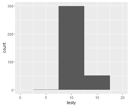
ggplot2::ggplot(my_data, ggplot2::aes(x = value)) +
  ggplot2::geom_histogram(ggplot2::aes(weight = weight), binwidth = bin_width) +
  ggplot2::scale_x_continuous(
    limits = c(min(x_seq), max(x_seq)),
    n.breaks = length(x_seq)
  )
#> Warning: Removed 2 rows containing missing values (`geom_bar()`).

关于r - 创建加权geom_histogram(),我们在Stack Overflow上找到一个类似的问题: https://stackoverflow.com/questions/75860455/