我想在单个图中比较不同分布与我的数据的拟合度。 fitdistrplus 包中的qqcomp 函数几乎完全符合我的要求。然而,我遇到的唯一问题是,它主要是使用基本 R 绘图编写的,而我所有其他绘图都是用 ggplot2 编写的。我基本上只想自定义 qqcomp 图,使其看起来像是在 ggplot2 中制作的。
从文档 ( https://www.rdocumentation.org/packages/fitdistrplus/versions/1.0-14/topics/graphcomp ) 我知道这完全可以通过设置 plotstyle="ggplot" 实现。但是,如果我这样做,即使没有 plotstyle 参数它也能完美运行,但情节上不会显示任何点。这是一个可视化我的问题的小例子:
library(fitdistrplus)
library(ggplot2)
set.seed(42)
vec <- rgamma(100, shape=2)
fit.norm <- fitdist(vec, "norm")
fit.gamma <- fitdist(vec, "gamma")
fit.weibull <- fitdist(vec, "weibull")
model.list <- list(fit.norm, fit.gamma, fit.weibull)
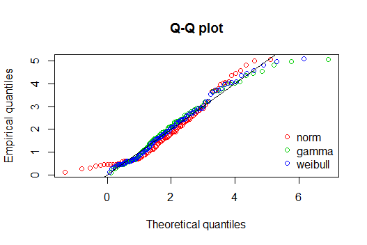
qqcomp(model.list)
这给出了以下输出:
同时:
qqcomp(model.list, plotstyle="ggplot")
给出以下输出:
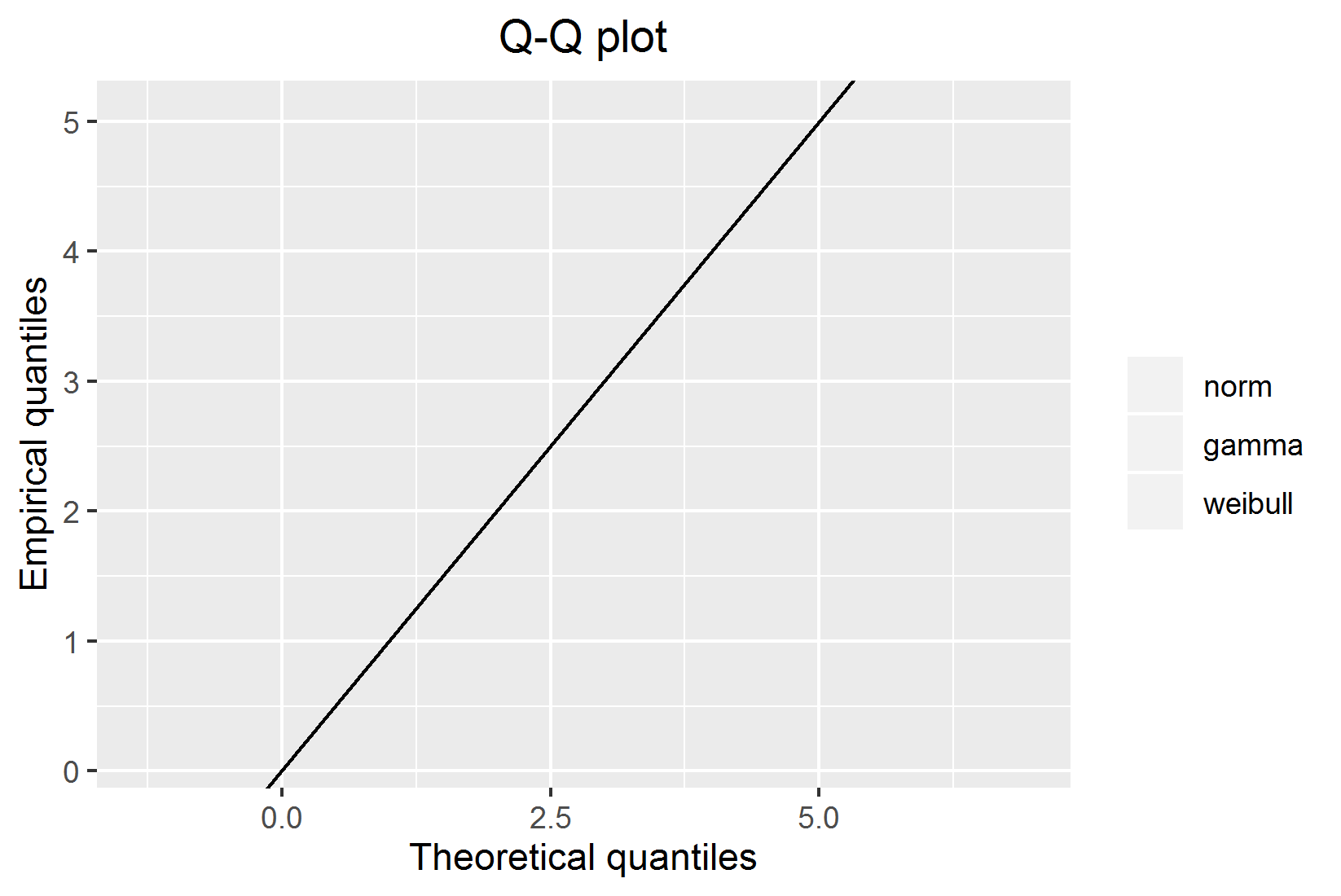
为什么积分不显示?我在这里做错了什么还是这是一个错误?
编辑:
所以我还没有弄清楚为什么这不起作用,但是有一个非常简单的解决方法。函数调用 qqcomp(model.list, plotstyle="ggplot") 仍然返回一个 ggplot 对象,其中包含用于绘制绘图的数据。使用该数据,可以轻松编写自己的绘图函数,完全按照自己的意愿进行。它不是很优雅,但在有人发现它无法按预期工作的原因之前,我将只使用此方法。
最佳答案
我能够重现您的错误,确实,这真的很有趣。也许,你应该联系这个包的开发者来提及这个错误。
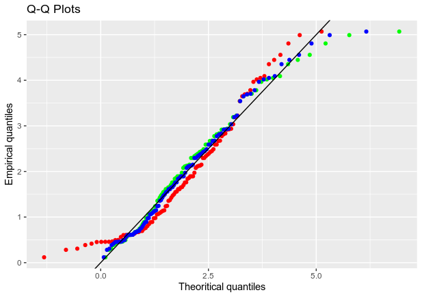
否则,如果您想使用 ggplot 和 stat_qq 重现此 qqplot,传递相应的分布函数和关联的参数(存储在 $estimate 中):
library(ggplot2)
df = data.frame(vec)
ggplot(df, aes(sample = vec))+
  stat_qq(distribution = qgamma, dparams = as.list(fit.gamma$estimate), color = "green")+
  stat_qq(distribution = qnorm, dparams = as.list(fit.norm$estimate), color = "red")+
  stat_qq(distribution = qweibull, dparams = as.list(fit.weibull$estimate), color = "blue")+
  geom_abline(slope = 1, color = "black")+
  labs(title = "Q-Q Plots", x = "Theoritical quantiles", y = "Empirical quantiles")
希望对你有所帮助。
关于r - 为什么在使用 plotstyle ="ggplot"时 qqcomp 函数中没有显示任何点?,我们在Stack Overflow上找到一个类似的问题: https://stackoverflow.com/questions/59529359/