我正在尝试使用 seaborn 创建这种“并排”条形图和 pandas .

这就是我创建数据框的方式:
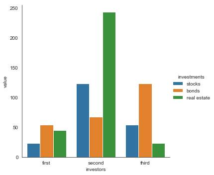
dfs = pd.DataFrame(data={'investors': ['first','second','third'], 'stocks': [23, 123, 54], 'bonds': [54, 67, 123], 'real estate': [45, 243, 23]})
这是条形图代码:
sns.factorplot(x='investors', y='bonds', data=dfs, kind='bar')
有人可以帮忙吗?谢谢
最佳答案
使用 melt 在你的日期框架上,然后用 seaborn 绘制它。
更新:在较新版本的 seaborn 中,factorplot 已更改为 catplot。
sns.catplot(x = 'investors', y='value',
            hue = 'investments',data=dfs1,
            kind='bar')
# import libraries
import seaborn as sns
import matplotlib.pyplot as plt
import pandas as pd

dfs = pd.DataFrame(data={'investors': ['first','second','third'],
                         'stocks': [23, 123, 54],
                         'bonds': [54, 67, 123],
                         'real estate': [45, 243, 23]})

dfs1 = pd.melt(dfs, id_vars = "investors")

print(dfs1)

    investors    investments    value
0   first         stocks         23
1   second        stocks        123
2   third         stocks         54
3   first          bonds         54
4   second         bonds         67
5   third          bonds        123
6   first      real estate       45
7   second     real estate      243
8   third      real estate       23


sns.factorplot(x = 'investors', y='value',
               hue = 'investments',data=dfs1, kind='bar')
plt.show()
关于python - 并排条形图,我们在Stack Overflow上找到一个类似的问题: https://stackoverflow.com/questions/52028043/