首先,让我们创建一些假数据:
d <- c("2019-01-01", "2019-01-02", "2019-01-03", "2019-01-04", "2019-01-03", "2019-04-06", "2019-04-03", "2019-05-07", "2019-05-03", "2019-05-03", "2019-05-03", "2019-05-03", "2019-06-03", "2019-06-03", "2019-06-03", "2019-06-03", "2019-06-03", "2019-06-03", "2019-06-03", "2019-07-03", "2019-07-03", "2019-07-04", "2019-08-03", "2019-09-05", "2019-09-03", "2019-09-03", "2019-09-06", "2019-09-08", "2019-10-03", "2019-11-03", "2019-11-03", "2019-11-03", "2019-11-03", "2019-11-03", "2019-11-03", "2019-12-03", "2019-12-03")

df <- data.frame(dates=as.Date(d))
现在,我创建一个时间序列图:
# aggregate data
df_plot <- df %>% mutate(month = lubridate::floor_date(dates, "month")) %>%
  group_by(month) %>% summarise(count = n())

# plot data
ggplot(aes(x = month, y = count), data = df_plot) + geom_line() +
  scale_x_date() +
  geom_vline(xintercept = as.numeric(as.Date("2019-01-30")), linetype=4)
使用 geom_vline(xintercept = as.numeric(as.Date("2019-01-30")), linetype=4) 我可以用垂直线标记某个日期。是否还有可能用彩色框或其他标记时间范围(比如从 2019-01-30 到 2019-02-15)?
最佳答案
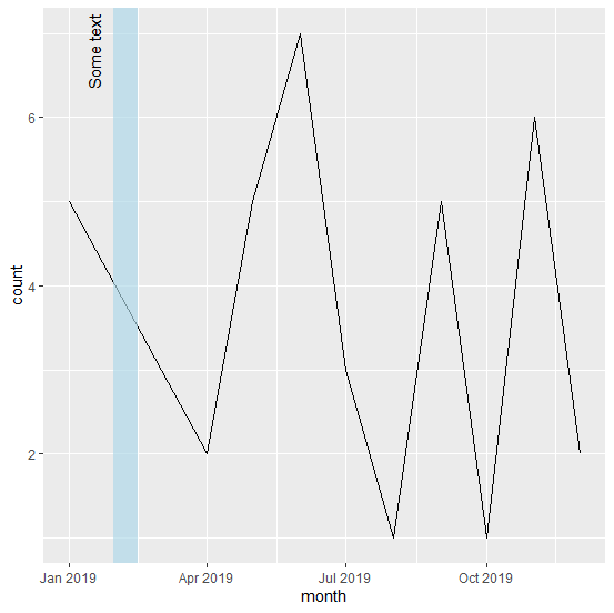
将 geom_rect 与 ymin = -Inf 和 ymax = Inf 一起使用。
xmin <- as.Date("2019-01-30")
xmax <- as.Date("2019-02-15")

ggplot(df_plot, aes(month, count)) +
  geom_line() +
  scale_x_date() +
  geom_rect(aes(xmin = xmin, xmax = xmax, ymin = -Inf, ymax = Inf,
    alpha = I(.1), fill  = I("lightblue"))) +
  annotate("text", label = "Some text", x = xmin, y = Inf, angle = 90,
    hjust = 1.1, vjust = -1)
(截图后继续)
另一种可能性是创建一个数据框 regimes 来保存边界和标签。这与之前的代码类似,但如果我们必须添加更多规则,则只需向 regimes 添加行即可。
regimes <- data.frame(xmin = as.Date("2019-01-30"),
                      xmax = as.Date("2019-02-15"),
                      label = "Some text")

ggplot(regimes) +
  geom_line(aes(month, count), df_plot) +
  scale_x_date() +
  geom_rect(aes(xmin = xmin, xmax = xmax, ymin = -Inf, ymax = Inf),
    alpha = I(.5), fill = I("lightblue")) +
  geom_text(aes(x = xmin, y = Inf, label = label), angle = 90,
    hjust = 1.1, vjust = -1)
关于r - 在时间序列图中标记一段时间,我们在Stack Overflow上找到一个类似的问题: https://stackoverflow.com/questions/59071127/