我有一个来自飞机飞行的数据集,我试图绘制飞机的位置(经度 x 纬度),然后根据这些坐标处的计划高度为该线着色。我的代码如下所示:
lat_data = np.array( [ 39.916294, 39.87139 , 39.8005  , 39.70801 , 39.64645 , 39.58172 ,
       39.537853, 39.55141 , 39.6787  , 39.796528, 39.91702 , 40.008347,
       40.09513 , 40.144157, 40.090584, 39.96447 , 39.838924, 39.712112,
       39.597103, 39.488377, 39.499096, 39.99354 , 40.112175, 39.77281 ,
       39.641186, 39.51512 , 39.538853, 39.882736, 39.90413 , 39.811333,
       39.73279 , 39.65676 , 39.584026, 39.5484  , 39.54484 , 39.629486,
       39.96    , 40.07143 , 40.187405, 40.304718, 40.423153, 40.549305,
       40.673313, 40.794548, 40.74402 , 40.755558, 40.770306, 40.73574 ,
       40.795086, 40.774628] )

long_data = np.array( [ -105.13034 , -105.144104, -105.01132 , -104.92708 , -104.78505 ,
       -104.6449  , -104.49255 , -104.36578 , -104.32623 , -104.31285 ,
       -104.32199 , -104.41774 , -104.527435, -104.673935, -104.81152 ,
       -104.82184 , -104.81882 , -104.81314 , -104.74657 , -104.78108 ,
       -104.93442 , -104.98039 , -105.0168  , -105.04967 , -105.056564,
       -105.03639 , -105.13429 , -105.05214 , -105.17435 , -105.070526,
       -104.93587 , -104.80029 , -104.65973 , -104.50339 , -104.33972 ,
       -104.21634 , -103.96216 , -103.84808 , -103.72534 , -103.60455 ,
       -103.48926 , -103.376495, -103.25937 , -103.10858 , -103.08469 ,
       -103.24878 , -103.4169  , -103.53073 , -103.23694 , -103.41254 ] )

altitude_data = np.array( [1.6957603e+00,  1.9788861e+00,  1.8547169e+00,  1.8768315e+00,
        1.9633590e+00,  2.0504241e+00,  2.1115899e+00,  2.1085002e+00,
        1.8621666e+00,  1.8893014e+00,  1.8268168e+00,  1.7574688e+00,
        1.7666028e+00,  1.7682364e+00,  1.8120643e+00,  1.7637002e+00,
        1.8054264e+00,  1.9149075e+00,  2.0173934e+00,  2.0875392e+00,
        2.1486480e+00,  1.8622510e+00,  1.7937366e+00,  1.8748144e+00,
        1.9063262e+00,  1.9397615e+00,  2.1261981e+00,  2.0180094e+00,
        1.9827688e+00, -9.9999990e+06,  1.8933343e+00,  1.9615903e+00,
        2.1000245e+00,  2.1989927e+00,  2.3200927e+00, -9.9999990e+06,
        4.0542388e+00,  4.0591464e+00,  4.0597038e+00,  4.3395977e+00,
        4.6702847e+00,  5.0433373e+00,  5.2824092e+00,  5.2813010e+00,
        5.2735353e+00,  5.2784677e+00,  5.2784038e+00,  5.2795196e+00,
        4.9482727e+00,  4.2531524e+00] )

import matplotlib as plt

fig, ax1 = plt.subplots( figsize = ( 10, 10 ) )
ax1.plot( long_data, lat_data, alpha = .4)
ax1.scatter( long_data, lat_data, c = altitude_data )
plt.show()
 .
.有没有办法将数据合并为一条绘制飞机位置并调整高程颜色的线?
虽然绘制一条线和一条散点图可以工作,但当我放入所有数据 (n = 2400 ) 时,它看起来不太好。谢谢!
最佳答案
更新
如前所述,现在这里的代码没有 for循环并包括第四个类别,例如加速度。现在代码使用 Line3DCollection使用 LinearSegmentedColormap 生成轨迹和定制的彩色 map 表示第四类(加速度):
import numpy as np
import matplotlib.pyplot as plt
from mpl_toolkits.mplot3d.art3d import Line3DCollection
from matplotlib.colors import LinearSegmentedColormap

fig = plt.figure(figsize=(12,12))
ax = fig.gca(projection='3d')

#rolling average between two acceleration data points
aver_accel = np.convolve(acceleration_data, np.ones((2,))/2, mode='valid')

#custom colour map to visualize acceleartion and decelaration
cmap_bgr = LinearSegmentedColormap.from_list("bluegreyred", ["red", "lightgrey", "lightgrey", "blue"])

#creating the trajectory as line segments
points = np.transpose([lat_data, long_data, altitude_data])
window = (2, 3)
view_shape = (len(points) - window[0] + 1,) + window
segments = np.lib.stride_tricks.as_strided(points, shape = view_shape, strides = (points.itemsize,) + points.strides)
trajectory = Line3DCollection(segments, cmap=cmap_bgr, linewidth=3)
#set the colour according to the acceleration data
trajectory.set_array(aver_accel)
#add line collection and plot color bar for acceleration
cb = ax.add_collection(trajectory)
cbar = plt.colorbar(cb, shrink=0.5)
cbar.set_label("acceleration", rotation=270)

#let's call it "autoscale"
ax.set_xlim(min(lat_data), max(lat_data))
ax.set_ylim(min(long_data), max(long_data))
ax.set_zlim(min(altitude_data), max(altitude_data))

ax.set_xlabel("latitude")
ax.set_ylabel("longitude")
ax.set_zlabel("altitude")

plt.show()
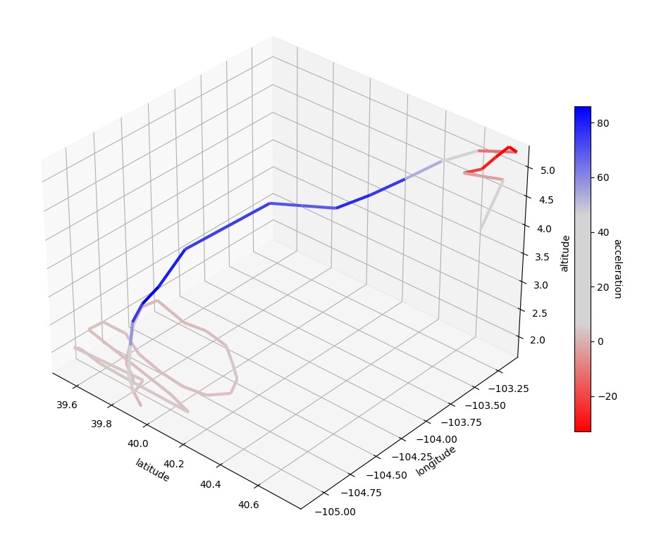
由于定制的颜色图,人们可以清楚地看到加速和减速阶段。由于我们直接使用数组,因此可以轻松添加用于校准的颜色条。请注意,您仍然拥有变量
linewidth这也需要一个数组(例如速度),尽管这可能很难阅读。在生成大规模 3D 线条集合方面也有大量时间增益 thanks to this marvellous answer.为了进行比较,这里是其他答案生成的 2D View :

原答案
既然你有 3D 数据,为什么不创建一个 3D 投影呢?如果您愿意,您可以随时将 View 移动到 2D 投影中。为避免颜色由每条线的第一个点定义的问题(即,陡峭的上升看起来与陡峭的下降不同),该程序确定每条线的中点以进行颜色编码的高度计算。缺点:使用速度慢
for循环,并且高度颜色在 0 和 1 之间标准化(这在这里无关紧要,因为高度在此 3D 投影中被过度确定,但如果您想对另一个参数进行颜色编码,这将成为一个问题)。import numpy as np
import matplotlib.pyplot as plt
from matplotlib import cm
fig = plt.figure(figsize=(10,10))
ax = fig.gca(projection='3d')
min_alt = np.min(altitude_data)
max_alt = np.max(altitude_data)
#generate normalized altitude array for colour code
#the factor 0.95 filters out the end of this colormap
cols_raw = 0.95 * (altitude_data-min_alt) / (max_alt-min_alt)
#rolling average between two data point colors
cols = np.convolve(cols_raw, np.ones((2,))/2, mode='valid')
for i, col in enumerate(cols):
ax.plot(lat_data[i:i+2], long_data[i:i+2], altitude_data[i:i+2], c=cm.gnuplot(col))
ax.set_xlabel("latitude")
ax.set_ylabel("longitude")
ax.set_zlabel("altitude")
plt.show()

上述输出的样本数据:
lat_data = np.array( [ 39.916294, 39.87139 , 39.8005  , 39.70801 , 39.64645 , 39.58172 ,
     39.537853, 39.55141 , 39.6787  , 39.796528, 39.91702 , 40.008347,
     40.09513 , 40.144157, 40.090584, 39.96447 , 39.838924, 39.712112,
     39.597103, 39.488377, 39.499096, 39.99354 , 40.112175, 39.77281 ,
     39.641186, 39.51512 , 39.538853, 39.882736, 39.90413 , 39.811333,
     39.73279 , 39.65676 , 39.584026, 39.5484  , 39.54484 , 39.629486,
     39.96    , 40.07143 , 40.187405, 40.304718, 40.423153, 40.549305,
     40.673313, 40.794548, 40.74402 , 40.755558, 40.770306, 40.73574 ,
     40.795086, 40.774628] )

long_data = np.array( [ -105.13034 , -105.144104, -105.01132 , -104.92708 , -104.78505 ,
       -104.6449  , -104.49255 , -104.36578 , -104.32623 , -104.31285 ,
       -104.32199 , -104.41774 , -104.527435, -104.673935, -104.81152 ,
       -104.82184 , -104.81882 , -104.81314 , -104.74657 , -104.78108 ,
       -104.93442 , -104.98039 , -105.0168  , -105.04967 , -105.056564,
       -105.03639 , -105.13429 , -105.05214 , -105.17435 , -105.070526,
       -104.93587 , -104.80029 , -104.65973 , -104.50339 , -104.33972 ,
       -104.21634 , -103.96216 , -103.84808 , -103.72534 , -103.60455 ,
       -103.48926 , -103.376495, -103.25937 , -103.10858 , -103.08469 ,
       -103.24878 , -103.4169  , -103.53073 , -103.23694 , -103.41254 ] )

altitude_data = np.array( [1.6957603e+00,  1.9788861e+00,  1.8547169e+00,  1.8768315e+00,
        1.9633590e+00,  2.0504241e+00,  2.1115899e+00,  2.1085002e+00,
        1.8621666e+00,  1.8893014e+00,  1.8268168e+00,  1.7574688e+00,
        1.7666028e+00,  1.7682364e+00,  1.8120643e+00,  1.7637002e+00,
        1.8054264e+00,  1.9149075e+00,  2.0173934e+00,  2.0875392e+00,
        2.1486480e+00,  1.8622510e+00,  1.7937366e+00,  1.8748144e+00,
        1.9063262e+00,  1.9397615e+00,  2.1261981e+00,  2.0180094e+00,
        1.9827688e+00,  1.9999990e+00,  1.8933343e+00,  1.9615903e+00,
        2.1000245e+00,  2.1989927e+00,  2.3200927e+00,  2.9999990e+00,
        4.0542388e+00,  4.0591464e+00,  4.0597038e+00,  4.3395977e+00,
        4.6702847e+00,  5.0433373e+00,  5.2824092e+00,  5.2813010e+00,
        5.2735353e+00,  5.2784677e+00,  5.2784038e+00,  5.2795196e+00,
        4.9482727e+00,  4.2531524e+00] )

acceleration_data = np.array(
    [1,   2,   2,   3,
     3,   3,   2,   2,
     2,   2,   4,   5,
     4,   3,   4,   3,
     3,   3,   3,   4,
     3,   3,   4,   5,
     4,   4,   4,   5,
     4,   15,  26,  49,
     67,  83,  89,  72,
     77,  63,  75,  82,
     69,  37,  5,  -29,
     -37, -27, -29, -14,
     9,   4] )
关于python - 绘制两个变量,然后用第三个变量着色,我们在Stack Overflow上找到一个类似的问题: https://stackoverflow.com/questions/64599117/