我试图表示两个变量 x和 y在使用颜色的 map 上。
到目前为止,我能做到的最好的方法是为一个变量使用颜色,为另一个变量使用透明度。plt.Polygon(shape.points, fill=False, color=cmap(y), alpha=x)
是否可以在 matplotlib 中创建一个带有两个变量的 2D 颜色图?
最佳答案
通常,matplotlib 中的颜色图是一维的,即将标量映射到颜色。
为了获得 2D 颜色图,需要以某种方式发明两个标量到一种颜色的映射。虽然这在原则上是可行的,但它不如通常的颜色图方便。
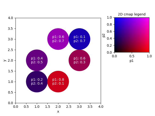
下面是一个示例,我们将两个参数分别映射到红色和蓝色 RGB 颜色 channel ,从而创建一个 2D 颜色图。
import matplotlib.pyplot as plt
import numpy as np

fig, ax = plt.subplots()
ax.set_aspect("equal")

x = [1,1,2,2,3,3] # xdata
y = [1,2,3,1,2,3] # ydata
p1 = [0.2,0.4,.6,.8,.6,.1] # parameter 1
p2 = [0.4,0.5,.7,.1,.3,.7] # parameter 2

# create a very simple colormap,
#  mapping parameter 1 to the red channel and
#          parameter 2 to the blue channel
cmap = lambda p1,p2 : (p1, 0, p2)

# put shapes at positions (x[i], y[i]) and colorize them with our
# cmap according to their respective parameters
for i in range(len(x)):
    circle = plt.Circle((x[i], y[i]), 0.5, color=cmap(p1[i],p2[i]))
    ax.add_artist(circle)
    tx="p1: {}\np2: {}".format(p1[i],p2[i]) # create a label
    ax.text(x[i], y[i], tx, ha="center", color="w", va="center")

ax.set_xlim(0,4)
ax.set_ylim(0,4)
ax.set_xlabel("x")
ax.set_ylabel("y")

# create the legend:

plt.subplots_adjust(left=0.1, right=0.65, top=0.85)
cax = fig.add_axes([0.7,0.55,0.3,0.3])
cp1 = np.linspace(0,1)
cp2 = np.linspace(0,1)
Cp1, Cp2 = np.meshgrid(cp1,cp2)
C0 = np.zeros_like(Cp1)
# make RGB image, p1 to red channel, p2 to blue channel
Legend = np.dstack((Cp1, C0, Cp2))
# parameters range between 0 and 1
cax.imshow(Legend, origin="lower", extent=[0,1,0,1])
cax.set_xlabel("p1")
cax.set_ylabel("p2")
cax.set_title("2D cmap legend", fontsize=10)

plt.show()
该方案当然可以扩展到其他(更复杂的)颜色映射以及 imshow 或 pcolormesh 图。还有,使用HSV colorscheme与 RGB 相比可能是有益的,所以
matplotlib.colors.hsv_to_rgb(hsv) 可能会有所帮助。
关于带有两个参数的 Matplotlib 颜色图,我们在Stack Overflow上找到一个类似的问题: https://stackoverflow.com/questions/41966600/