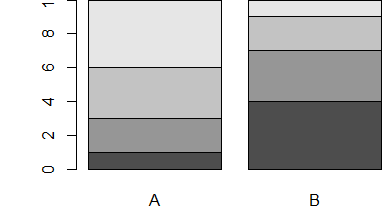
使条形图成为“标准”方式
dat <- read.table(text = "A   B
+ 1 1 4
+ 2 2 3
+ 3 3 2
+ 4 4 1", header = TRUE)
barplot(as.matrix(dat))
给出这样的条形图:
相反,我想让不同的部分重叠,就像这样
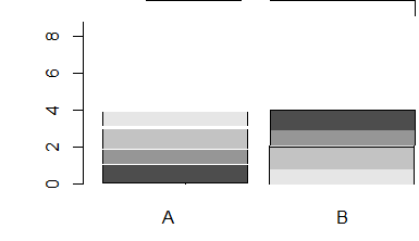
我怎样才能在 R 中制作这样的情节?
最佳答案
我用过的方法有两种:
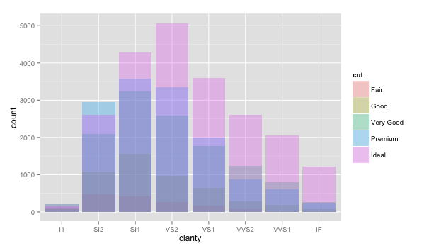
(counts <- with(diamonds, table(cut, clarity)))
#            clarity
# cut           I1  SI2  SI1  VS2  VS1 VVS2 VVS1   IF
# Fair         210  466  408  261  170   69   17    9
# Good          96 1081 1560  978  648  286  186   71
# Very Good     84 2100 3240 2591 1775 1235  789  268
# Premium      205 2949 3575 3357 1989  870  616  230
# Ideal        146 2598 4282 5071 3589 2606 2047 1212
在 ggplot 中非常容易
library(ggplot2)
ggplot(diamonds, aes(clarity, fill = cut)) +
  geom_bar(position = 'identity', alpha = .3)
在基础 R
par(xpd = TRUE, mar = c(4,4,2,2))
invisible(sapply(1:nrow(counts), function(x)
  barplot(counts[x, ], axes = FALSE, axisnames = FALSE,
          main = 'identity', border = NA,
          col = tcol(ggcols(5)[x], 50),
          axis.lty = 1, ylim = c(0, 5000),
          add  = ifelse(x == 1, FALSE, TRUE))))
axis(1, at = barplot(counts, plot = FALSE), labels = colnames(counts))
axis(2, at = seq(0, 5000, 1000), labels = seq(0, 5000, 1000))
legend('topright', bty = 'n', title = 'cut',
       legend = rownames(counts), fill = tcol(ggcols(5), 100))
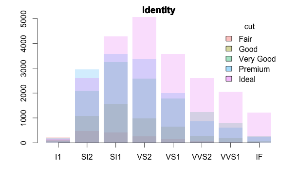
我使用了个人包中的这种透明颜色功能:
#' Transparent colors
#'
#' Add transparency to colors
#'
#' @usage tcol(color, trans = 255)
#'
#' @param color single or string of color names (or hexadecimal format)
#' @param trans transparency defined as an integer in the range
#' \code{[0, 255]} where \code{0} is fully transparent and \code{255} is fully
#' visible; see details
#'
#' @details This is a vectorized function to add transparency to colors.
#' \code{color} and \code{trans} must either be the same length or one of the
#' two must have length one.
#'
#' The function adds integers (in hex) between 0 (fully transparent) and 255
#' (fully visible) to the color(s) given. \code{color} values are converted to
#' RGB with transparency.
#'
#' @seealso \code{\link{num2hex}}, \code{\link{col2rgb}}
#'
#' @examples
#' cols <- c('red','green','pink')
#'
#' # a normal plot
#' plot(rnorm(100), col = tcol(cols), pch = 16, cex = 4)
#'
#' # more transparent
#' plot(rnorm(100), col = tcol(cols, 100), pch = 16, cex = 4)
#'
#' # hexadecimal colors also work
#' cols <- c('#FF0000','#00FF00','#FFC0CB')
#' plot(rnorm(100), col = tcol(cols, 200), pch= 16, cex = 4)
#' @export

tcol <- function(color, trans = 255) {

  if (length(color) != length(trans) &
        !any(c(length(color), length(trans)) == 1))
    stop('Vector lengths not correct')
  if (length(color) == 1 & length(trans) > 1)
    color <- rep(color, length(trans))
  if (length(trans) == 1 & length(color) > 1)
    trans <- rep(trans, length(color))

  res <- paste0('#', apply(apply(rbind(col2rgb(color)), 2, function(x)
    format(as.hexmode(x), 2)), 2, paste, collapse = ''))
  res <- unlist(unname(Map(paste0, res, as.character(as.hexmode(trans)))))
  res[is.na(color)] <- NA
  return(res)
}
并匹配 ggplot 颜色:
ggcols <- function (n, l = 65, c = 100) {
    hues <- seq(15, 375, length = n + 1)
    hcl(h = hues, l = l, c = c)[1:n]
}
关于r - 如何制作重叠的条形图?,我们在Stack Overflow上找到一个类似的问题: https://stackoverflow.com/questions/23228082/