我想使用ggplot2和ggalluvial来计算冲积图中各组之间的距离
我的例子来自https://corybrunson.github.io/ggalluvial/articles/ggalluvial.html
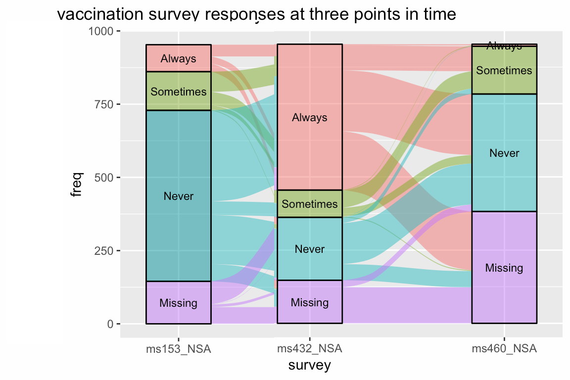
data(vaccinations)
levels(vaccinations$response) <- rev(levels(vaccinations$response))
ggplot(vaccinations,
       aes(x = survey, stratum = response, alluvium = subject,
           y = freq,
           fill = response, label = response)) +
  scale_x_discrete(expand = c(.1, .1)) +
  geom_flow() +
  geom_stratum(alpha = .5) +
  geom_text(stat = "stratum", size = 3) +
  theme(legend.position = "none") +
  ggtitle("vaccination survey responses at three points in time")
给我:

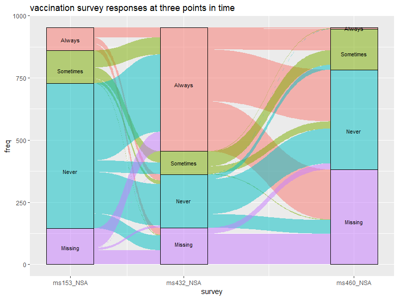
现在我想缩短 ms153_NSA 之间的距离,同时保持 ms432_NSA 和 ms460_NSA 之间的距离相同:
我尝试使用以下(没有成功):
https://rdrr.io/cran/ggalluvial/man/stat_flow.html
How to increase the space between the bars in a bar plot in ggplot2?
甚至谷歌does not给我看一个不对称的冲积图::'-/
最佳答案
这是一种破解方法
数据操作:
# get layer data calculated by ggalluvial, & shift 2nd position x leftwards by desired amount

library(dplyr)

p <- ggplot(vaccinations,
            aes(x = survey, stratum = response, alluvium = subject,
                y = freq,
                fill = response, label = response)) +
  scale_x_discrete(expand = c(.1, .1)) +
  geom_flow() +
  theme(legend.position = "none") +
  ggtitle("vaccination survey responses at three points in time")

shift.amt = 0.2

new.df <- layer_data(p) %>%
  mutate(xmin = ifelse(x == 2, xmin - shift.amt, xmin),
         xmax = ifelse(x == 2, xmax - shift.amt, xmax),
         x = ifelse(x == 2, x - shift.amt, x))
剧情:
library(ggforce) # needed for geom_diagonal_wide

ggplot(new.df, aes(fill = fill)) +

  # recreate each geom layer using the modified data
  geom_diagonal_wide(data = . %>%
                       select(alluvium, fill, side, xmin, xmax, ymin, ymax) %>%
                       group_by(alluvium,) %>%
                       summarise(fill = fill[side == "start"],
                                 x = list(c(xmax[side == "start"], xmin[side == "end"],
                                            xmin[side == "end"], xmax[side == "start"])),
                                 y = list(c(ymax[side == "start"], ymax[side == "end"],
                                            ymin[side == "end"], ymin[side == "start"]))) %>%
                       tidyr::unnest(),
                     aes(x = x, y = y, group = alluvium),
                     alpha = 0.5) +
  geom_rect(data = . %>% group_by(x, stratum, fill) %>%
              summarise(xmin = min(xmin), xmax = max(xmax),
                        ymin = min(ymin), ymax = max(ymax)),
            aes(xmin = xmin, xmax = xmax, ymin = ymin, ymax = ymax),
            alpha = 0.5, colour = "black") +
  geom_text(data = . %>% group_by(x, stratum, label) %>%
              summarise(y = mean(range(y))),
            aes(x = x, y = y, label = label),
            inherit.aes = FALSE, size = 3) +

  # recreate original x-axis breaks/labels, fill values, & axis titles
  scale_x_continuous(breaks = sort(unique(new.df$x)),
                     labels = layer_scales(p)$x$get_labels()) +
  scale_fill_identity() + # by default, this won't create a legend
  labs(title = "vaccination survey responses at three points in time",
       x = p$labels$x, y = p$labels$y)
关于r - 冲积图中组之间的不对称距离,我们在Stack Overflow上找到一个类似的问题: https://stackoverflow.com/questions/55977199/