我正在尝试制作这架飞机的动画,以便飞机在全局范围内飞行:
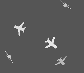
我已使用 <circle> 将地球添加到代码中元素,但我不确定如何掩盖飞机的背面,使它们看起来像是在“环绕”地球飞行。
我试过使用 position:relative连同 z-indexes为了实现地球仪的位置比飞机后部“更近”,但我没能做到这一点。
感谢任何帮助,谢谢。
代码
<svg width="300px" height="300px">
  <defs>
    <path id="svg-half-plane"
          d=" M 0,-5
             A 1,1 0 0 1 1,-4
             L 1,-1 5,1 5,2 1,1 1,3 2,4 2,5 0,4
             Z"
          ></path>

    <symbol viewBox="0 0 10 10" id="svg-plane" overflow="visible">
      <use xlink:href="#svg-half-plane"></use>
      <use xlink:href="#svg-half-plane" transform="scale(-1, 1)"></use>
    </symbol>
  </defs>
  <g class="sky" transform="translate(150, 150)">

    <circle class="globe" cx="0" cy="0" r="100" />

    <g class="plane-container" transform="rotate(289)">
      <use class="plane" xlink:href="#svg-plane" width="50" height="50"></use>
    </g>

    <g class="plane-container" transform="rotate(129)">
      <use class="plane delay-1" xlink:href="#svg-plane" width="50" height="50"></use>
    </g>

    <g class="plane-container" transform="rotate(37.5)">
      <use class="plane delay-2" xlink:href="#svg-plane" width="50" height="50"></use>
    </g>

    <g class="plane-container" transform="rotate(57.5)">
      <use class="plane delay-3" xlink:href="#svg-plane" width="50" height="50"></use>
    </g>

    <g class="plane-container" transform="rotate(-37.5)">
      <use class="plane delay-4" xlink:href="#svg-plane" width="50" height="50"></use>
    </g>


  </g>
</svg>
CSS
body, html {
  padding: 0;
  margin: 0;
  border: 0;
  height: 100%;
  background: #222;
  display: flex;
  justify-content: center;
  align-items: center;
}

svg {
  display          : block;
  background-color : #555;
  shape-rendering  : crispEdges;
}

.plane-container {
  -webkit-perspective : 900px;
  -ms-perspective     : 900px;
  perspective         : 900px;
  z-index:            : 3;
}

@-webkit-keyframes flyaround {
  0% {
    -webkit-transform : rotateX(0deg) translateZ(140px) scale3d(1, 1, 1);
    transform         : rotateX(0deg) translateZ(140px) scale3d(1, 1, 1);
    fill              : #eee;
    opacity           : 1.0;
  }

  50% {
    -webkit-transform : rotateX(180deg) translateZ(140px) scale3d(0.5, 0.5, 0.5);
    transform         : rotateX(180deg) translateZ(140px) scale3d(1, 1, 1);
    fill              : #eee;
    opacity           : 0.5;
  }

  100% {
    -webkit-transform : rotateX(360deg) translateZ(140px) scale3d(1, 1, 1);
    transform         : rotateX(360deg) translateZ(140px) scale3d(1, 1, 1);
    fill              : #eee;
    opacity           : 1.0;
  }
}

@keyframes flyaround {
  0% {
    -webkit-transform : rotateX(0deg) translateZ(140px) scale3d(1, 1, 1);
    -ms-transform     : rotateX(0deg) translateZ(140px) scale3d(1, 1, 1);
    transform         : rotateX(0deg) translateZ(140px) scale3d(1, 1, 1);
    fill              : #eee;
    opacity           : 1.0;
  }

  50% {
    -webkit-transform : rotateX(180deg) translateZ(140px) scale3d(0.5, 0.5, 0.5);
    -ms-transform     : rotateX(180deg) translateZ(140px) scale3d(0.5, 0.5, 0.5);
    transform         : rotateX(180deg) translateZ(140px) scale3d(1, 1, 1);
    fill              : #eee;
    opacity           : 0.5;
  }

  100% {
    -webkit-transform : rotateX(360deg) translateZ(140px) scale3d(1, 1, 1);
    -ms-transform     : rotateX(360deg) translateZ(140px) scale3d(1, 1, 1);
    transform         : rotateX(360deg) translateZ(140px) scale3d(1, 1, 1);
    fill              : #eee;
    opacity           : 1.0;
  }
}

.plane {
  fill              : none;
  -webkit-animation : flyaround 2500ms infinite linear;
  animation         : flyaround 2500ms infinite linear;
}

.delay-1 { -webkit-animation-delay: 123ms; animation-delay: 123ms; }
.delay-2 { -webkit-animation-delay: 2023ms; animation-delay: 2023ms; }
.delay-3 { -webkit-animation-delay: 773ms; animation-delay: 773ms; }
.delay-4 { -webkit-animation-delay: 1123ms; animation-delay: 1123ms; }
最佳答案
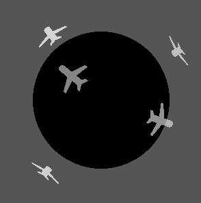
我认为如果没有一些额外的元素或 javascript,这会很困难。
您可以通过添加第二个镜像元素来做到这一点,该元素早先在 DOM 中创建,即圆圈,因此它出现在它的后面。同时,在试图给出它在后面的外观时,使前面的平面消失。
所以要让前平面消失...
<pre><code>
@keyframes blink {
  0% { opacity: 1.0; }
  50% { opacity: 0.0; }
  100% { opacity: 1.0; }
}
@-webkit-keyframes blink {
  0% { opacity: 1.0; }
  50% { opacity: 0.0; }
  100% { opacity: 1.0; }
}
.blink {
  animation: blink 2500ms step-start 0s infinite;
  -webkit-animation: blink 2500ms step-start 0s infinite;
  -webkit-animation-delay: 400ms;
  animation-delay: 400ms;
}

...

    <g class="plane-container" transform="rotate(0)">
      <use class="plane" xlink:href="#svg-plane" width="50" height="50"></use>
    </g>

    <circle class="globe" cx="0" cy="0" r="100" />

    <g class="plane-container blink" transform="rotate(0)">
      <use class="plane" xlink:href="#svg-plane" width="50" height="50"></use>
    </g>
只需检查您需要的浏览器支持,尤其是在 IE 中是否支持 svg+css3 转换
关于css - SVG 动画飞机环绕地球,我们在Stack Overflow上找到一个类似的问题: https://stackoverflow.com/questions/31459555/