我正在构建一个响应式网站,但我在主页上遇到了困境。我有两个盒子:一个幻灯片和一个装满事件的盒子。这些框需要始终具有相同的高度,幻灯片始终是事件框的最大高度。如果事件框包含的内容比幻灯片多,它只会添加一个滚动条。
我实际上使用了一些 jQuery 来完成这个工作,但我真的更喜欢只使用 CSS 来完成它。如果它在 IE8 及更低版本上不能正常工作,那也没关系。
这是我想要删除的脚本:
<script type="text/javascript">
    // fixes slideshow and events responsiveness
    function slideshowEventsResponiveness() {
        var figureHeight = $("main > figure").outerHeight();
        var pageMargin = parseInt($(".page").css("marginTop")) + parseInt($(".page").css("marginBottom"));
        $(".page").outerHeight(figureHeight - pageMargin);
        var pageHeaderHeight = $(".page").children("header").outerHeight();
        var pageFooterHeight = $(".page").children("footer").outerHeight();
        $(".scroll").outerHeight(figureHeight - pageHeaderHeight - pageFooterHeight - pageMargin);
    }
    $(document).ready(function() {
        slideshowEventsResponiveness();
    });
    $(window).resize(function() {
        slideshowEventsResponiveness();
    });
</script>
这是主页的标记:
<main>
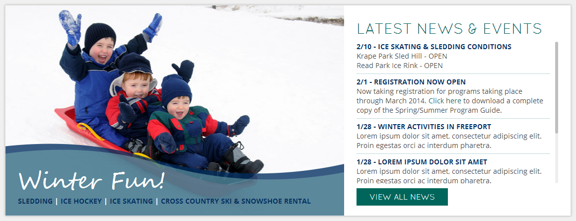
<figure>
<section class="bjqs">
<figure>
<img src="images/static/sledders.jpg" />
<figcaption>
<h6>Winter Fun!</h6>
<p><a href="#">Sledding</a> | <a href="#">Ice Hockey</a> | <a href="#">Ice Skating</a> | <a href="#">Cross Country Ski & SnowShoe Rental</a></p>
</figcaption>
</figure>
<figure>
<img src="images/static/sledders_inverted.jpg" />
<figcaption>
<h6>Winter Fun!</h6>
<p><a href="#">Sledding</a> | <a href="#">Ice Hockey</a> | <a href="#">Ice Skating</a> | <a href="#">Cross Country Ski & SnowShoe Rental</a></p>
</figcaption>
</figure>
</section><!--/.bjqs-->
</figure>
<section class="page">
<header>
<h1>Latest News & Events</h1>
</header>
<section class="scroll">
<article>
<header>
<h1><a href="#"><time>2/10</time> - Ice Skating & Sledding Conditions</a></h1>
</header>
<p>
Krape Park Sled Hill - OPEN<br />
Read Park Ice Rink - OPEN
</p>
</article>
<article>
<header>
<h1><a href="#"><time>2/1</time> - Registration Now Open</a></h1>
</header>
<p>Now taking registration for programs taking place through March 2014. <a href="#">Click here</a> to download a complete copy of the Spring/Summer Program Guide.</p>
</article>
<article>
<header>
<h1><a href="#"><time>1/28</time> - Winter Activities in Freeport</a></h1>
</header>
<p>Lorem ipsum dolor sit amet, consectetur adipiscing elit. Proin egestas orci ac interdum pharetra.</p>
</article>
<article>
<header>
<h1><a href="#"><time>1/28</time> - Lorem ipsum dolor sit amet</a></h1>
</header>
<p>Lorem ipsum dolor sit amet, consectetur adipiscing elit. Proin egestas orci ac interdum pharetra.</p>
</article>
<article>
<header>
<h1><a href="#"><time>1/28</time> - Lorem ipsum dolor sit amet</a></h1>
</header>
<p>Lorem ipsum dolor sit amet, consectetur adipiscing elit. Proin egestas orci ac interdum pharetra.</p>
</article>
<article>
<header>
<h1><a href="#"><time>1/28</time> - Lorem ipsum dolor sit amet</a></h1>
</header>
<p>Lorem ipsum dolor sit amet, consectetur adipiscing elit. Proin egestas orci ac interdum pharetra.</p>
</article>
</section><!--/.scroll-->
<footer>
<a class="button" href="#">View All News</a>
</footer>
</section><!--/.page-->
</main>
如果我当前的 CSS 有帮助,我可以提供,请告诉我。
我的目标截图:
更新:这是一个非常愚蠢的 JS Fiddle:http://jsfiddle.net/hCHrE/
这不是完全相同的标记,但其工作原理应该相同。
最佳答案
你能做到
- 使用
display:table-row和display:table-cell构建两个“单元格”,一个是您的幻灯片,另一个是您的幻灯片的容器文本必须具有相同的高度 - 将可变文本部分包装在容器中并使用绝对位置使其适合单元格
CSS:
#box {
    display:table-row;
}
#a, #box figure {
     display: table-cell;
}
#a { /* #a wraps your section */
    position: relative;
}
#box figure {
    margin: 0;
    width: 30%;
}
#box figure img {
    display: block;
    width: 100%;
}
#box section {
    position: absolute;
    top:0;right:0;left:0;bottom:0;
    overflow-y:scroll;
}
关于jquery - 使用 CSS 使一个部分匹配另一个部分的高度,我们在Stack Overflow上找到一个类似的问题: https://stackoverflow.com/questions/22563083/