我在一个容器中有 3 个 div。没有嵌套的 div。
我正在使用 flex 和 order 属性。
在移动设备上,order 属性是可以的。
但在大屏幕上它会失败。
我没有为 div 2 和 3 使用容器 div,以便在移动设备上将它们排序为 2、1、3。

HTML 文件
<div class="container">
<div class="orange">1</div>
<div class="blue">2</div>
<div class="green">3</div>
</div>
CSS 文件
/*************** MOBILE *************/
.container
{
    display: flex;
    flex-wrap: wrap;

}
div.blue
{
    order:1;
    width: 100%;
}
div.orange
{
    order:2;
    width: 100%;
}
div.green
{
    order:3;
    width: 100%;

}
/***************************/
@media screen and (min-width:1200px)
{
.container
{
    justify-content: space-between;
}
div.blue
{
    order:2;
    width: 36%;
}
div.orange
{
    order:1;
    width: 60%;
}
div.green
{
    order:3;
    width: 36%;
}
}
最佳答案
在您的布局中,为桌面 View 使用 row wrap 将很难(如果不是不可能的话)用 CSS 实现。至少,事情会变得过于复杂。为什么?
因为flexbox不是网格系统。它是一种布局系统,旨在通过容器中的空间分布来对齐内容。
在 flexbox 中,row wrap 容器中的元素必须换行到新行。这意味着 div3 不能环绕在 div2 之下。它必须包裹在 div1 之下。
以下是使用row wrap 将元素包装在 flex 容器中的方式:
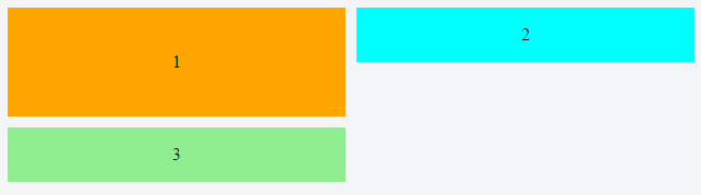
如果 div3 被包裹在 div2 之下,那将不是一个行,而是一个网格,并且 flex 元素被限制在一个笔直的、不 flex 的行中.
换句话说,你不能让 flex 元素包裹在同一行的另一个元素之下。
因此,由不是行中最高的元素创建的空白保留在每一列中,从而形成难看的间隙。
为了让您希望的布局在换行中工作,flex 元素必须退出它们的行以缩小间隙——也许使用绝对定位——这是 flexbox 做不到的。
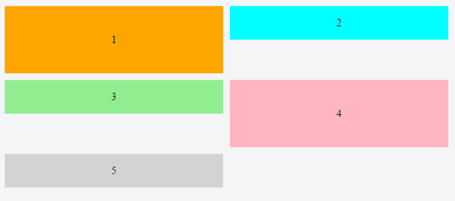
对齐元素的一种方法是将 div2 和 div3 包装在它们自己的容器中。这个新容器将是 div1 的兄弟。然后它可以成为一个带有 flex-direction: column 的嵌套 flex 容器。现在间隙消失了,布局看起来正确。
除非,在这种特殊情况下,您需要 order 属性才能工作(意味着所有项必须具有相同的父项),因此嵌套的 flex 容器是不可能的。
可能有用的是 column wrap 而不是 row wrap:
/*************** MOBILE *************/

.container {
  display: flex;
  flex-direction: column;
  height: 200px; /* necessary so items know where to wrap */
}
div.orange {
  background-color: orange;
}
div.blue {
  order: -1;
  background-color: aqua;
}
div.green {
  background-color: lightgreen;
}
.container > div {
  width: 100%;
  flex: 1;
  display: flex;
  align-items: center;
  justify-content: center;
}
/***************************/

@media screen and (min-width: 800px) {
  .container {
    flex-wrap: wrap;
  }
  div.orange {
    flex-basis: 100%;
    width: 50%;
  }
  div.blue {
    flex-basis: 50%;
    width: 50%;
    order: 0;
  }
  div.green {
    flex-basis: 50%;
    width: 50%;
  }
}
<div class="container">
<div class="orange">1</div>
<div class="blue">2</div>
<div class="green">3</div>
</div>jsFiddle
这里有另外两个选项:
-
Masonry is a JavaScript grid layout library. It works by placing elements in optimal position based on available vertical space, sort of like a mason fitting stones in a wall.
source: http://masonry.desandro.com/
CSS Grid Layout Module Level 1
This CSS module defines a two-dimensional grid-based layout system, optimized for user interface design. In the grid layout model, the children of a grid container can be positioned into arbitrary slots in a predefined flexible or fixed-size layout grid.
相关帖子:Is it possible for flex items to align tightly to the items above them?
关于html - 使用 flex order 属性为桌面和移动 View 重新排列元素,我们在Stack Overflow上找到一个类似的问题: https://stackoverflow.com/questions/39868826/