我想要这个结构,一个有flex:display的容器,一个 float 在右侧的图像,然后是h1和h2,我想把这些垂直和水平中心放在div的剩余空间上。
这是我当前的结果。
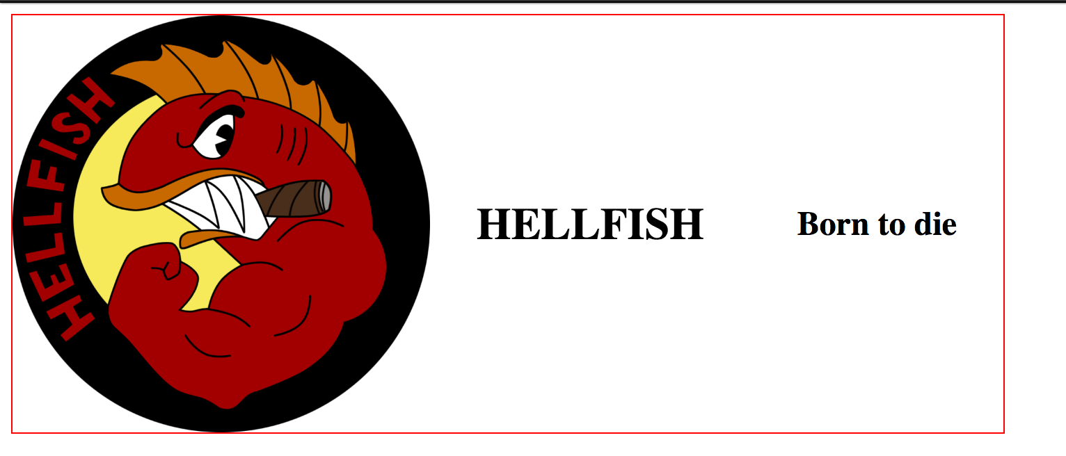
样机。
+-----------------------+
|                       |
|XXXX                   |
|XXXX     HELLFISH      |
|XXXX    born to die    |
|XXXX                   |
|                       |
+-----------------------+
这是 html 代码。
div.container
  img(src='http://vignette3.wikia.nocookie.net/simpsons/images/a/a1/Flying_Hellfish_Logo.png/revision/latest?cb=20150327234211')
  h1 HELLFISH
  h2 Born to die
SCSS。
.container{
  display: flex;
  width: 50%;
  border: 1px solid red;
  justify-content: space-between;
  img{
    max-width: 300px;
    max-height: 300px;
    float: left;
  }
  h1{
    align-self: center;
    margin: auto;
    position: relative;
  }
  h2{
    align-self: center;
    margin: auto;
    vertical-align:middle;
    position: relative;
  }
 }
代码笔。 http://codepen.io/TabaresSotelo/pen/pRyxPz
致以诚挚的问候
最佳答案
- 将
h1和h2包装在一个容器中(该容器成为图像的同级 Flex 元素)。 - 使用
order属性将图像向右移动。 - 您不需要使用
float属性或justify-content: space- Between。
.container {
  display: flex;
  width: 50%;
  border: 1px solid red;
}
.nested-container {
  flex: 1; /* to consume all remaining space */
  display: flex;
  flex-direction: column;
  justify-content: center;
  align-items: center;
}
.container img {
  max-width: 300px;
  max-height: 300px;
  order: 1;
}
h1, h2 {
  margin: 0;
}
<div class="container">
<img src="http://vignette3.wikia.nocookie.net/simpsons/images/a/a1/Flying_Hellfish_Logo.png/revision/latest?cb=20150327234211" />
<div class="nested-container">
<h1>HELLFISH</h1>
<h2>Born to die</h2>
</div>
</div>revised codepen (编译后的代码)
关于html - 如何在剩余空间中 float 图像并居中标题?,我们在Stack Overflow上找到一个类似的问题: https://stackoverflow.com/questions/41618339/