我必须绘制以下格式的数据:
x = 范围(6)
y = 范围(11)
和z取决于x, y
对于x的每个值,应该有一条连续曲线显示z w.r.t y的变化以及不同值的曲线x 必须断开连接
我正在使用 mplot3d 并且不太清楚如何绘制断开连接的曲线。
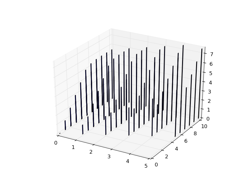
这是使用条形图的样子。
最佳答案
您可以使用 Axes3D.plot 叠加多个图:
import matplotlib.pyplot as plt
import mpl_toolkits.mplot3d.axes3d as axes3d
import numpy as np

x = np.arange(6)
y = np.linspace(0, 11, 50)
z = x[:, np.newaxis] + y**2

fig = plt.figure()
ax = fig.add_subplot(1, 1, 1, projection = '3d')
for xval, zrow in zip(x, z):
    ax.plot(xval*np.ones_like(y), y, zrow, color = 'black')
plt.show()

关于python - 使用来自 matplotlib 的 maplot3d 的 3D 图 -,我们在Stack Overflow上找到一个类似的问题: https://stackoverflow.com/questions/9053255/