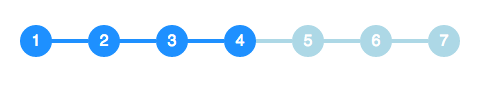
我必须在 CSS 中实现以下圆和线组合,我正在寻找有关如何有效实现它的指示。圆圈和线条应如下所示:

我可以这样实现圆圈:
span.step {
  background: #ccc;
  border-radius: 0.8em;
  -moz-border-radius: 0.8em;
  -webkit-border-radius: 0.8em;
  color: #1f79cd;
  display: inline-block;
  font-weight: bold;
  line-height: 1.6em;
  margin-right: 5px;
  text-align: center;
  width: 1.6em;
}
但这些台词对我来说很难理解。
圆圈的大小根据它是否处于事件状态而变化,连接圆圈的线的颜色也根据状态而变化。我将如何做到这一点?
最佳答案
您可以使用伪元素和相邻的兄弟选择器 (~) 在没有额外标记的情况下实现此效果:
li {
  width: 2em;
  height: 2em;
  text-align: center;
  line-height: 2em;
  border-radius: 1em;
  background: dodgerblue;
  margin: 0 1em;
  display: inline-block;
  color: white;
  position: relative;
}

li::before{
  content: '';
  position: absolute;
  top: .9em;
  left: -4em;
  width: 4em;
  height: .2em;
  background: dodgerblue;
  z-index: -1;
}


li:first-child::before {
  display: none;
}

.active {
  background: dodgerblue;
}

.active ~ li {
  background: lightblue;
}

.active ~ li::before {
  background: lightblue;
}
<ul>
<li>1</li>
<li>2</li>
<li>3</li>
<li class="active">4</li>
<li>5</li>
<li>6</li>
<li>7</li>
</ul> 关于css - 创建由线连接的 CSS3 圆,我们在Stack Overflow上找到一个类似的问题: https://stackoverflow.com/questions/19642308/