这是我的数据和绘图
nmar <- seq (1, 100, 5)
position= rep(nmar, 5)
n = length (nmar )
chr = rep(1:5, each = n )
mapdata <- data.frame (chr, position,
snpname = paste("SNP-", 1:length (position), sep = ""))
mapdata
chr.lab = 1 ; mbar.col = "blue"
layout(matrix(c(1,1,2),nc=1)) # works for two but I need to extend it to
n (which is level of chr = 5)
# plot level 1
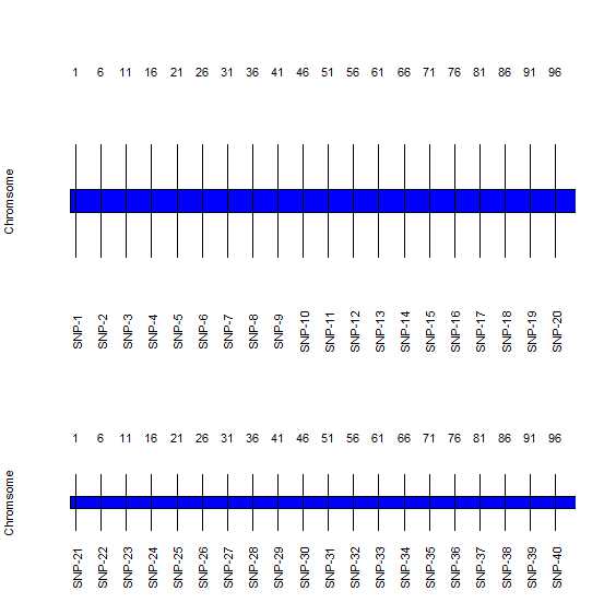
mapdata1 <- mapdata[mapdata$chr == 1,]
m <- par()$mar
m[1] <- m[3] <- 0
par(mar=m)
# Set the limits of the plot
plot(mapdata1$position,mapdata1$position-mapdata1$position, type="n",
axes=FALSE,
xlab="", ylab="Chromsome", yaxt="n" )
polygon(
c(0,max(mapdata1$position + 0.08 * max(mapdata1$position)),max(mapdata1$position)+
0.08 * max(mapdata1$position),0),
.2*c(-0.3,-0.3,0.3,0.3),
col= mbar.col
)
segments(mapdata1$position, -.3, mapdata1$position, .3 )
text(mapdata1$position, -.7, mapdata1$snpname, srt = 90, cex.lab = chr.lab)
text(mapdata1$position, .7, mapdata1$position,cex.lab = chr.lab )
text(0, labels = c("Chr 2"))
二级
# plot level 2
mapdata2 <- mapdata[mapdata$chr == 2,]
m <- par()$mar
m[1] <- m[3] <- 0
par(mar=m)
# Set the limits of the  plot
plot(mapdata2$position,mapdata2$position-mapdata1$position, type="n", axes=FALSE,
xlab="", ylab="Chromsome", yaxt="n" )

polygon(
  c(0,max(mapdata2$position + 0.08 * max(mapdata2$position)),max(mapdata2$position)+
 0.08 * max(mapdata2$position),0),
  .2*c(-0.3,-0.3,0.3,0.3),
  col= mbar.col
)
segments(mapdata2$position, -.3, mapdata2$position, .3 )
text(mapdata2$position, -.7, mapdata2$snpname, srt = 90, cex.lab = chr.lab)
text(mapdata2$position,  .7, mapdata2$position,cex.lab = chr.lab )
text(0, labels = c("Chr 2"))
输出
(1) 如何自动化 n 个级别的过程 - 将类似的绘图扩展到 chr 的 n 个级别 (2) 如果您看到相同规范的条形尺寸发生变化,可能是由于绘图面积不同所致。我该如何调整它以使所有图都相同?
最佳答案
ggplot 绝对是正确的选择。但如果你真的想坚持使用基本的 plot,那么这个函数就可以工作:
plot.as.stack= function(mapdata1, mbar.col = "blue"){
    # mapdata1 <- mapdata[mapdata$chr == chr,]
    m <- par()$mar
    m[1] <- m[3] <- 0
    par(mar=m)
    # Set the limits of the  plot
    plot(mapdata1$position,mapdata1$position-mapdata1$position, type="n",
       axes=FALSE,
    xlab="", ylab="Chromsome", yaxt="n" )

    polygon(
      c(0,max(mapdata1$position + 0.08 * max(mapdata1$position)),max(mapdata1$position)+
         0.08 * max(mapdata1$position),0),
      .2*c(-0.3,-0.3,0.3,0.3),
      col= mbar.col
    )
    segments(mapdata1$position, -.3, mapdata1$position, .3 )
    text(mapdata1$position, -.7, mapdata1$snpname, srt = 90, cex.lab = chr.lab)
    text(mapdata1$position,  .7, mapdata1$position,cex.lab = chr.lab )
    text(0, labels = paste("Chr",unique(mapdata1$chr)))
}

# Example Run.
par(mfrow=c(length(unique(mapdata$chr)),1))
x=by(mapdata,factor(mapdata$chr),plot.as.stack) # Assigned to x to prevent output
par(mfrow=c(1,1))
如您所见,我只是将您的代码放入一个函数中,然后对其运行 by 。请注意,这将在 chr 的所有级别上运行该函数。您可以对其进行修改,以便该函数采用 chr 的值:
plot.as.stack = function(chr){
    mapdata1 <- mapdata[mapdata$chr == chr,]
    ...
}
然后使用 chr 的值运行该函数:
par(mfrow=c(5,1))
sapply(1:5,plot.as.stack)
par(mfrow=c(1,1))
关于r - r 中基本图中按一个变量水平排列的多图排列,我们在Stack Overflow上找到一个类似的问题: https://stackoverflow.com/questions/10397235/