我有一些数据here
我将数据读入数据框中,然后使用以下代码绘制该数据,
# Reading data from a .csv file into a data frame
     df <- read.table("newcsv_file.csv",header=T,sep="\t" )
# Now melting the data frame prior to plotting
df_mlt <- melt(df, id=names(df)[1], measure=names(df)[c(2, 6, 11,16,21,26,31,36,41,46,51,106,111,116,121,126,131,136,141,146,151)], variable = "cols")

# plotting the data
plt_fit <- ggplot(df_mlt, aes(x=x,y= value, color=cols)) +
    geom_point(size=2) +
    geom_smooth(method = "lm", se = FALSE) +
    scale_y_log10(breaks = trans_breaks("log10", function(x) 10^x), labels = trans_format("log10", math_format(10^.x))) +
    annotation_logticks(sides = "rl") +
    theme_bw() +
    theme(legend.text=element_text(size=12), legend.title=element_text(size=12))+
    theme(axis.text=element_text(size=14)) +
    theme(axis.title=element_text(size=14,face="bold")) +
    labs(x = "x", y = "y") +
    scale_color_discrete(name = "values", labels = c("0","-0.1","-0.2","-0.3","-0.4","-0.5","-0.6","-0.7","-0.8","-0.9","-1","+0.1","+0.2","+0.3","+0.4","+0.5","+0.6","+0.7","+0.8","+0.9","+1")) +
    guides(colour = guide_legend(override.aes = list(size=3),nrow=2,title.position = 'top',title.hjust=0.5,legend.direction = "horizontal")) +
    theme(legend.position = 'bottom', legend.margin=unit(1,"cm"),legend.background = element_rect(fill ='gray94')) +
    theme(plot.margin=unit(c(0,2,0,0),"mm"))
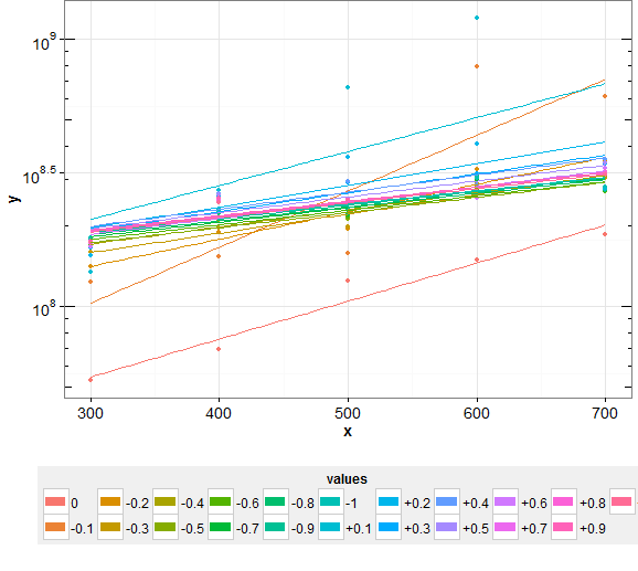
生成的图如下所示,这里的问题是图例的最右边缘被裁剪。
我使用 +theme(legend.margin=unit(1,"cm")) 但这似乎还不够。有人可以让我知道我可以更改什么才能在图中正确显示完整的图例吗?
谢谢。
最佳答案
代码没问题。问题是绘图窗口的大小。尝试将其加宽,您就会看到整个图例。
另外,
ggsave("plot_fit.pdf",plot_fit)
将创建一个 pdf 文件,其中显示完整的图例。
关于r - 自动调整使用 ggplot2 绘制的图例的大小,使整个图例位于图层的边界内,我们在Stack Overflow上找到一个类似的问题: https://stackoverflow.com/questions/21339138/