我有一个像这样的 df:
library(dplyr)
library(data.table)
library(ggplot2)
library(scales)

Events <- c("A_1","A_2","A_3","B_1","B_2","B_3","C_1","C_2","C_3","D_1","D_2","D_3","E_1","E_2","E_3")
Percentage_Occur <- c(4.6,6.5,1.3,3.4,6.6,5.5,7.8,2.2,2.4,2.1,6.6,5.9,4.9,11.1,4.3)
df1 <- data.frame(Events,Percentage_Occur)
我试图将这些子事件组合到单独的类别中以确定前 3 个事件,因此我这样做:
df2 <- data.frame(df1)
df2$Events <- gsub("*_.*", "\\1", df2$Events)
df2 <- df2 %>% group_by(Events) %>% summarise_each(funs(sum(., na.rm = T)))
df2 <- df2[ order(-df2[,2]), ]

ggplot(df2, aes(reorder(Events,Percentage_Occur), Percentage_Occur)) +
  geom_bar(stat = "identity") + coord_flip() +
  xlab("Events")

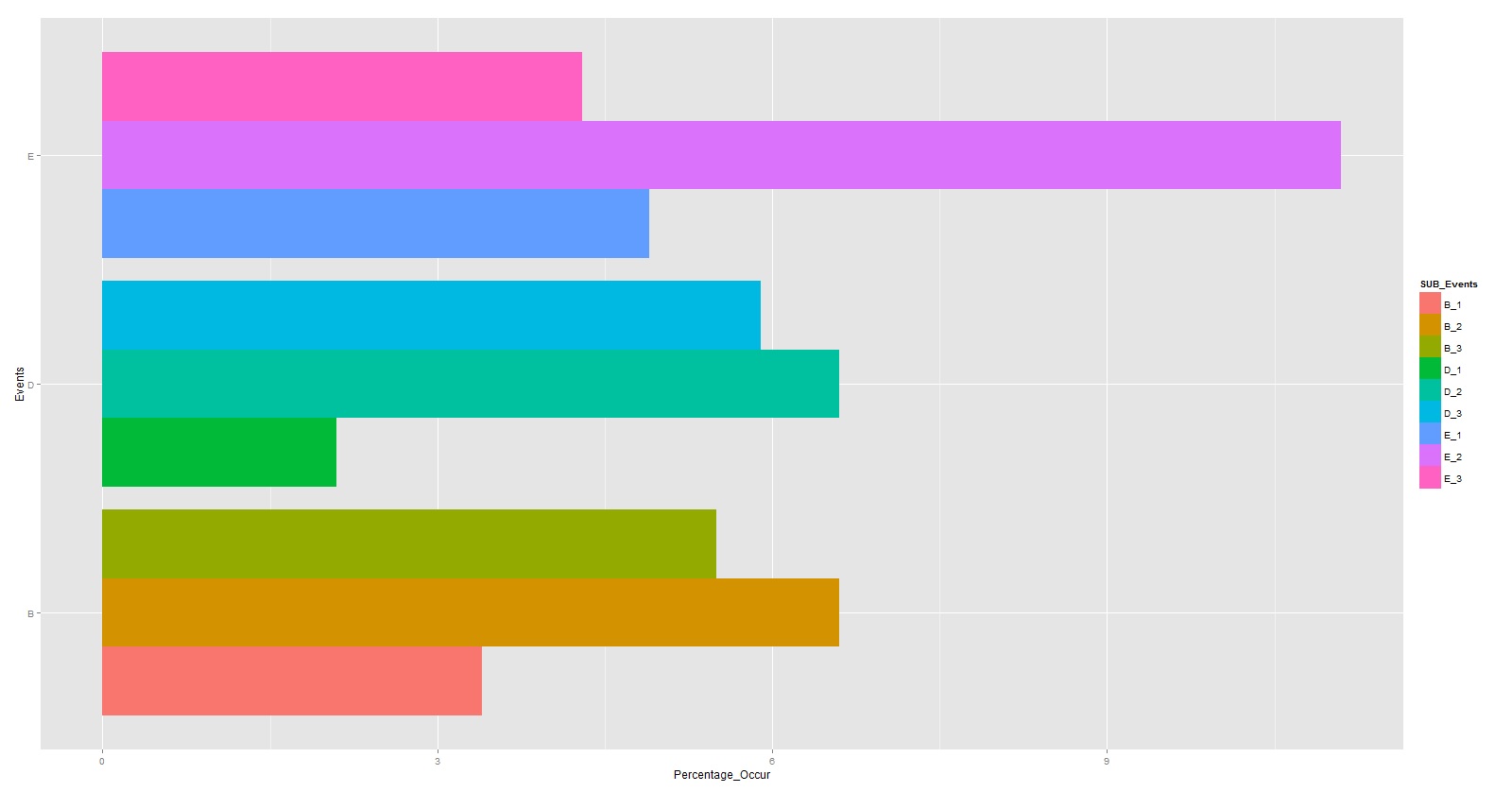
一旦我能够可视化前 3 个事件(在本例中它们是 E、B、D),我想在单独的图中绘制这些前 3 个事件的子事件,如下所示。
我通过提取顶级事件的子事件来手动完成此操作。由于这是一个示例数据集,我能够做到这一点。我想将逻辑应用于我拥有的更大的数据集。
我想要的只是确定最重要的事件(我能够做到),然后以某种方式以编程方式绘制这些最重要事件的相应子事件,而无需手动查看数据帧并提取它。原因之一是这些事件随着时间的推移而变化,并且希望每 2 小时运行一次此类逻辑以查看到达顶部的任何新事件。请提供您对此的意见并帮助我继续前进。
注意:我也想要更好的颜色。
最佳答案
为了自动提取前 3 个事件,您可以使用以下方式处理数据:
library(data.table)
library(splitstackshape)

dt <- cSplit(df1, "Events", sep="_", drop=FALSE)[, tot := sum(Percentage_Occur), Events_1
                                                 ][order(-tot,Events_1,-Percentage_Occur)
                                                   ][, top := rleid(tot)
                                                     ][top <= 3]
然后在 scale_fill_manual 和 reorder() 的帮助下,您将获得一个具有更好颜色的绘图,并且组内的条形图也已排序:
# create a vector for the labels of the events in the legend
# this is needed to get the legend in the right order
lbls <- dt$Events

# create the plot
ggplot(dt, aes(x=reorder(Events_1,-tot), y=Percentage_Occur, fill=reorder(Events,-Percentage_Occur), color="black")) +
  geom_bar(stat="identity", position = position_dodge(width=0.8), width=0.7) +
  geom_text(aes(y=1, label=Events), position = position_dodge(width=0.8), angle=90) +
  labs(title="Occurence by Event", x="Events", y="Percentage Occurance") +
  scale_color_manual(values = "black") +
  scale_fill_manual("Events", breaks = lbls,
                    values = c('#d53e4f','#3288bd','#fee08b','#ffffbf','#66c2a5','#f46d43','#fdae61','#abdda4','#e6f598')) +
  guides(color=FALSE) +
  theme_minimal()
这将导致:

您可以根据自己的喜好调整 scale_fill_manual 中的颜色值。
数据准备也可以使用 dplyr/tidyr 完成(尽管您仍然需要 data.table 用于 rleid函数):
library(dplyr)
library(tidyr)
library(data.table)

df1 <- df1 %>% separate(Events, c("Event","Subevent"), sep="_", remove=FALSE) %>%
  ungroup() %>%
  group_by(Event) %>%
  mutate(tot = sum(Percentage_Occur)) %>%
  ungroup() %>%
  arrange(-tot,-Percentage_Occur) %>%
  mutate(top = rleid(tot)) %>%      # for this part you need data.table
  filter(top <= 3)
关于r - 使用 ggplot 以编程方式绘制热门事件的子事件 : R,我们在Stack Overflow上找到一个类似的问题: https://stackoverflow.com/questions/33526365/