我正在使用 plot.ly 库在 shiny 应用程序中进行交互式图表,但是我在管理图表中的颜色时遇到了一些麻烦。
使用plotly 4.3.5(来自github)的可重现示例:
library(data.table)
library(plotly)

dt <- data.table(campaign_week = c(1,2,3,1,2,3), category = c(rep("income",3),rep("cost",3)),
                 amount = c(100,50,35,-500,-20,-15))
dt_net <- dt[, .(amount = sum(amount)), by = campaign_week][,.(campaign_week, amount = cumsum(amount))]

y <- list(title = "Income", tickformat = "$,.0f",hoverformat = "$,.2f")

plot_ly(dt_net, x = ~campaign_week, y = ~amount, type = "scatter",
        mode= "lines+markers",
        line = list(color = "#00AEFF"), name = "Net Income") %>%
  add_trace(data = dt, x = ~campaign_week, y = ~amount, color = ~category, type = "bar",
            colors = c("#00ff00", "#ff0000")) %>%
  layout(yaxis = y, barmode = "relative")
这将创建我想要的图表,但是颜色未正确应用于跟踪。我预计其中一个条形为红色,另一个为绿色,而线条为蓝色。
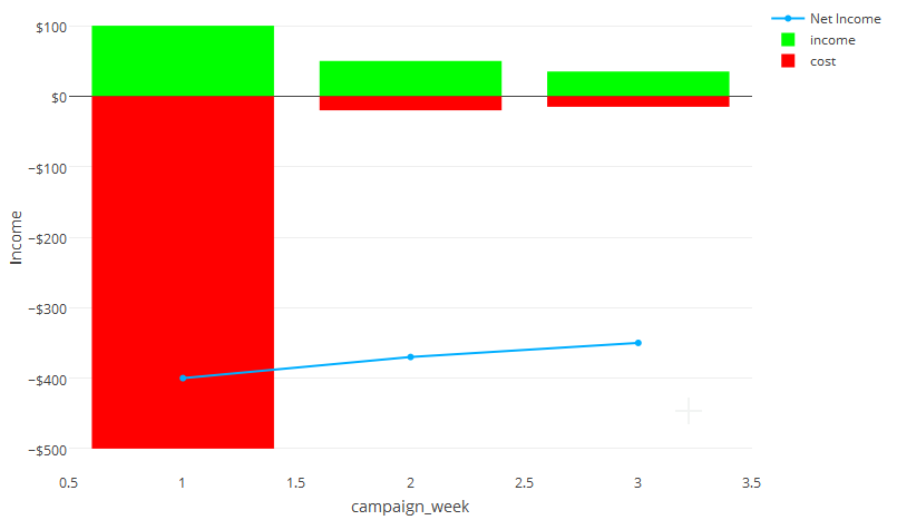
编辑添加创建的plotly图表的屏幕截图

最佳答案
基于https://plot.ly/r/bar-charts/#bar-chart-with-relative-barmode处的示例为每个类别单独的 add_trace 是可行的方法。
plot_ly(dt_net, x = ~campaign_week, y = ~amount, type = "scatter",
        mode= "lines+markers",
        line = list(color = "#00AEFF"), name = "Net Income") %>%
  add_trace(data =  dt[category=="income",] , x = ~campaign_week, y = ~amount,  type = "bar", name = "income",
            marker=list(color = "#00ff00")) %>%
  add_trace(data =  dt[category=="cost",] , x = ~campaign_week, y = ~amount,  type = "bar", name = "cost",
            marker=list(color = "#ff0000")) %>%
  layout(yaxis = y, barmode = "relative")
请注意,这会发出警告,因为条形图跟踪继承了散点图的 mode 和 line 属性,但条形图不支持这些属性。您可以忽略警告,也可以在分散之前调用条形图以避免它们......就像这样:
plot_ly() %>%
  add_trace(data =  dt[category=="income",] , x = ~campaign_week, y = ~amount,  type = "bar", name = "income",
            marker=list(color = "#00ff00")) %>%
  add_trace(data =  dt[category=="cost",] , x = ~campaign_week, y = ~amount,  type = "bar", name = "cost",
            marker=list(color = "#ff0000"))  %>%
  add_trace(data =  dt_net, x = ~campaign_week, y = ~amount, type = "scatter", mode= "lines+markers",
            line = list(color = "#00AEFF"), name = "Net Income") %>%
  layout(yaxis = y, barmode = "relative")
关于r - 在 R 中管理plot.ly 的颜色,我们在Stack Overflow上找到一个类似的问题: https://stackoverflow.com/questions/39584748/