我想画一个enterotype plot熟悉的图表在 research 。但我的新的 multiple-ggproto 看起来很糟糕,如 p1 所示,因为缺少标签的 backgroup 颜色。我尝试了多种变体,例如修改 GeomLabel$draw_panel 以重置 ggplot2::ggproto 中 geom 的默认参数。但是,我找不到在 ggplot2 和 grid 包中删除的 labelGrob() 函数。因此,修改的解决方案不起作用。如何修改multiple-ggproto中标签的backgroup颜色。有任何想法吗?提前致谢。这是我的代码和两张图片。
p1:标签的背景颜色应为白色或文本颜色应为黑色。

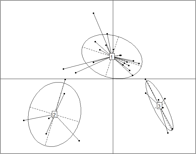
P2:显示错误的点颜色、线条颜色和图例。 
geom_enterotype <- function(mapping = NULL, data = NULL, stat = "identity",  position = "identity",
                            alpha = 0.3, prop = 0.5, ..., lineend = "butt", linejoin = "round",
                            linemitre = 1, arrow = NULL, na.rm = FALSE, parse = FALSE,
                            nudge_x = 0, nudge_y = 0, label.padding = unit(0.15, "lines"),
                            label.r = unit(0.15, "lines"), label.size = 0.1,
                            show.legend = TRUE, inherit.aes = TRUE) {
library(ggplot2)
# create new stat and geom for PCA scatterplot with ellipses
StatEllipse <- ggproto("StatEllipse", Stat,
    required_aes = c("x", "y"),
    compute_group = function(., data, scales, level = 0.75, segments = 51, ...) {
    library(MASS)
    dfn <- 2
    dfd <- length(data$x) - 1
    if (dfd < 3) {
        ellipse <- rbind(c(NA, NA))
    } else {
        v <- cov.trob(cbind(data$x, data$y))
        shape <- v$cov
        center <- v$center
        radius <- sqrt(dfn * qf(level, dfn, dfd))
        angles <- (0:segments) * 2 * pi/segments
        unit.circle <- cbind(cos(angles), sin(angles))
        ellipse <- t(center + radius * t(unit.circle %*% chol(shape)))
    }
    ellipse <- as.data.frame(ellipse)
    colnames(ellipse) <- c("x", "y")
    return(ellipse)
})

# write new ggproto
GeomEllipse <- ggproto("GeomEllipse", Geom,
    draw_group = function(data, panel_scales, coord) {
            n <- nrow(data)
            if (n == 1)
            return(zeroGrob())
            munched <- coord_munch(coord, data, panel_scales)
            munched <- munched[order(munched$group), ]
            first_idx <- !duplicated(munched$group)
            first_rows <- munched[first_idx, ]
            grid::pathGrob(munched$x, munched$y, default.units = "native",
                           id = munched$group,
                           gp = grid::gpar(col = first_rows$colour,
                           fill = alpha(first_rows$fill, first_rows$alpha), lwd = first_rows$size * .pt, lty = first_rows$linetype))
             },
             default_aes = aes(colour = "NA", fill = "grey20", size = 0.5, linetype = 1, alpha = NA, prop = 0.5),
             handle_na = function(data, params) {
                   data
           },
          required_aes = c("x", "y"),
          draw_key = draw_key_path
)

# create a new stat for PCA scatterplot with lines which totally directs to the center
StatConline <- ggproto("StatConline", Stat,
    compute_group = function(data, scales) {
    library(miscTools)
    library(MASS)
    df <- data.frame(data$x,data$y)
    mat <- as.matrix(df)
    center <- cov.trob(df)$center
    names(center)<- NULL
    mat_insert <- insertRow(mat, 2, center )
    for(i in 1:nrow(mat)) {
    mat_insert <- insertRow( mat_insert, 2*i, center )
    next
    }
    mat_insert <- mat_insert[-c(2:3),]
    rownames(mat_insert) <- NULL
    mat_insert <- as.data.frame(mat_insert,center)
    colnames(mat_insert) =c("x","y")
    return(mat_insert)
    },
    required_aes = c("x", "y")

)

# create a new stat for PCA scatterplot with center labels
StatLabel <- ggproto("StatLabel" ,Stat,
               compute_group = function(data, scales) {
                library(MASS)
                df <- data.frame(data$x,data$y)
                center <- cov.trob(df)$center
                names(center)<- NULL
                center <- t(as.data.frame(center))
                center <- as.data.frame(cbind(center))
                colnames(center) <- c("x","y")
                rownames(center) <- NULL
                return(center)
                },
                required_aes = c("x", "y")
)


layer1 <- layer(data = data, mapping = mapping, stat = stat, geom = GeomPoint,
        position = position, show.legend = show.legend, inherit.aes = inherit.aes,
        params = list(na.rm = na.rm, ...))
layer2 <- layer(stat = StatEllipse, data = data, mapping = mapping, geom = GeomEllipse, position = position, show.legend = FALSE,
                     inherit.aes = inherit.aes, params = list(na.rm = na.rm, prop = prop, alpha = alpha, ...))
layer3 <- layer(data = data, mapping = mapping, stat =  StatConline, geom = GeomPath,
                                   position = position, show.legend = show.legend, inherit.aes = inherit.aes,
                                   params = list(lineend = lineend, linejoin = linejoin,
                                   linemitre = linemitre, arrow = arrow, na.rm = na.rm, ...))
if (!missing(nudge_x) || !missing(nudge_y)) {
    if (!missing(position)) {
      stop("Specify either `position` or `nudge_x`/`nudge_y`",
           call. = FALSE)
    }
    position <- position_nudge(nudge_x, nudge_y)
  }
layer4 <- layer(data = data, mapping = mapping, stat = StatLabel, geom = GeomLabel,
        position = position, show.legend = FALSE, inherit.aes = inherit.aes,
        params = list(parse = parse, label.padding = label.padding,
                      label.r = label.r, label.size = label.size, na.rm = na.rm, ...))
return(list(layer1,layer2,layer3,layer4))
}

# data
data(Cars93, package = "MASS")
car_df <- Cars93[, c(3, 5, 13:15, 17, 19:25)]
car_df <- subset(car_df, Type == "Large" | Type == "Midsize" | Type == "Small")
x1 <- mean(car_df$Price) + 2 * sd(car_df$Price)
x2 <- mean(car_df$Price) - 2 * sd(car_df$Price)
car_df <- subset(car_df, Price > x2 | Price < x1)
car_df <- na.omit(car_df)

# Principal Component Analysis
car.pca <- prcomp(car_df[, -1], scale = T)
car.pca_pre <- cbind(as.data.frame(predict(car.pca)[, 1:2]), car_df[, 1])
colnames(car.pca_pre) <- c("PC1", "PC2", "Type")
xlab <- paste("PC1(", round(((car.pca$sdev[1])^2/sum((car.pca$sdev)^2)), 2) * 100, "%)", sep = "")
ylab <- paste("PC2(", round(((car.pca$sdev[2])^2/sum((car.pca$sdev)^2)), 2) * 100, "%)", sep = "")
head(car.pca_pre)

#plot
library(ggplot2)
p1 <- ggplot(car.pca_pre, aes(PC1, PC2, fill = Type , color= Type ,label = Type)) +
geom_enterotype()
p2 <- ggplot(car.pca_pre, aes(PC1, PC2, fill = Type , label = Type)) +
geom_enterotype()
最佳答案
您可以手动更改色阶,使其更加强调背景填充颜色:
p3 <- ggplot(car.pca_pre, aes(PC1, PC2, fill = Type , color = Type, label = Type)) +
  geom_enterotype() +
  scale_colour_manual(values = c("red4", "green4", "blue4"))
p3
 您还可以通过更改 Alpha 值或分配不同的颜色值来调整填充颜色,以便为标签提供更好的对比度。
p4 <- ggplot(car.pca_pre, aes(PC1, PC2, label = Type, shape = Type, fill = Type, colour = Type)) +
  geom_enterotype() +
  scale_fill_manual(values = alpha(c("pink", "lightgreen", "skyblue"), 1)) +
  scale_colour_manual(values = c("red4", "green4", "blue4"))
p4

最后,如果您希望标签的背景颜色为白色,则必须删除填充选项。您还可以另外指定形状值。
正如您所观察到的,背景文本颜色与形状填充颜色相关联,而文本标签颜色与线条颜色(形状边框颜色)相关联。
 p5 <- ggplot(car.pca_pre, aes(PC1, PC2, label = Type, shape = Type, colour = Type)) +
  geom_enterotype() + scale_colour_manual(values = c("red4", "green4", "blue4"))
 p5

关于r - 如何使用ggplot2修改multiple-ggproto中标签的背景颜色,我们在Stack Overflow上找到一个类似的问题: https://stackoverflow.com/questions/42575769/