我刚刚开始在 R 中使用plotly,它工作得很好,但我不知道如何做两件事。
1) 我需要选择分割的颜色。目前,我正在按领土进行分割,并且不允许我对每个领土想要的颜色进行编码。 2)我还需要缩放点,以便一些标记非常大。我尝试为每行创建一个大小并设置 size = ~size 和sized = c(2, 100) 但这不起作用。
关于如何做到这一点有什么建议吗?我尝试阅读plotly R 引用指南,但无法弄清楚如何使用plotly_mapbox 执行此操作。我粘贴了我的代码,但没有尝试尺寸或颜色,因为我永远无法让它工作。
p <- df %>%
  plot_mapbox(lat = ~lat, lon = ~lon,
              split = ~Territory,
              mode = 'scattermapbox',
              text = df$text,
              hoverinfo = "text"
              ) %>%
  layout(title = 'Ship to Zip Codes',
         font = list(color='white'),
         plot_bgcolor = '#191A1A',
         paper_bgcolor = '#191A1A',
         mapbox = list(style = 'dark'),
         legend = list(orientation = 'h',
                  font = list(size = 8)),
         margin = list(l = 25, r = 25,
                       b = 25, t = 25,
                       pad = 2))
最佳答案
您可以通过marker = list(size = 2)设置标记大小。
据我所知,设置颜色比较棘手,不能直接使用 plot_mapbox 完成。
但是我们可以为数据框分配一个新列
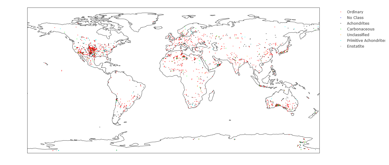
df$colors <- factor(df$class, levels = unique(df$class))
然后定义我们自己的颜色列表
cols <- c("red", "blue", "black", "green", "orange", "cyan", "gray50")
最后通过plot_geo绘制所有内容
plot_geo(df) %>%
  add_markers(
    x = ~reclong, y = ~reclat, color = ~colors, colors = cols, marker = list(size = 2))
在 Plotly 中的散点图中获取自定义颜色的完整代码。
library(plotly)

df = read.csv('https://raw.githubusercontent.com/bcdunbar/datasets/master/meteorites_subset.csv')

df$colors <- factor(df$class, levels = unique(df$class))
cols <- c("red", "blue", "black", "green", "orange", "cyan", "gray50")

plot_geo(df) %>%
add_markers(x = ~reclong,
            y = ~reclat,
            color = ~df$colors,
            colors = cols,
            marker = list(size = 2))
关于r - 使用plot_ly R包缩放点并选择颜色,我们在Stack Overflow上找到一个类似的问题: https://stackoverflow.com/questions/42661873/