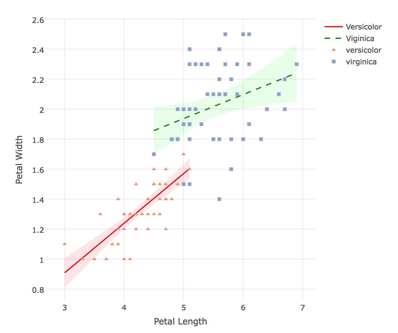
我需要为两个级别的分类因素(在我的例子中为性别)构建一个带有两条回归线的散点图。散点图应该包含所有观测值,但每个级别的线性模型需要单独绘制。换句话说,以下模型的散点图:
连续A = 截距+连续B + 分类+连续B*分类。
Plotly 不会注册由 add_markers() 指定的颜色,除非删除了 add_lines() 和 add_ribbons() 。如果这不能用 Plotly 完成(一个 bug?),那么可以用 ggplot(也许还有 GGally)完成吗?
此外,我很想看看这是否可以通过更短、更整洁或更漂亮的代码或函数来完成。一次完成所有三个 iris$Species 会更好。
library(plotly)
library(broom)
plot_ly() %>%
  add_lines(data = iris[which(iris$Species=='versicolor'), ],
            y = ~fitted(lm(data = iris[which(iris$Species=='versicolor'), ], Petal.Width ~ Petal.Length)),
            x = ~Petal.Length,
            line = list(color = "red"),
            name = "Versicolor") %>%
  # Plot the 95% CI of slope ribbon
  add_ribbons(data = augment(lm(data = iris[which(iris$Species=='versicolor'), ], Petal.Width ~ Petal.Length)),
              y = ~Petal.Width,
              x = ~Petal.Length,
              ymin = ~.fitted - 1.96 * .se.fit,
              ymax = ~.fitted + 1.96 * .se.fit,
              line = list(color = 'rgba(255, 255, 255, 0.05)'), #get rid of the border line
              fillcolor = 'rgba(255, 0, 0, 0.1)', #red with alpha transparency
              name = "Versicolor (Standard Error)",
              showlegend = FALSE) %>%
  add_lines(data = iris[which(iris$Species=='virginica'), ],
            y = ~fitted(lm(data = iris[which(iris$Species=='virginica'), ], Petal.Width ~ Petal.Length)),
            x = ~Petal.Length,
            line = list(color = "green", dash = "dash"),
            name = "Viginica") %>%
  add_ribbons(data = augment(lm(data = iris[which(iris$Species=='virginica'), ], Petal.Width ~ Petal.Length)),
              y = ~Petal.Width,
              x = ~Petal.Length,
              ymin = ~.fitted - 1.96 * .se.fit,
              ymax = ~.fitted + 1.96 * .se.fit,
              line = list(color = 'rgba(255, 255, 255, 0.05)'), #get rid of the border line
              fillcolor = 'rgba(0, 255, 0, 0.1)', #green with alpha transparency
              name = "Virginica (Standard Error)",
              showlegend = FALSE) %>%
  add_markers(data = iris[which(iris$Species=='versicolor' | iris$Species=='virginica'), ],
              x = ~Petal.Length,
              y = ~Petal.Width,
              symbol = ~Species,
              color = ~Species, colors = c("versicolor" = "red", "virginica" = "green")) %>%
  layout(xaxis = list(title = "Petal Length"), yaxis = list(title = "Petal Width"))
最佳答案
Plotly does not register the colors specified by add_markers(), unless the add_lines() and add_ribbons() are removed. If this cannot be done with Plotly (a bug?) then can it be done with ggplot (and perhaps GGally)?
您可以单独为不同类别添加标记,即重复调用 add_markers。
Also, I would love to see if this can be done with shorter, tidier, or prettier code, or with a function. It would be even better to do all three iris$Species at once.
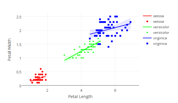
您可以循环遍历所有三个物种,因此您只需编写一次代码。
library(plotly)
library(broom)

species <-  unique(iris$Species)
colors <- c('(255, 0, 0', '(0, 255, 0', '(0, 0, 255')

p <- plot_ly()

for (i in 1:length(species)) {
  p <- add_lines(p, data = iris[which(iris$Species==species[[i]]), ],
            y = fitted(lm(data = iris[which(iris$Species==species[[i]]), ], Petal.Width ~ Petal.Length)),
            x = ~Petal.Length,
            line = list(color = paste('rgb', colors[[i]], ')')),
            name = species[[i]])
    p <- add_ribbons(p, data = augment(lm(data = iris[which(iris$Species==species[[i]]), ], Petal.Width ~ Petal.Length)),
                y = ~Petal.Width,
                x = ~Petal.Length,
                ymin = ~.fitted - 1.96 * .se.fit,
                ymax = ~.fitted + 1.96 * .se.fit,
                line = list(color = paste('rgba', colors[[i]], ', 0.05)')),
                fillcolor = paste('rgba', colors[[i]], ', 0.1)'),
                showlegend = FALSE)
    p <- add_markers(p, data = iris[which(iris$Species==species[[i]]), ],
              x = ~Petal.Length,
              y = ~Petal.Width,
              symbol = ~Species,
              marker=list(color=paste('rgb', colors[[i]])))
}
p <- layout(p, xaxis = list(title = "Petal Length"), yaxis = list(title = "Petal Width"))

p
关于Rplot_ly通过带有颜色和符号的连续交互散点图回归线进行分类,我们在Stack Overflow上找到一个类似的问题: https://stackoverflow.com/questions/42708828/