我束手无策,但到目前为止还没有找到任何文档来解决我的具体问题。我正在使用 jupyter 笔记本。
我有两个数据框,df1 和 df2。
# libraries
import pandas as pd
import numpy as np

import matplotlib.pyplot as plt
import cufflinks as cf
cf.go_offline()
import plotly.graph_objs as go

# df1 & df2
np.random.seed(0)
dates = pd.date_range('20130101',periods=6)

df1 = pd.DataFrame(np.random.randn(6,4),index=dates,columns=list('ABCD'))
df2 = pd.DataFrame(np.random.randn(6,4),index=dates,columns=list('ABCD'))
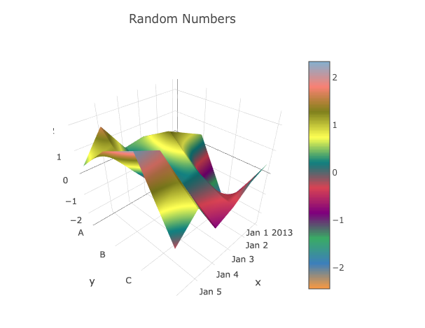
我有两个曲面图:
layout = go.Layout(
    title='Random Numbers',
    autosize=False,
    width=500,
    height=500,
    margin=dict(
        l=65,
        r=50,
        b=65,
        t=90
    )
)

df1.iplot(kind="surface", layout=layout)
df2.iplot(kind="surface", layout=layout)
我遇到三个问题:
- 我需要并排绘制它们,如(行 = 1 & 列 = 2)。
- 比例图例已删除或共享。
- 坐标区中的
x和y被删除。我不需要改变它们,只需摆脱它们即可。
任何帮助将不胜感激。
最佳答案
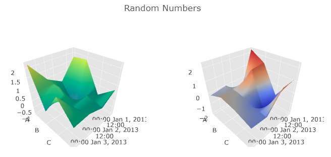
如果这不能直接回答您的问题,我很抱歉,但我建议使用不带 cufflings 的 plotly。
import plotly

# Define scene which changes the default attributes of the chart
scene = dict(
    xaxis=dict(title=''),
    yaxis=dict(title=''),
    zaxis=dict(title='')
)

# Create 2 empty subplots
fig = plotly.tools.make_subplots(rows=1, cols=2,
                                 specs=[[{'is_3d': True}, {'is_3d': True}]])
# Add df1
fig.append_trace(dict(type='surface', x=df1.index, y=df1.columns, z=df1.as_matrix(),
                      colorscale='Viridis', scene='scene1', showscale=False), 1, 1)

# Add df2
fig.append_trace(dict(type='surface', x=df2.index, y=df2.columns, z=df2.as_matrix(),
                      colorscale='RdBu', scene='scene2', showscale=False), 1, 2)

# Set layout and change defaults with scene
fig['layout'].update(title='Random Numbers', height=400, width=800)
fig['layout']['scene1'].update(scene)
fig['layout']['scene2'].update(scene)

# Use plotly offline to display the graph
plotly.offline.plot(fig)
输出:
编辑:
要回答你的第三个问题,你可以使用.update(scene)来更改轴属性。详细信息在上面的代码中。
关于python-3.x - 使用 pandas 隐藏曲面图上的图例和比例信息,plotly,我们在Stack Overflow上找到一个类似的问题: https://stackoverflow.com/questions/46593417/