我在 R 上绘制多条线的图表时遇到问题。 我试图在绘图上添加一些垂直线,但它不起作用。
我正在使用以下代码。
library(ggplot2)
library("ggthemes")
library("scales")
dat <- data.frame(
  time = factor(c("2007","2008","2009","2010","2011","2012","2013","2014","2015","2016"),
                levels=c("2007","2008","2009","2010","2011","2012","2013","2014","2015","2016")),
  #frequency = c(3, 8, 20, 26, 30, 38,29, 27, 13, 1)
  frequency = c(3, 8, 22, 29, 29, 37, 29, 33, 19, 30),
  frequency_performance = c(3, 7, 20, 22, 19, 29, 18, 15, 16, 18),
  frequency_correctness = c(0, 1, 1, 2, 1, 6, 5, 9, 1, 4),
  frequency_fault = c(0, 0, 2, 4, 6, 2, 6, 7, 2, 8)
)

p <- ggplot(data=dat, aes(x=time)) + #, y=frequency, group=1)) +
   theme(aspect.ratio=.4,text = element_text(size=13),
          panel.grid.major = element_line(colour = "grey"),
          panel.border = element_rect( fill = NA),
          panel.background = element_rect(fill = "white", colour = "grey")) +
  geom_line(aes(y=frequency, colour="slateblue"),group=1, size=1.5) +
  geom_line(aes(y=frequency_performance, colour="darkgoldenrod"),group=1, size=1.5) +
  geom_line(aes(y=frequency_correctness, colour="darkgreen"),group=1, size=1.5) +
  geom_line(aes(y=frequency_fault, colour="chocolate"),group=1, size=1.5) +
  xlab("Year") + ylab("Number of publications") + # Set axis labels
  scale_color_discrete(name = "Category", labels = c("Fault tolerance", "Performance", "Correctness", "All papers")) +
  ggtitle("")

p +   geom_vline(xintercept=c(2010,2012,2014,2016), linetype="dotted", color="red")
我尝试在此代码中使用另一种格式,但它也不起作用。
dat <- data.frame(
  time = factor(c("2007","2008","2009","2010","2011","2012","2013","2014","2015","2016"),
                levels=c("2007","2008","2009","2010","2011","2012","2013","2014","2015","2016")),
  frequency = c(3, 8, 22, 29, 29, 37, 29, 33, 19, 30, 3, 7, 20, 22, 19, 29, 18, 15, 16, 18, 0, 1, 1, 2, 1, 6, 5, 9, 1, 4, 0, 0, 2, 4, 6, 2, 6, 7, 2, 8),
  group = c(1,1,1,1,1,1,1,1,1,1,2,2,2,2,2,2,2,2,2,2,3,3,3,3,3,3,3,3,3,3,4,4,4,4,4,4,4,4,4,4)
)

p<- ggplot(data=dat, aes(x=time, y=frequency,group=group, color=as.factor(group) )) +
  geom_line() +
  geom_point() +
  scale_color_manual(breaks = c("1", "2", "3", "4"),
                     values=c("slateblue", "darkgoldenrod", "darkgreen", "chocolate")) +
  xlab("Year") + ylab("Number of publications") + theme_bw() +

guides(shape = FALSE, linetype = FALSE,
       colour = guide_legend(override.aes =  list(shape = c(16, 16, 16,  16),
                                                  linetype = c("solid","solid","solid", "solid"),
                                                  labels= c("All articles","Performance","Correctness","Fault tolerance"),
                                                  title = "Category"
       )))

p +   geom_vline(xintercept=as.numeric(2012), linetype="dotted", color="red", size=3)
这两个代码还存在其他问题(这就是为什么我有两个不同的代码),例如无法在第一个代码上订购图例,或者由于某种原因颜色错误。第二张图由于某种原因我无法替换图例文本,但垂直线是现在的主要问题。
最佳答案
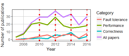
我将创建时间列的方式从因子更改为数字,如下所示。
dat <- data.frame(
  time = 2007:2016,
  #frequency = c(3, 8, 20, 26, 30, 38,29, 27, 13, 1)
  frequency = c(3, 8, 22, 29, 29, 37, 29, 33, 19, 30),
  frequency_performance = c(3, 7, 20, 22, 19, 29, 18, 15, 16, 18),
  frequency_correctness = c(0, 1, 1, 2, 1, 6, 5, 9, 1, 4),
  frequency_fault = c(0, 0, 2, 4, 6, 2, 6, 7, 2, 8)
)
现在可以了。为了清楚起见,在下面的代码中,我还将行大小更改为 2。
p <- ggplot(data=dat, aes(x=time)) + #, y=frequency, group=1)) +
  theme(aspect.ratio=.4,text = element_text(size=13),
        panel.grid.major = element_line(colour = "grey"),
        panel.border = element_rect( fill = NA),
        panel.background = element_rect(fill = "white", colour = "grey")) +
  geom_line(aes(y=frequency, colour="slateblue"),group=1, size=1.5) +
  geom_line(aes(y=frequency_performance, colour="darkgoldenrod"),group=1, size=1.5) +
  geom_line(aes(y=frequency_correctness, colour="darkgreen"),group=1, size=1.5) +
  geom_line(aes(y=frequency_fault, colour="chocolate"),group=1, size=1.5) +
  xlab("Year") + ylab("Number of publications") + # Set axis labels
  scale_color_discrete(name = "Category", labels = c("Fault tolerance", "Performance", "Correctness", "All papers")) +
  ggtitle("")

p +   geom_vline(xintercept=c(2010,2012,2014,2016),
                 linetype="dotted",
                 color="red",
                 size = 2)
关于r - R 上的 geom_vline 不适用于在 ggplot 图上添加垂直线,我们在Stack Overflow上找到一个类似的问题: https://stackoverflow.com/questions/47294014/