您好,我正在使用 Material UI slider 组件构建一个具有 2 个值的范围 slider ,并且我正在尝试使两个拇指具有不同的颜色。
我怎样才能做到这一点?
最佳答案
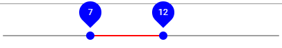
这有点hacky,但它实现了你想要的。
本质上,您希望利用 MaterialUI 的 useStyle 创建自定义样式,然后通过引用其子索引来选择拇指元素。
因为拇指可以预见是范围 slider 中的第四个和第五个元素,所以您可以使用一些 CSS 选择它们并相应地设置它们的样式:

import React from "react";
import { Slider, Typography } from "@material-ui/core";
import { makeStyles } from "@material-ui/core/styles";

export default function StyledSlider() {
  const [value, setValue] = React.useState([20, 37]);

  const handleChange = (event, newValue) => {
    setValue(newValue);
  };

  const useStyles = makeStyles({
    root: {
      "&>.MuiSlider-thumb": {
        "&:nth-child(4)": {
          color: "green !important"
        },
        "&:nth-child(5)": {
          color: "red !important"
        }
      }
    }
  });

  const classes = useStyles();

  return (
    <div>
      <Typography id="range-slider" gutterBottom>
        Example Slider
      </Typography>
      <Slider
        value={value}
        onChange={handleChange}
        valueLabelDisplay="auto"
        aria-labelledby="range-slider"
        className={classes.root}
      />
    </div>
  );
}
工作代码沙箱:https://codesandbox.io/s/stack-66666691-muithumbs-4s3rh?file=/src/StyledSlider.jsx:0-900
引用文献:
关于css - 为 Material UI 范围 slider slider 设置不同的颜色,我们在Stack Overflow上找到一个类似的问题: https://stackoverflow.com/questions/66666691/