我正在尝试在 ggplot 中生成一个图例,该图例显示的点的名称与线的名称不同。我需要该图例与显示颜色、形状和线型的图例分开显示。
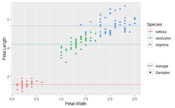
我最初有与这个较小的示例类似的代码,它可以工作。基本上,我人为地为点和线设置了尺寸美感,然后覆盖图例以仅显示其中之一。据我所知,这就是人们在绘图中添加回归线的方式。然而,在 ggplot2 版本 3.4.0 中,不推荐使用线条尺寸美学。它仍然有效,但我认为行为略有改变。
# Use iris dataframe as example and create new column for horizontal lines
data <- iris %>%
  group_by(Species) %>%
  mutate(AvgLength = mean(Petal.Length))

ggplot(data) +
  geom_point(aes(x = Petal.Width, y = Petal.Length, color = Species, shape = Species, size = "Samples")) +
  geom_hline(aes(yintercept = AvgLength, color = Species, linetype = Species, size = "Average")) +
  # Set manual size to get normal points and linewidths
  scale_size_manual(values = c("Average" = .5, "Samples" = 1.5)) +
  # Override the size legend to show only a line for the first entry and only a point for the second
  guides(size = guide_legend(override.aes = list(linetype = c(1,0), shape = c(NA, 16)), title = ""))
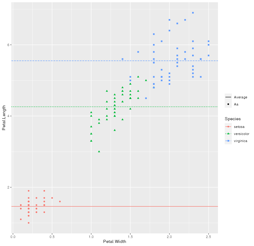
在我的实际应用程序中,线名称按字母顺序排列在点名称之后(但应首先显示在图例中),这打破了图例,如此处所示。我认为当我第一次编写代码(3.4.0 之前)时,图例中遵循了 size_scale 的顺序,但我不确定。
ggplot(data) +
  geom_point(aes(x = Petal.Width, y = Petal.Length, color = Species, shape = Species, size = "Aa")) +
  geom_hline(aes(yintercept = AvgLength, color = Species, linetype = Species, size = "Average")) +
  scale_size_manual(values = c("Average" = .5, "Aa" = 1.5)) +
  guides(size = guide_legend(override.aes = list(linetype = c(1,0), shape = c(NA, 16)), title = ""))
Plot with legend messed up by name order
我想用新版本的 ggplot 做正确的事情,而不是使用尺寸美学,但我不确定如何在具有不同美学的同一个图例上同时拥有点和线,因为我已经将颜色用于其他事物。我能得到的最接近的是将它们显示为两个单独的图例,如下所示,然后以某种方式手动更改间距。但是,如果您必须将其应用于图例显示在不同位置的多种类型的绘图,并且我不确定如何手动修复大小和线宽图例之间的间距,同时留下另一个传奇。
ggplot(data) +
  geom_point(aes(x = Petal.Width, y = Petal.Length, color = Species, shape = Species, size = "Aa")) +
  geom_hline(aes(yintercept = AvgLength, color = Species, linetype = Species, linewidth = "Average")) +
  scale_size_manual(values = c("Average" = .5, "Aa" = 1.5)) +
  scale_linewidth_manual(values = c("Average" = .5)) +
  guides(size = guide_legend(title = "", order = 1),
        linewidth = guide_legend(title = "", order = 2))
Plot that doesn't use the size aesthetic for lines, but the legends look weird
我知道 ggplot 通常不能很好地处理手动图例规范,因为您应该如何设置绘图和数据框。但是,我认为在这个应用程序中,很难以不同的方式设置数据框。有没有人有一个干净的解决方案来解决这个问题?
最佳答案
由于我们现在必须处理两种美学问题,因此我们必须确保通过“复制”比例规范来合并图例,即为两个比例中的两个类别设置一个值,并设置限制 实际上在每个图例中都包含这两个类别。这样做,size 和 lindwidth 图例会合并,通过限制,您还可以设置图例中类别的顺序,最后我们可以使用 override.aes 来完善图例,即去掉“线”类别的 shape 和“点”类别的 linetype。
library(ggplot2)

ggplot(data) +
  geom_point(aes(x = Petal.Width, y = Petal.Length, color = Species, shape = Species, size = "Aa")) +
  geom_hline(aes(yintercept = AvgLength, color = Species, linetype = Species, linewidth = "Average")) +
  scale_size_manual(values = c("Average" = .5, "Aa" = 1.5), limits = c("Average", "Aa")) +
  scale_linewidth_manual(values = c("Average" = .5, "Aa" = 1.5), limits = c("Average", "Aa")) +
  labs(size = NULL, linewidth = NULL) +
  guides(
    size = guide_legend(
      override.aes = list(linetype = c("solid", "blank"), shape = c(NA, 16))
    )
  )
关于r - 在 ggplot2 中显示点与线的图例,我们在Stack Overflow上找到一个类似的问题: https://stackoverflow.com/questions/75658149/