这一定是一个常见问题解答,但我在其他答案中找不到完全相同的示例(如果您可以指出类似的问答,请随意关闭此答案)。我仍然是 ggplot2 的新手,似乎不太容易理解它。
我有 2 个 data.frames(来自单独的混合模型),我试图将它们绘制到同一个图表中。数据帧是:
newdat
      id   Type         pred        SE
       1      1     15.11285 0.6966029
       2      1     13.68750 0.9756909
       3      1     13.87565 0.6140860
       4      1     14.61304 0.6187750
       5      1     16.33315 0.6140860
       6      1     16.19740 0.6140860
       1      2     14.88805 0.6966029
       2      2     13.46270 0.9756909
       3      2     13.65085 0.6140860
       4      2     14.38824 0.6187750
       5      2     16.10835 0.6140860
       6      2     15.97260 0.6140860
和
newdat2
      id                pred        SE
       1            14.98300 0.6960460
       2            13.25893 0.9872502
       3            13.67650 0.6150701
       4            14.39590 0.6178266
       5            16.37662 0.6171588
       6            16.08426 0.6152017
如您所见,第二个 data.frame 没有 Type ,而第一个有,因此每个 id 有 2 个值.
我可以用 ggplot 做的就是绘制其中一个,如下所示:
图1
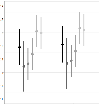
图2

正如您所看到的,在图 1 ids 中堆叠为 Type在 x 轴上形成两组 6 ids 。然而,图 2 中没有 Type ,但只是 6 ids .
我想要完成的是将Fig2绘制到Fig1的左侧/右侧,并进行类似的分组。因此,生成的图将类似于图 1,但有 3 组,每组 6 ids .
问题还在于,我需要标记和组织结果图,以便 newdat x 轴将包含“model1”和 newdat2 的标签“model2”的标签,或一些类似的指示符,表明它们来自不同的型号。更糟糕的是,我需要一些 Type 的标签在newdat .
我的(希望)可重现(但显然非常糟糕)的图 1 代码:
library(ggplot2)
pd <- position_dodge(width=0.6)
ggplot(newdat,aes(x=Type,y=newdat$pred,colour=id))+
  geom_point(position=pd, size=5)
geom_linerange(aes(ymin=newdat$pred-1.96*SE,ymax=newdat$pred+1.96*SE), position=pd, size=1.5, linetype=1) +
  theme_bw() +
  scale_colour_grey(start = 0, end = .8, name="id") +
  coord_cartesian(ylim=c(11, 18)) +
  scale_y_continuous(breaks=seq(10, 20, 1)) +
  scale_x_discrete(name="Type", limits=c("1","2"))
图 2 的代码相同,但没有 limits在最后一行并带有 id为 ggplot(aes()) 中的 x 轴定义
据我了解,定义的东西在 ggplot()使这些东西在整个图表中成为“标准”,并且我尝试删除常见的东西并单独定义 geom_point和geom_linerange对于两者newdat和newdat2 ,但到目前为止还没有运气......非常感谢任何帮助,因为我完全陷入困境。
最佳答案
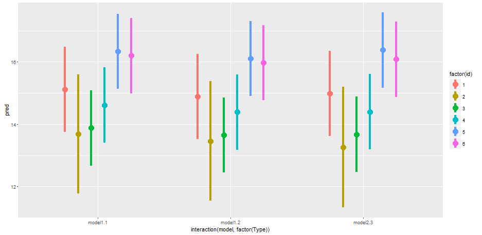
首先向每个数据集添加一些新变量,然后将它们组合起来如何:
newdat$model <- "model1"

newdat2$model <- "model2"
newdat2$Type <- 3

df <- rbind(newdat, newdat2)
# head(df)
然后我们可以绘制:
library(ggplot2)

ggplot(df, aes(x = interaction(model, factor(Type)), y = pred, color = factor(id))) +
  geom_point(position = position_dodge(width = 0.6), size = 5) +
  geom_linerange(aes(ymin = pred - 1.96 * SE, ymax = pred + 1.96 * SE),
                 position = position_dodge(width = 0.6),
                 size = 1.5, linetype = 1)
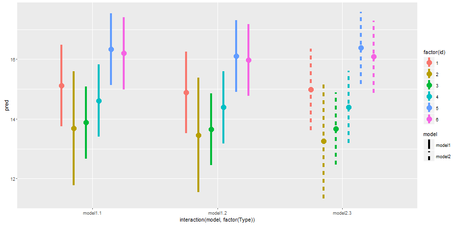
或者,您可以将额外的美感传递给 geom_linerange 以进一步描述模型类型:
ggplot(df, aes(x = interaction(model, factor(Type)), y = pred, color = factor(id))) +
  geom_point(position = position_dodge(width = 0.6), size = 5) +
  geom_linerange(aes(ymin = pred - 1.96 * SE, ymax = pred + 1.96 * SE, linetype = model),
                 position = position_dodge(width = 0.6),
                 size = 1.5)
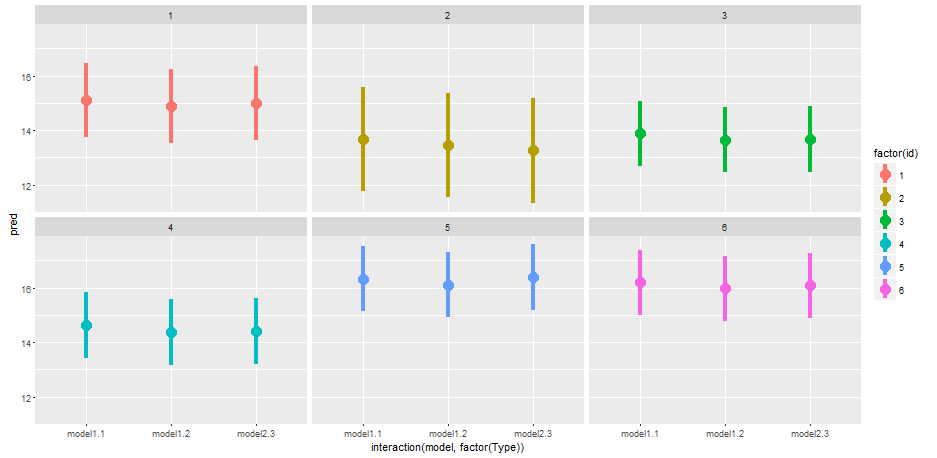
最后,您可能需要考虑方面:
ggplot(df, aes(x = interaction(model, factor(Type)), y = pred, color = factor(id))) +
  geom_point(position = position_dodge(width = 0.6), size = 5) +
  geom_linerange(aes(ymin = pred - 1.96 * SE, ymax = pred + 1.96 * SE),
                 position = position_dodge(width = 0.6),
                 size = 1.5) +
  facet_wrap(~ id)
关于r - ggplot2 将两个数据集绘制成一张图片,我们在Stack Overflow上找到一个类似的问题: https://stackoverflow.com/questions/35848654/