我希望设置一个镜像条形图,中间有一组轴标签。该图片显示了我到目前为止所拥有的内容(在最后重现的代码):
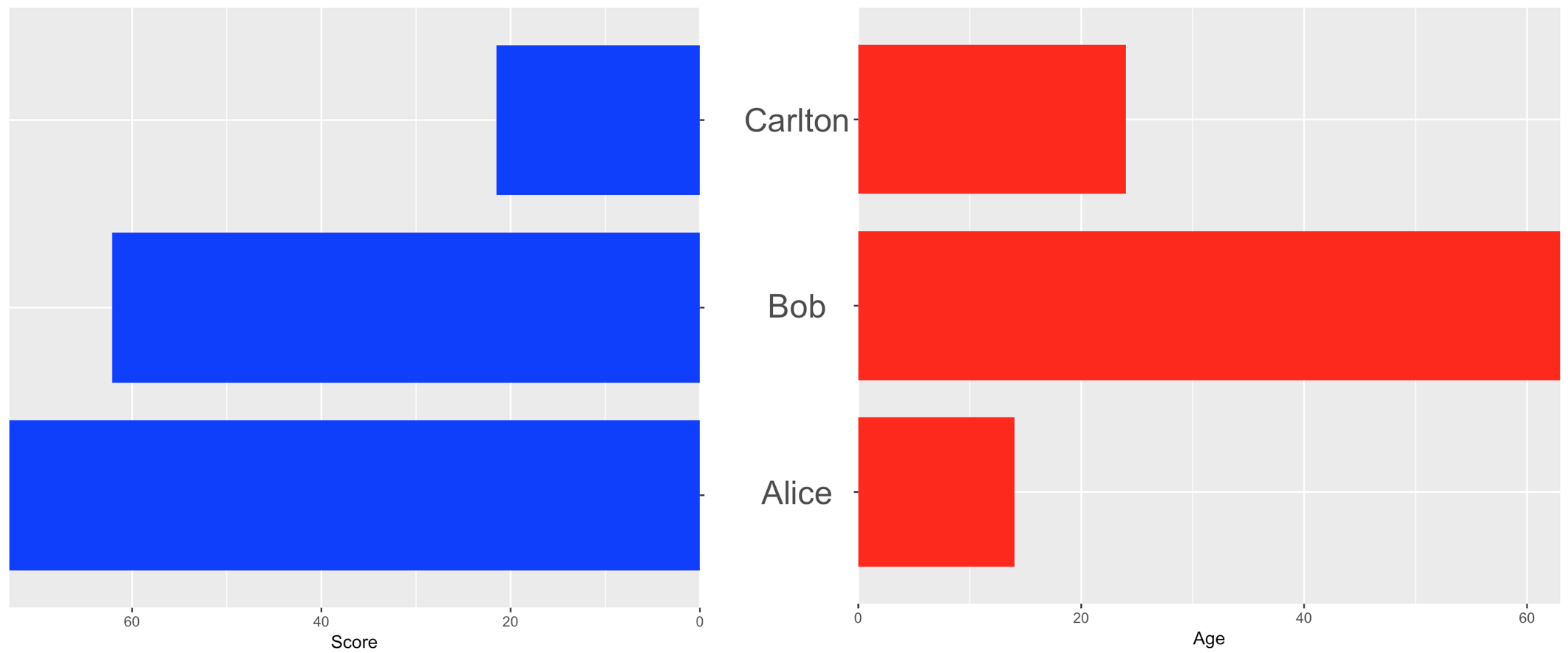
我希望名称位于图表之间的中心。尝试过的方法:
- 使用轴标签(此处显示最佳尝试)
- 使用
annotation_custom(我发现放置标签非常困难,并且不喜欢 ggplot 引用和基本图引用的组合) - 创建一个单独的“图表对象”以放入 grid.arrange 面板中(在没有任何条形的情况下很难在标签之间获得正确的垂直间距)
我欢迎任何有关实现此布局的最简单方法的建议。基础必须是 ggplot,但很乐意使用其他包来排列图表。
require("ggplot2")
require("gridExtra")

dataToPlot <- data.frame(
  "Person" = c("Alice", "Bob", "Carlton"),
  "Age" = c(14, 63, 24),
  "Score" = c(73, 62.1, 21.5))

plot1 <- ggplot(dataToPlot) +
  geom_bar(data = dataToPlot, aes(x = Person, y = Score), stat = "identity",
    fill = "blue", width = 0.8) +
  scale_y_continuous(trans = "reverse", expand = c(0, 0)) +
  scale_x_discrete(position = "top") +
  theme(
    axis.text.y = element_blank()
  ) +
  labs(x = NULL) +
  coord_flip()

plot2 <- ggplot(dataToPlot) +
  geom_bar(data = dataToPlot, aes(x = Person, y = Age), stat = "identity",
    fill = "red", width = 0.8) +
  scale_y_continuous(expand = c(0, 0)) +
  theme(
    axis.text.y = element_text(size = 20, hjust = 0.5)
  ) +
  labs(x = "") +
  coord_flip()

gridExtra::grid.arrange(plot1, plot2, ncol = 2, widths = c(1, 1.2))
最佳答案
有两种方法(也许组合起来)...
在右侧图表中轴标签的右侧添加边距...
element_text(size = 20, hjust = 0.5, margin=margin(r=30))
...或者将两个图表移得更近
grid.arrange(plot1, plot2, ncol = 2, widths = c(1, 1.2),padding=0)
关于r - ggplot : Centre and move the vertical axis labels,我们在Stack Overflow上找到一个类似的问题: https://stackoverflow.com/questions/43918698/