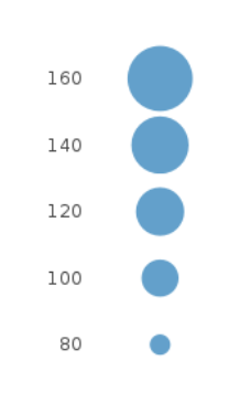
我用 Python Plotly 创建了一个气泡图。在下面的示例中,气泡的大小代表不同国家的人口规模。我想在图例中添加气泡大小,如下图所示:
但不可能,我真的很难找到解决方案,无论是在 Plotly 文档上还是在 stack-overflow 等论坛上。下面是代码示例:
import plotly.graph_objects as go
import plotly.express as px
import pandas as pd
import math

# Load data, define hover text and bubble size
data = px.data.gapminder()
df_2007 = data[data['year']==2007]
df_2007 = df_2007.sort_values(['continent', 'country'])
df_2007 = df_2007[df_2007["continent"] == "Asia"]

hover_text = []
bubble_size = []

for index, row in df_2007.iterrows():
    hover_text.append(('Country: {country}<br>'+
                      'Life Expectancy: {lifeExp}<br>'+
                      'GDP per capita: {gdp}<br>'+
                      'Population: {pop}<br>'+
                      'Year: {year}').format(country=row['country'],
                                            lifeExp=row['lifeExp'],
                                            gdp=row['gdpPercap'],
                                            pop=row['pop'],
                                            year=row['year']))
    bubble_size.append(math.sqrt(row['pop']))

df_2007['text'] = hover_text
df_2007['size'] = bubble_size
sizeref = 2.*max(df_2007['size'])/(100**2)

# Dictionary with dataframes for each continent
continent_names = ['Asia']

continent_data = {continent:df_2007.query("continent == '%s'" %continent)
                              for continent in continent_names}

# Create figure
fig = go.Figure()

for continent_name, continent in continent_data.items():
    fig.add_trace(go.Scatter(
        x=continent['gdpPercap'], y=continent['lifeExp'],
        name=continent_name, text=continent['text'],
        marker_size=continent['size'],
        ))

# Tune marker appearance and layout
fig.update_traces(mode='markers', marker=dict(sizemode='area',
                                              sizeref=sizeref, line_width=2))

fig.update_layout(
    title='Life Expectancy v. Per Capita GDP, 2007',
    xaxis=dict(
        title='GDP per capita (2000 dollars)',
        gridcolor='white',
        type='log',
        gridwidth=2,
    ),
    yaxis=dict(
        title='Life Expectancy (years)',
        gridcolor='white',
        gridwidth=2,
    ),
    paper_bgcolor='rgb(243, 243, 243)',
    plot_bgcolor='rgb(243, 243, 243)',
)
fig.show()
感谢各位的帮助!
最佳答案
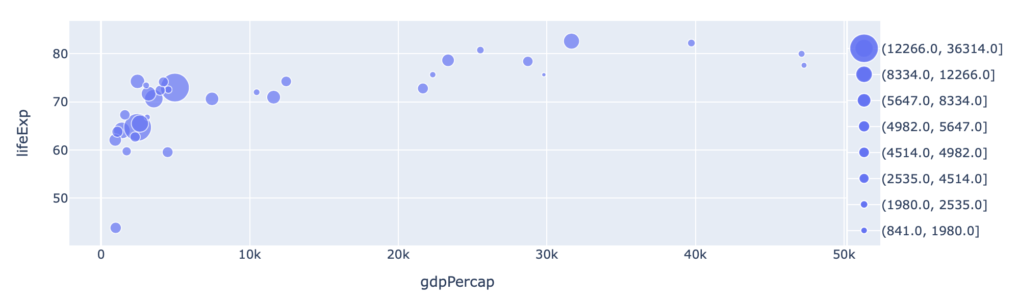
- 显然,您可以创建一条有效地可视化图例的轨迹
- 这条轨迹可以与其他轴相对,并且可以创建一个整体图形
import plotly.graph_objects as go
import plotly.express as px
import pandas as pd
import numpy as np
import math

# Load data, define hover text and bubble size
data = px.data.gapminder()
df_2007 = data[data["year"] == 2007]
df_2007 = df_2007.sort_values(["continent", "country"])
df_2007 = df_2007[df_2007["continent"] == "Asia"]
df_2007["pop_size"] = np.sqrt(df_2007["pop"])
fig1 = px.scatter(df_2007, x="gdpPercap", y="lifeExp", size="pop_size")

df_l = df_2007.sort_values("pop_size")
fig2 = px.scatter(
    df_l,
    x=np.zeros(len(df_2007)),
    y=pd.qcut(df_l["pop_size"], q=8, precision=0).astype(str),
    size="pop_size",
)


fig = go.Figure(
    data=[t for t in fig1.data] + [t.update(xaxis="x2", yaxis="y2") for t in fig2.data],
    layout=fig1.layout,
)

# now config axes appropriately
fig.update_layout(
    xaxis_domain=[0, 0.958],
    xaxis2={"domain": [0.96, 1], "matches": None, "visible": False},
    yaxis2={"anchor": "free", "overlaying": "y", "side": "right", "position": 1},
    showlegend=False,
)
关于python - 使用 Python Plotly 绘制气泡大小图例,我们在Stack Overflow上找到一个类似的问题: https://stackoverflow.com/questions/71694358/