我想知道是否有可能生成饱和度+亮度的掩码,例如在颜色选择器中使用(类似于 http://johndyer.name/lab/colorpicker/refresh_web/colorpicker/images/map-hue.png )但在 css3 中仅使用线性渐变? 我尝试了几件事,例如:
background: linear-gradient(to right, hsla(0,100%,0,0) 0%, hsla(0,0%,0%,.5) 100%), /* saturation mask */
            linear-gradient(to top, hsla(0,0%,0%,.5) 0%, hsla(0,0%,100%,.5) 100%), /* lightness mask */
但是我做不出像图片这样的东西,找不到合适的组合,而且因为我不是很了解,所以我不知道是否可以。
谢谢
最佳答案
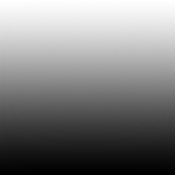
这可能是你写的方式。
- 对于图像,1 个渐变 + 背景色即可。
- 你没有正确关闭你的规则,仍然需要一个值
100%),/* li:) - 可能是这样:
ele {
background:
    linear-gradient(0deg, hsla(0,0%,0%,.5) 0%, hsla(0,0%,100%,.5) 100%) no-repeat left ,
    white   linear-gradient(180deg, hsla(0,0%,0%,.5) 0%, hsla(0,0%,100%,.5) 100%) no-repeat right;
    background-size:95% 100%, 5% 100%;
}
http://codepen.io/anon/pen/ubDsr (渐变覆盖 body )
关于css - 使用渐变生成饱和度/亮度蒙版,我们在Stack Overflow上找到一个类似的问题: https://stackoverflow.com/questions/17224383/