我有一个数据框:
    index   zip lat lng city    state_id    state_name  population  density county_name timezone
0   0   01001   42.0626 -72.6259    Agawam  MA  Massachusetts   16769   565.8   Hampden America/New_York
1   1   01002   42.3749 -72.4621    Amherst MA  Massachusetts   29049   203.8   Hampshire   America/New_York
2   2   01003   42.3919 -72.5248    Amherst MA  Massachusetts   10372   5629.7  Hampshire   America/New_York
3   3   01005   42.4202 -72.1061    Barre   MA  Massachusetts   5079    44.3    Worcester   America/New_York
4   4   01007   42.2787 -72.4003    Belchertown MA  Massachusetts   14649   107.4   Hampshire   America/New_York
... ... ... ... ... ... ... ... ... ... ... ...
460 531 02771   41.8379 -71.3174    Seekonk MA  Massachusetts   13708   288.1   Bristol America/New_York
461 532 02777   41.7570 -71.2121    Swansea MA  Massachusetts   15840   269.7   Bristol America/New_York
462 533 02779   41.8349 -71.0754    Berkley MA  Massachusetts   6411    149.9   Bristol America/New_York
463 534 02780   41.9076 -71.1196    Taunton MA  Massachusetts   49036   573.1   Bristol America/New_York
464 535 02790   41.5999 -71.0832    Westport    MA  Massachusetts   15717   113.0   Bristol America/New_York
465 rows × 11 columns
我必须绘制城市及其人口的直方图。所以,我使用了来自 this answer 的以下代码:
import pylab as plt
ma_hist = ma_StateData.hist('city',weights=ma_StateData['population'] )
plt.ylabel('population')
plt.show()
这会产生一个错误:
ValueError: hist method requires numerical columns, nothing to plot.
我也试过文档:
ma_StateData.columns
# ma_histogram = pd.DataFrame.hist(ma_StateData, column='city', by='population')
# ma_histogram.plot.hist()
ma_city_population = ma_StateData[['city','population']]
ma_city_population.plot.hist(by='city')
但是生成的直方图不正确(不是我要找的):

我想要的是一个直方图,x轴是城市,对应每个城市,柱状图显示该城市的人口。
我该怎么做?
最佳答案
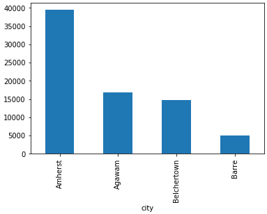
我只复制了你数据的前 5 行,我不确定你是否真的需要 histogram,你可以用 groupby 和 sort_values:
>>> df.groupby('city')['population'].sum().sort_values(ascending=False).plot(kind='bar')
关于python - 如何绘制非数字列的直方图 w.r.t pandas 数据框中的另一个计算列?,我们在Stack Overflow上找到一个类似的问题: https://stackoverflow.com/questions/60708374/