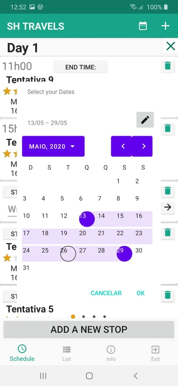
This is my situation, as you can see I have a daterangepicker from the MaterialComponents.DatePicker library. The circle to select the day is off by a lot. Before any of you suggest, I have tried changing the date ranger picker to fullscreen instead of dialog and all the problems remained. This said, if any of you prefer to make the changes in the fullscreen mode, it is fine by me. By the way, the fragment in which the datepicker is called is centered.
The colors I have no idea where he got them from, so if anyone knows where or how to change, please tell me. Plus, the purple color shown there is nowhere to be found in my colors.xml
Now, the code: This is my Datepicker (called by a options menu button):
MaterialDatePicker.Builder dateBuilder = MaterialDatePicker.Builder.dateRangePicker();
                CalendarConstraints.Builder constraintsBuilder = new CalendarConstraints.Builder();
                dateBuilder.setCalendarConstraints(constraintsBuilder.build());
                dateBuilder.setTitleText("Select your Dates");
                dateBuilder.setTheme(R.style.DatePickerTheme);
                MaterialDatePicker<Pair<Long, Long>> datePicker = dateBuilder.build();
                datePicker.addOnCancelListener(new DialogInterface.OnCancelListener() {
                    @Override
                    public void onCancel(DialogInterface dialog) {
                        Log .d("DatePicker Activity", "Dialog was cancelled");
                    }
                });
                datePicker.addOnNegativeButtonClickListener(new View.OnClickListener() {
                    @Override
                    public void onClick(View v) {
                        Log.d("DatePicker Activity", "Dialog Negative Button was clicked");
                    }
                });
                datePicker.addOnPositiveButtonClickListener(new MaterialPickerOnPositiveButtonClickListener<Pair<Long, Long>>() {
                    @Override
                    public void onPositiveButtonClick(Pair<Long, Long> selection) {
                        Log.d("DatePicker Activity", "Date String = ${picker.headerText}::  Date epoch values::${it.first}:: to :: ${it.second}");
                        SharedPreferences sharedPreferences = getActivity().getSharedPreferences("Settings", Context.MODE_PRIVATE);
                        SharedPreferences.Editor sEditor = sharedPreferences.edit();
                        sEditor.putLong("Start Date", selection.first);
                        sEditor.putLong("End Date", selection.second);
                        Toast.makeText(getActivity(), "Primeiro:" + selection.first.toString() + "SEgundo:" + selection.second.toString(), Toast.LENGTH_LONG).show();
                    }
                });
                assert getFragmentManager() != null;
                datePicker.show(getFragmentManager(), "RangePicker");
And this is my styles.xml: (A lot of people suggest putting the style inside the AppTheme which I just couldn't do!)
<resources>

    <!-- Base application theme. -->
    <style name="AppTheme" parent="Theme.AppCompat.Light.DarkActionBar">
        <!-- Customize your theme here. -->
        <item name="colorPrimary">@color/colorPrimary</item>
        <item name="colorPrimaryDark">@color/colorPrimaryDark</item>
        <item name="colorAccent">@color/colorAccent</item>
        <item name="windowActionBar">false</item>
        <item name="windowNoTitle">true</item>
    </style>

    <!-- Picker styles and themes. -->
    <style name="DatePickerTheme" parent="Theme.MaterialComponents.DayNight">
        <item name="materialCalendarStyle">@style/Widget.MaterialComponents.MaterialCalendar</item>
        <item name="materialCalendarFullscreenTheme">@style/ThemeOverlay.MaterialComponents.MaterialCalendar.Fullscreen</item>
        <item name="materialCalendarTheme">@style/ThemeOverlay.MaterialComponents.MaterialCalendar</item>
    </style>
</resources>
最佳答案
如 the doc 中所述你必须使用Material Components Theme。
只需将您的应用主题更改为:
<style name="AppTheme" parent="Theme.MaterialComponents.Light.DarkActionBar">
   ....
</style>
在选择器中固定选择器日期的样式和位置就足够了。
默认样式基于应用主题中定义的colorOnPrimary、colorPrimary 和colorOnSurface。
如果您想自定义颜色,您可以使用以下方法覆盖这些颜色:
builder.setTheme(R.style.MaterialCalendarTheme);
与:
  <style name="MaterialCalendarTheme" parent="ThemeOverlay.MaterialComponents.MaterialCalendar">
    <item name="colorOnPrimary">@color/...</item>
    <item name="colorPrimary">@color/....</item>
  </style>
关于android - MaterialComponents.DatePicker 日期选择器圆圈关闭位置以及如何改变颜色?,我们在Stack Overflow上找到一个类似的问题: https://stackoverflow.com/questions/62021782/