我正在尝试创建一个甘特图,其中涉及计划和实际开始/结束日期。我希望相同的任务重叠,例如:
到目前为止,这是我的代码。
import plotly.figure_factory as ff
import pandas as pd

df = pd.DataFrame([
    dict(Task="Job A", Start='2009-01-01', Finish='2009-02-28'),
    dict(Task="Job A", Start='2009-01-05', Finish='2009-02-15'),
    dict(Task="Job C", Start='2009-02-20', Finish='2009-05-30')
])
colors = {'Job A': 'rgb(220, 0, 0)',
          'Job C': (1, 0.9, 0.16), }

fig = ff.create_gantt(df, colors=colors, index_col="Task", show_colorbar=True, group_tasks=True)
fig.update_yaxes(autorange="reversed")  # otherwise tasks are listed from the bottom up
fig.show()
这是结果:

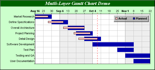
如何区分计划日期和实际日期?欢迎使用 Python、R 和 Excel 解决方案。在解决方案中使用 Plotly 是完全可选的。
最佳答案
这是一个 R 解决方案:
library(tidyverse)

df %>%
  mutate(Task = factor(Task, rev(levels(factor(Task)))),
         yval = as.numeric(Task)) %>% {
  ggplot(., aes(xmin = Start, xmax = Finish)) +
  geom_rect(data = filter(., Type == "Planned"), alpha = 0.5,
            aes(ymin = yval - 0.4, ymax = yval + 0.4, fill = "Planned")) +
  geom_rect(data = filter(., Type == "Actual"),
            aes(ymin = yval - 0.2, ymax = yval + 0.2, fill = "Actual"),
            color = "black") +
  scale_fill_manual("", values = c("deepskyblue4", "olivedrab")) +
  scale_y_continuous(breaks = seq_along(levels(.$Task)),
                     labels = levels(.$Task)) +
  labs(title = "Planned versus actual job times", x = "Date") +
  coord_fixed(15) +
  theme_bw(base_size = 16)
}

为此,您的数据应采用以下格式:
df
#>    Task      Start     Finish    Type
#> 1 Job A 2009-01-01 2009-02-28 Planned
#> 2 Job A 2009-01-05 2009-02-15  Actual
#> 3 Job B 2009-02-01 2009-03-15 Planned
#> 4 Job B 2009-02-10 2009-03-15  Actual
#> 5 Job C 2009-02-20 2009-05-30 Planned
#> 6 Job C 2009-02-22 2009-05-20  Actual
由 reprex package 于 2022 年 5 月 23 日创建(v2.0.1)
关于python - 如何在甘特图中指示预期日期和实际日期?,我们在Stack Overflow上找到一个类似的问题: https://stackoverflow.com/questions/72354057/