我有一个具有明显分层的数据集,我正在寻找图形证据表明它们的直方图存在差异。假设在这里我的数据集看起来像
id | cat | hour
---------------
1  | a   | 14
5  | c   | 9
如果我尝试为固定的分类变量绘制每个直方图,那么我会得到重叠的图形。例如,如果我写
unique_cats = list(df["cat"].unique())
for cat in unique_cats:
    df[df["cat"] == cat]["hour"].hist(bins=24, rwidth=0.9,
                                      normed=True, alpha=0.3)
然后我得到一堆重叠的直方图。这是一个屏幕截图:
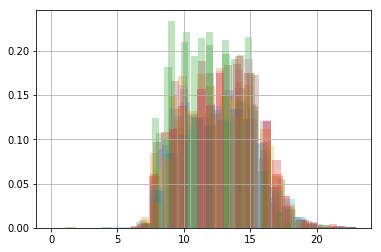
我怎样才能让我的直方图在我的 jupyter 笔记本中有自己单独的行?
最佳答案
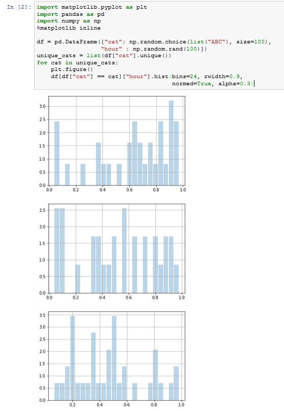
您可能希望为每个类别创建一个新图 ( plt.figure() ):
import matplotlib.pyplot as plt
import pandas as pd
import numpy as np
%matplotlib inline

df = pd.DataFrame({"cat": np.random.choice(list("ABC"), size=100),
                  "hour" : np.random.rand(100)})
unique_cats = list(df["cat"].unique())
for cat in unique_cats:
    plt.figure()
    df[df["cat"] == cat]["hour"].hist(bins=24, rwidth=0.9,
                                      normed=True, alpha=0.3)
关于pandas - 如何在同一个 jupyter notebook cell 中显示多个 pandas 系列直方图?,我们在Stack Overflow上找到一个类似的问题: https://stackoverflow.com/questions/48453123/