在以下示例中,分组 ggplot-elements 似乎有效,直到我使用 plotly::ggplotly() 转换绘图。我正在努力理解这是因为我做错了什么,还是这是另一个 plotly 错误。
可重现的例子
# example data
df <- structure(list(a = structure(list(est_score = c(0.208979731611907,0.328919041901827, 0.396166493743658), upper_bound = c(0.992965325427929,1.11290463571785, 1.18015208755968), lower_bound = c(-0.575005862204114,-0.455066551914195, -0.387819100072363), ci_range = c(1.56797118763204,1.56797118763204, 1.56797118763204)), row.names = c(NA, -3L), class = c("tbl_df","tbl", "data.frame")), b = structure(list(est_score = c(0.688612399809063,0.584376397356391, 0.63451482411474), upper_bound = c(1.47259799362508,1.36836199117241, 1.41850041793076), lower_bound = c(-0.0953731940069589,-0.19960919645963, -0.149470769701281), ci_range = c(1.56797118763204,1.56797118763204, 1.56797118763204)), row.names = c(NA, -3L), class = c("tbl_df","tbl", "data.frame")), c = structure(list(est_score = c(0.462245718948543,0.636445740051568, 0.206650576367974), upper_bound = c(1.24623131276456,1.42043133386759, 0.990636170183996), lower_bound = c(-0.321739874867478,-0.147539853764454, -0.577335017448047), ci_range = c(1.56797118763204,1.56797118763204, 1.56797118763204)), row.names = c(NA, -3L), class = c("tbl_df","tbl", "data.frame")), d = structure(list(est_score = c(0.105384588986635,0.456747563555837, 0.281916436739266), upper_bound = c(0.889370182802657,1.24073315737186, 1.06590203055529), lower_bound = c(-0.678601004829386,-0.327238030260185, -0.502069157076755), ci_range = c(1.56797118763204,1.56797118763204, 1.56797118763204)), row.names = c(NA, -3L), class = c("tbl_df","tbl", "data.frame"))), row.names = c(NA, -3L), class = c("tbl_df","tbl", "data.frame"))
library(dplyr)
library(tidyr)
library(ggplot2)
library(plotly)

y_names <- colnames(df) %>% unique()
y_n <- length(y_names)

plot_data <- df %>% mutate("case_id" = row_number()) %>%
  tidyr::pivot_longer(
    cols = -case_id
  ) %>%
  arrange(name)


plot <- ggplot()

plot <- plot + geom_point(
  data = plot_data,
  aes(
    x = value$est_score,
    y = factor(name),
    shape = factor(case_id),
    color = factor(case_id)
  ),
  size = 2
)

plot <- plot + ggplot2::geom_segment(
  data = plot_data,
  aes(
    y = factor(name),
    yend = factor(name),
    x = value$lower_bound,
    xend = value$upper_bound,
    color = factor(case_id)
  ),
  size = .2
)
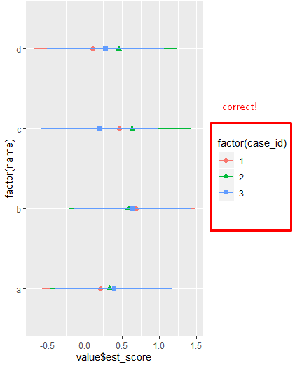
期望输出
如您所见,ggplot中的图例分组正确
> plot而
ggplotly(p = plot) 将三个 geom_segments 中的两个添加到图例中。为什么会发生这种情况以及如何防止这种情况发生?
谢谢

编辑: 似乎与 Combined geom_bar and geom_point legend in ggplotly 有关
最佳答案
我查看了转换后的 plotly-object 并找到了一个临时(但丑陋)的修复方法:
pp <- ggplotly(
  p = plot
)
检查时
pp$x$data ,很明显 name , legendgroup和 showlegend某些几何体的设置不同。这可以手动修复,例如通过循环转换后的对象:n_cases <- length(unique(plot_data$case_id))
for (i in 1:n_cases) {
pp$x$data[[i]]$name <- i
pp$x$data[[i]]$legendgroup <- i
pp$x$data[[i + n_cases]]$name <- i
pp$x$data[[i + n_cases]]$legendgroup <- i
pp$x$data[[i + n_cases]]$showlegend <- FALSE
}
这可能是 plotly 中的一个错误,但由于缺乏替代方案,我将坚持这个解决方案。
关于r - 使用 ggplotly 对图例中的元素进行分组失败,我们在Stack Overflow上找到一个类似的问题: https://stackoverflow.com/questions/59613787/