我正在尝试使用 highcharts 创建交互式折线图,并根据分类列(即 CFR_level)更改线条的颜色。
下面是 ggplot(非交互式版本的所需形式)
p1_cfr <- grouped_cases_df %>%
  filter(Country.Region %in% top_10) %>%

  ggplot(aes(x = Date, y = Confirmed, col = CFR_level, group = Country.Region, label = continent)) +
  geom_path()

p1_cfr

问题:当我尝试使用 highcharts 将其转换为交互式绘图时,它不会根据分类变量(即 CFR_level)对线条进行着色,而是而是基于每个 Country.Region
library(tidyverse)
library(highcharter)
grouped_cases_df %>%
  filter(Country.Region %in% top_10) %>%

  hchart(type = "line", hcaes(x = Date, y = Confirmed, group = Country.Region, color = CFR_level))
如何根据分类变量 CFR_level 为 highchart 中的每行着色?
---------------------------------------------------------------
更新(数据详细信息):
top_10

######### output ##########

 [1] "US"
 [2] "India"
 [3] "Brazil"
 [4] "Russia"
 [5] "France"
 [6] "United Kingdom"
 [7] "Italy"
 [8] "Turkey"
 [9] "Spain"
[10] "Argentina"
grouped_cases_df %>%
  filter(Country.Region %in% top_10) %>%
  head(n = 30)

####### output #########

   Country.Region continent Date       Confirmed Deaths Case_Fatality_Ratio CFR_level
   <chr>          <fct>     <date>         <int>  <int>               <dbl> <fct>
 1 Argentina      Americas  2020-01-22         0      0                   0 Low
 2 Argentina      Americas  2020-01-23         0      0                   0 Low
 3 Argentina      Americas  2020-01-24         0      0                   0 Low
 4 Argentina      Americas  2020-01-25         0      0                   0 Low
 5 Argentina      Americas  2020-01-26         0      0                   0 Low
 6 Argentina      Americas  2020-01-27         0      0                   0 Low
 7 Argentina      Americas  2020-01-28         0      0                   0 Low
 8 Argentina      Americas  2020-01-29         0      0                   0 Low
 9 Argentina      Americas  2020-01-30         0      0                   0 Low
10 Argentina      Americas  2020-01-31         0      0                   0 Low
# ... with 20 more rows
grouped_cases_df %>% str()

####### output #########

tibble [64,176 x 7] (S3: tbl_df/tbl/data.frame)
 $ Country.Region     : chr [1:64176] "Afghanistan" "Afghanistan" "Afghanistan" "Afghanistan" ...
 $ continent          : Factor w/ 6 levels "Africa","Americas",..: 3 3 3 3 3 3 3 3 3 3 ...
 $ Date               : Date[1:64176], format: "2020-01-22" "2020-01-23" "2020-01-24" ...
 $ Confirmed          : int [1:64176] 0 0 0 0 0 0 0 0 0 0 ...
 $ Deaths             : int [1:64176] 0 0 0 0 0 0 0 0 0 0 ...
 $ Case_Fatality_Ratio: num [1:64176] 0 0 0 0 0 0 0 0 0 0 ...
 $ CFR_level          : Factor w/ 3 levels "Low","Med","High": 1 1 1 1 1 1 1 1 1 1 ...
grouped_cases_df %>%
  filter(Country.Region %in% top_10) %>%
  str()

####### output #########

tibble [3,360 x 7] (S3: tbl_df/tbl/data.frame)
 $ Country.Region     : chr [1:3360] "Argentina" "Argentina" "Argentina" "Argentina" ...
 $ continent          : Factor w/ 6 levels "Africa","Americas",..: 2 2 2 2 2 2 2 2 2 2 ...
 $ Date               : Date[1:3360], format: "2020-01-22" "2020-01-23" "2020-01-24" ...
 $ Confirmed          : int [1:3360] 0 0 0 0 0 0 0 0 0 0 ...
 $ Deaths             : int [1:3360] 0 0 0 0 0 0 0 0 0 0 ...
 $ Case_Fatality_Ratio: num [1:3360] 0 0 0 0 0 0 0 0 0 0 ...
 $ CFR_level          : Factor w/ 3 levels "Low","Med","High": 1 1 1 1 1 1 1 1 1 1 ...
grouped_cases_df %>%
  filter(Country.Region %in% top_10) %>%
  summary()

####### output #########

 Country.Region        continent         Date              Confirmed            Deaths
 Length:3360        Africa  :   0   Min.   :2020-01-22   Min.   :       0   Min.   :     0
 Class :character   Americas:1008   1st Qu.:2020-04-14   1st Qu.:   46875   1st Qu.:  1382
 Mode  :character   Asia    : 336   Median :2020-07-07   Median :  283225   Median : 26286
                    Europe  :2016   Mean   :2020-07-07   Mean   : 1338426   Mean   : 39411
                    Oceania :   0   3rd Qu.:2020-09-29   3rd Qu.: 1344549   3rd Qu.: 41590
                    Unknown :   0   Max.   :2020-12-22   Max.   :18230242   Max.   :322765
 Case_Fatality_Ratio CFR_level
 Min.   : 0.000      Low : 455
 1st Qu.: 1.746      Med : 719
 Median : 2.791      High:2186
 Mean   : 4.722
 3rd Qu.: 6.214
 Max.   :23.835
更新2(回复“coloredline”)
我已经按照您的建议尝试了几种方法,但我不确定为什么会出现空行,即使这些数据点存在于此处
1.
grouped_cases_df %>%

  # filtering only couple of countries for simplicity
  filter(Country.Region %in% c("France","India")) %>%

  hchart(type = "coloredline",
         hcaes(x = Date, y = Confirmed, group = Country.Region, segmentColor = CFR_level)) %>%
  hc_add_series(name = "Low",
                color = "green", marker = list(symbol = "line")) %>%

  hc_add_series(name = "Med",
                color = "yellow", marker = list(symbol = "line")) %>%

  hc_add_series(name = "High",
                color = "red", marker = list(symbol = "line")) %>%

  hc_add_dependency("plugins/multicolor_series.js")
grouped_cases_df %>%
  filter(Country.Region %in% c("France","India")) %>%

  hchart(type = "coloredline",
         hcaes(x = Date, y = Confirmed, group = Country.Region, segmentColor = CFR_level)) %>%
  hc_add_dependency("plugins/multicolor_series.js")
hc_add_series(data = .,) 则会收到错误解决方案更新(感谢@Ben建议)
grouped_cases_df %>%
  filter(Country.Region %in% top_10) %>%
  mutate(CFR_col = case_when(CFR_level == "Low" ~ "#FFFF00",
                         CFR_level == "Med" ~ "#008000",
                         TRUE ~ "#FF0000")
         ) %>%

  hchart(type = "coloredline",
         hcaes(x = Date, y = Confirmed, group = Country.Region, segmentColor = CFR_col)) %>%
  hc_add_dependency("plugins/multicolor_series.js")
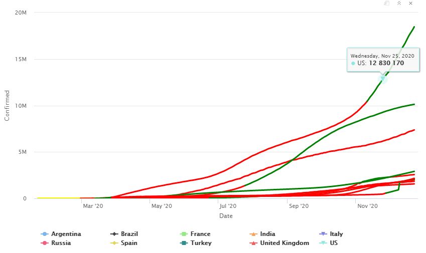
最佳答案
请参阅与 highcharter github 问题类似的问题的简要说明 here .
我正在使用 COVID19 包来获取一些现成的数据以用作说明。我假设将一些国家/地区设置为不同的 CFR_level 值作为示例(这只是为了演示,它们并不反射(reflect)实际的病死率)。
使用hchart使用coloredline和multicolor_series模块,它允许使用单独的segmentColor值(更多info and examples here on plugins and modules)。然后,您可以使用group 的列和segmentColor 的不同列。
此外,我还添加了带有空数据的 hc_add_series 以添加自定义图例。
编辑 (12/24/20):如果您在 hchart 中的 hcaes 中设置 color,您可以获取根据 CFR_level 匹配的工具提示悬停颜色。对于此示例,我将颜色以十六进制等价形式表示(在本例中,CFR_level 是颜色而不是字符值)。
library(tidyverse)
library(highcharter)
library(COVID19)
df <- covid19()
df$CFR_level <- "#008000"
df$CFR_level[df$id == "IND"] <- "#FFFF00"
df$CFR_level[df$id == "USA"] <- "#FF0000"
df %>%
filter(id %in% c("USA", "BRA", "RUS", "IND")) %>%
hchart(type = "coloredline",
hcaes(x = date, y = confirmed, group = id, color = CFR_level, segmentColor = CFR_level),
showInLegend = F) %>%
hc_add_series(name = "Low", color = "#008000", marker = list(symbol = "line")) %>%
hc_add_series(name = "Med", color = "#FFFF00", marker = list(symbol = "line")) %>%
hc_add_series(name = "High", color = "#FF0000", marker = list(symbol = "line")) %>%
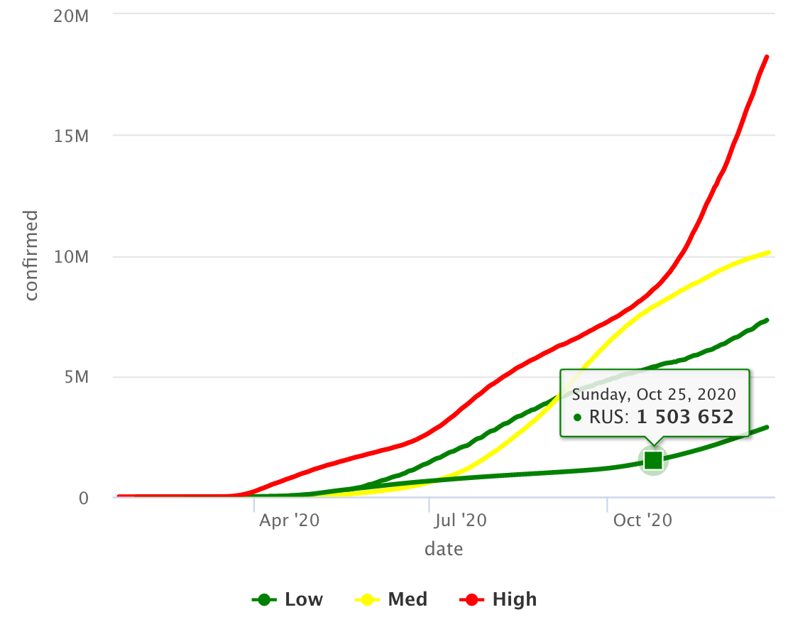
hc_add_dependency("plugins/multicolor_series.js")
情节
关于r - 如何根据r中的分类列更改highchart中折线图的颜色?,我们在Stack Overflow上找到一个类似的问题: https://stackoverflow.com/questions/65427527/