我正在尝试用边缘轴在我的密度图旁边绘制一个颜色条。
它确实绘制了颜色条,但不幸的是不在旁边。
到目前为止,这是一个尝试:
sns.jointplot(x,y, data=df3, kind="kde", color="skyblue", legend=True, cbar=True,
              xlim=[-10,40], ylim=[900,1040])
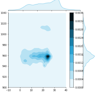
它看起来像这样:
我也试过这个:
from matplotlib import pyplot as plt
import seaborn as sns
import numpy as np

kdeplot = sns.jointplot(x=tumg, y=pumg, kind="kde")
plt.subplots_adjust(left=0.2, right=0.8, top=0.8, bottom=0.2)
cbar_ax = kdeplot.fig.add_axes([.85, .25, .05, .4])
plt.colorbar(cax=cbar_ax)
plt.show()
但是使用第二个选项时,我收到了运行时错误:
No mappable was found to use for colorbar creation.First define a mappable such as an image (with imshow) or a contour set (with contourf).
有谁知道如何解决这个问题?
最佳答案
有效创建颜色条时,似乎只有颜色条的信息。
因此,一个想法是将两种方法结合起来:通过 kdeplot 添加一个颜色条,然后将其移动到所需的位置。这将使主联合图的宽度不足,因此其宽度也应进行调整:
from matplotlib import pyplot as plt
import seaborn as sns
import numpy as np

# create some dummy data: gaussian multivariate with 10 centers with each 1000 points
tumg = np.random.normal(np.tile(np.random.uniform(10, 20, 10), 1000), 2)
pumg = np.random.normal(np.tile(np.random.uniform(10, 20, 10), 1000), 2)

kdeplot = sns.jointplot(x=tumg, y=pumg, kind="kde", cbar=True)
plt.subplots_adjust(left=0.1, right=0.8, top=0.9, bottom=0.1)
# get the current positions of the joint ax and the ax for the marginal x
pos_joint_ax = kdeplot.ax_joint.get_position()
pos_marg_x_ax = kdeplot.ax_marg_x.get_position()
# reposition the joint ax so it has the same width as the marginal x ax
kdeplot.ax_joint.set_position([pos_joint_ax.x0, pos_joint_ax.y0, pos_marg_x_ax.width, pos_joint_ax.height])
# reposition the colorbar using new x positions and y positions of the joint ax
kdeplot.fig.axes[-1].set_position([.83, pos_joint_ax.y0, .07, pos_joint_ax.height])
plt.show()

关于python - 侧面的 sns.jointplot "kde"样式的颜色条,我们在Stack Overflow上找到一个类似的问题: https://stackoverflow.com/questions/60845764/