我想在同一个面板图上绘制多个时间序列,而不是在单独的面板中。我从 another stackoverflow post 中获取了以下 R 代码.
请注意 3 个时间序列在 3 个不同面板中的显示方式。我如何才能将 3 个时间序列分层放在 1 个面板上,并且每条线的颜色都不同。
Time = Sys.time()+(seq(1,100)*60+c(rep(1,100)*3600*24, rep(2, 100)*3600*24, rep(3, 100)*3600*24))
Value = rnorm(length(Time))
Group = c(0, cumsum(diff(Time) > 1))

library(ggplot2)
g <- ggplot(data.frame(Time, Value, Group)) +
 geom_line (aes(x=Time, y=Value, color=Group)) +
 facet_grid(~ Group, scales = "free_x")
如果你运行上面的代码,你会得到:
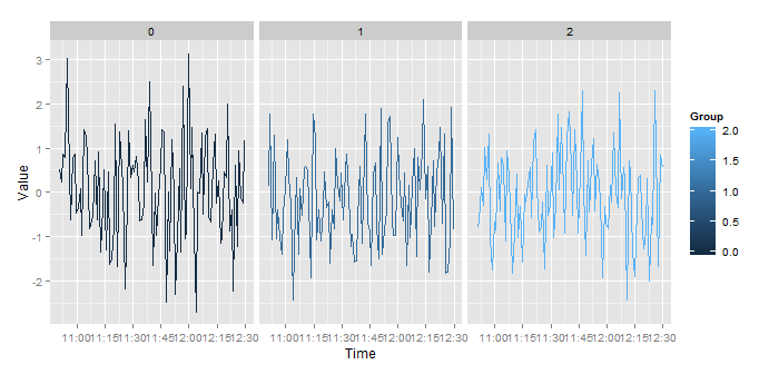
当 facet_grid() 部分被删除时,我得到一个如下所示的图表:

基本上,我希望 ggplot 忽略日期差异,只考虑时间。然后使用 group 来识别不同的日期。
这个问题可以通过创建一个只包含时间的新列来解决(例如。22:01, format="%H:%M") .但是,当使用 as.POSIXct() 函数时,我得到一个包含日期和时间的变量。我似乎无法逃避日期部分。
最佳答案
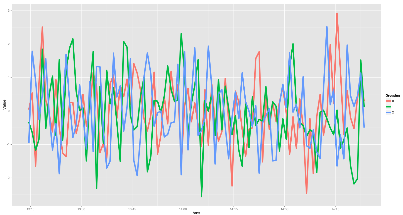
由于数据文件对每个组的时间有不同的日期,将所有组放在同一个图上的一种方法是创建一个新变量,为所有组提供相同的“虚拟”日期,但使用收集的实际时间。
experiment <- data.frame(Time, Value, Group)  #creates a data frame
experiment$hms <- as.POSIXct(paste("2015-01-01", substr(experiment$Time, 12, 19)))  # pastes dummy date 2015-01-01 onto the HMS of Time
现在您有了所有相同日期的时间,然后您可以轻松地绘制它们。
experiment$Grouping <- as.factor(experiment$Group)  # gglot needed Group to be a factor, to give the lines color according to Group
ggplot(experiment, aes(x=hms, y=Value, color=Grouping)) + geom_line(size=2)
下面是生成的图像(您可以根据需要更改/修改基本图):
关于r - ggplot 时间序列绘图 : group by dates,我们在Stack Overflow上找到一个类似的问题: https://stackoverflow.com/questions/32976820/