我正在尝试使用 R 中的以下数据创建饼图:
    2009    2010
US  10  12
UK  13  14
Germany 18  11
China   9   8
Malaysia    7   15
Others  13  15
我使用的命令是:
slices<-c(10,13,18,9,7,13,12,14,11,8,15,15)
 lbls <- c("US","UK","Germany","China", "Malaysia", "Others","US","UK","Germany","China", "Malaysia", "Others")
 pct <- round(slices/sum(slices)*100)
 lbls <- paste(lbls,"%",sep="")
 lbls <- paste(lbls, pct)
 pie(slices,labels = lbls, col=rainbow(length(lbls)),  main="Pie Chart of Countries")
我得到的图
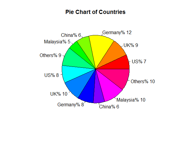
现在我如何配置图表以便国家具有相同的配色方案?它们在两半中遵循相同的顺序,首先应该是美国和英国等等。
二简化了我想在一个饼图中制作两个饼图的问题,饼图的一半代表2009年,另一半代表2010年。
请帮助。
谢谢
最佳答案
 lbls0 <- c("US","UK","Germany","China", "Malaysia", "Others","US","UK","Germany","China", "Malaysia", "Others")
 pct <- round(slices/sum(slices)*100)
 lbls <- paste(lbls,"%",sep="")
 lbls <- paste(lbls, pct)
 pie(slices,labels = lbls, col=rainbow(length(lbls)),
      main="Pie Chart of Countries")


 nlbl <- length(lbls)
 yrs <- rep(2009:2010,each=nlbl/2)
 xlbls <- sprintf("%s (%d) %d%%",lbls0,yrs,pct)
 pie(slices,labels = xlbls, col=rep(rainbow(nlbl/2),2),
      main="Pie Chart of Countries")
您是否愿意考虑一种更容易进行定量比较的可视化形式?
 library(ggplot2); theme_set(theme_bw())
 dd <- data.frame(lbls0,yrs,slices,pct)
 dd$lbls0 <- reorder(dd$lbls0,-dd$slices)
 ggplot(dd,aes(x=lbls0,y=slices,fill=lbls0))+
    geom_bar(aes(alpha=factor(yrs)),
                    stat="identity",position=position_dodge(width=1))+
    scale_alpha_discrete(range=c(0.7,1.0))+
    geom_text(aes(label=paste0(pct,"%"),
              group=interaction(lbls0,yrs)),hjust=-0.2,
              position=position_dodge(width=1))+
                  coord_flip()+
    expand_limits(y=20)+labs(x="",y="total")
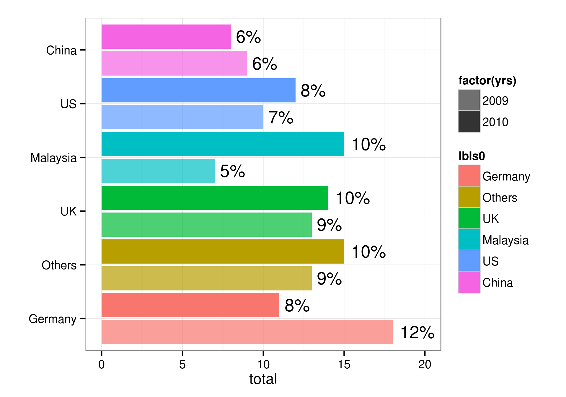
如果您对几年内国家之间的比较而不是国家内年份之间的比较更感兴趣,您可以跳过
scale_alpha东西和使用 facet_wrap(~yrs) ...
关于r - 将两个饼图合二为一,我们在Stack Overflow上找到一个类似的问题: https://stackoverflow.com/questions/23984035/