我正在努力使每个团队都有一条线,该线的颜色与图例中的颜色相匹配。我把程序写成一个条形图,因为我知道怎么做,所以我认为只需要做一些改变就可以把它变成线条。注意:我不想要一条最适合的线,而是一条点对点连接的线。
下一部分可能会非常耗时,所以我不希望任何人对此提供帮助,但我也真的很想在图例中加入团队 Logo ,也许可以替换团队名称。然后在图例中,我希望将与团队相关联的颜色作为一条线而不是一个框。
非常感谢您对其中一个或两个的任何帮助。
编辑:我想保留下面程序的所有功能,例如灰色背景、白色网格等。
df <- read.table(textConnection(
  'Year  Orioles RedSox Yankees Rays BlueJays
  1998   79       92      114    63    88
  1999   78       94      98     69    84
  2000   74       85      87     69    83
  2001   63       82      95     62    80
  2002   67       93      103    55    78
  2003   71       95      101    63    86
  2004   78       98      101    70    67
  2005   74       95      95     67    80
  2006   70       86      97     61    87
  2007   69       96      94     66    83
  2008   68       95      89     97    86
  2009   64       95      103    84    75
  2010   66       89      95     96    85
  2011   69       90      97     91    81
  2012   93       69      95     90    73
  2013   85       97      85     92    74
  2014   96       71      84     77    83
  2015   81       78      87     80    93
  2016   89       93      84     68    89'), header = TRUE)


df %>%
  gather(Team, Wins, -Year) %>%
  mutate(Team = factor(Team, c("Orioles", "RedSox", "Yankees","Rays","BlueJays"))) %>%
  ggplot(aes(x=Year, y=Wins)) +
  ggtitle("AL East Wins") +
  ylab("Wins") +
  geom_col(aes(fill = Team), position = "dodge") +
  scale_fill_manual(values = c("orange", "red", "blue", "black","purple"))+
  theme(
    plot.title = element_text(hjust=0.5),
    axis.title.y = element_text(angle = 0, vjust = 0.5),
    panel.background = element_rect(fill = "gray"),
    panel.grid = element_line(colour = "white")
  )
最佳答案
您可以使用 geom_path(aes(color = Team)) 而不是 geom_col(aes(fill = Team) 和命名的调色板来实现您的基本目标,例如这个:
# break this off the pipeline
df <- gather(df, Team, Wins, -Year) %>%
mutate(Team = factor(Team, c("Orioles", "RedSox", "Yankees","Rays","BlueJays")))
# if you want to resuse the same theme a bunch this is nice
# theme_grey() is the default theme
theme_set(theme_grey() +
theme(plot.title = element_text(hjust=0.5),
axis.title.y = element_text(angle = 0, vjust = 0.5),
panel.background = element_rect(fill = "gray")))
# named palettes are easy
# for specific colors i like hex codes the best
# i just grabbed these of this nice website TeamColorCodes, could be fun!
cust <- c("#FC4C00", "#C60C30", "#1C2841", "#79BDEE","#003DA5")
names(cust) <- levels(df$Team)
# use geom_path inplace of geom_col
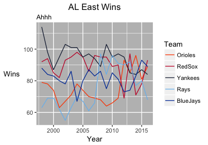
ggplot(df, aes(x=Year, y=Wins, color = Team)) +
geom_path(aes(color = Team)) +
scale_color_manual(values = cust) +
labs(title = "AL East Wins",
subtitle = "Ahhh",
y = "Wins",
x = "Year")
关于MLB 球队按年获胜的 R 多线图,我们在Stack Overflow上找到一个类似的问题: https://stackoverflow.com/questions/42662357/