我正在尝试使用 highcharter R 包“Motion Plugin”,用于制作热图的动态图表。 IE。我希望热图随时间变化,使用带有播放/暂停按钮的 slider (请参阅下面的链接)。
我可以为特定年份创建一个简单的热图,例如:
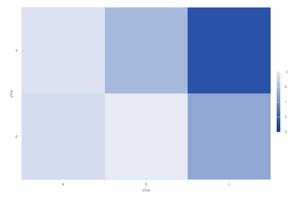
df <- tibble(year = c(rep(2016, 6), rep(2017, 6)),
         xVar = rep(c("a", "a", "b", "b", "c", "c"), 2),
         yVar = rep(c("d", "e"), 6),
         heatVar = rnorm(12))

df %>%
  filter(year == 2016) %>%
  hchart(type = "heatmap", hcaes(x = xVar, y = yVar, value = heatVar)) %>%
  hc_legend(layout = "vertical", verticalAlign = "top", align = "right")
但是,我正在努力使它成为一个动态图表(在本示例中滑过 2016 年、2017 年),使用
hc_motion(enabled = TRUE, ...)功能。我已阅读并关注以下链接:
https://www.r-bloggers.com/adding-motion-to-choropleths/
http://jkunst.com/highcharter/plugins.html
但无论我如何定义我的系列,我都没有得到预期的结果。任何人都可以指出我如何
xVar , yVar应该定义系列和 hc_motion函数用于使其工作?更新:
关注 this我使用
shiny 设法做到了这一点,但我仍然希望避免这种解决方案:server <- shinyServer(function(input, output) {
output$heatmap <- renderHighchart({
df <- tibble(year = c(rep(2016, 6), rep(2017, 6)),
xVar = rep(c("a", "a", "b", "b", "c", "c"), 2),
yVar = rep(c("d", "e"), 6),
heatVar = rnorm(12))
# filter data based on selected year
df.select <- dplyr::filter(df, year == input$year)
# chart
hchart(df.select, type = "heatmap", hcaes(x = xVar, y = yVar, value = heatVar))
})
})
ui <- shinyUI(fluidPage(
# Application title
titlePanel("Highcharts Heatmap Motion Chart"),
# Sidebar with a slider input for the selected year
sidebarLayout(
sidebarPanel(
sliderInput("year",
"Year:",
min = 2016,
max = 2017,
step = 1,
value = 2016,
animate = TRUE,
sep = "")
),
# Show a bubble plot for the selected year
mainPanel(
highchartOutput("heatmap")
)
)
))
shinyApp(ui = ui, server = server)
最佳答案
这种方法肯定不是最干净的,因为它需要创建初始位置(如标准图表),然后为每个点创建 te 序列。
http://rpubs.com/jbkunst/questions-42945062
所以添加 Action 插件的结构是:
模拟数据
library(highcharter)
library(dplyr)
library(purrr)


years <- 10
nx <- 5
ny <- 6
df <- data_frame(year = rep(c(2016 + 1:years - 1), each = nx * ny), xVar = rep(1:nx,
  times = years * ny), yVar = rep(1:ny, times = years * nx))

df <- df %>% group_by(xVar, yVar) %>% mutate(heatVar = cumsum(rnorm(length(year))))
获取初始值
df_start <- df %>% arrange(year) %>% distinct(xVar, yVar, .keep_all = TRUE)
df_start
#> Source: local data frame [30 x 4]
#> Groups: xVar, yVar [30]
#>
#>     year  xVar  yVar    heatVar
#>    <dbl> <int> <int>      <dbl>
#> 1   2016     1     1  0.5894443
#> 2   2016     2     2 -1.0991727
#> 3   2016     3     3  1.1209292
#> 4   2016     4     4  0.4936719
#> 5   2016     5     5 -0.4614157
#> # ... with 25 more rows
对固定变量进行分组以创建具有序列的列表
df_seqc <- df %>% group_by(xVar, yVar) %>% do(sequence = list_parse(select(.,
  value = heatVar)))
df_seqc
#> Source: local data frame [30 x 3]
#> Groups: <by row>
#>
#> # A tibble: 30 × 3
#>     xVar  yVar    sequence
#> *  <int> <int>      <list>
#> 1      1     1 <list [10]>
#> 2      1     2 <list [10]>
#> 3      1     3 <list [10]>
#> 4      1     4 <list [10]>
#> 5      1     5 <list [10]>
#> # ... with 25 more rows
加入
data <- left_join(df_start, df_seqc)
#> Joining, by = c("xVar", "yVar")
data
#> Source: local data frame [30 x 5]
#> Groups: xVar, yVar [?]
#>
#>     year  xVar  yVar    heatVar    sequence
#>    <dbl> <int> <int>      <dbl>      <list>
#> 1   2016     1     1  0.5894443 <list [10]>
#> 2   2016     2     2 -1.0991727 <list [10]>
#> 3   2016     3     3  1.1209292 <list [10]>
#> 4   2016     4     4  0.4936719 <list [10]>
#> 5   2016     5     5 -0.4614157 <list [10]>
#> # ... with 25 more rows
和图表
limits <- (unlist(data$sequence)) %>% {
  c(min(.), max(.))
}
limits
#> [1] -5.332709  6.270384

hc1 <- hchart(data, type = "heatmap", hcaes(x = xVar, y = yVar, value = heatVar))

hc2 <- hchart(data, type = "heatmap", hcaes(x = xVar, y = yVar, value = heatVar)) %>%
  hc_motion(enabled = TRUE, series = 0, startIndex = 0, labels = unique(df$year)) %>%
  hc_legend(layout = "vertical", verticalAlign = "top", align = "right") %>%
  hc_colorAxis(min = limits[1], max = limits[2])
关于R highcharter : putting heatmaps into motion,我们在Stack Overflow上找到一个类似的问题: https://stackoverflow.com/questions/42945062/