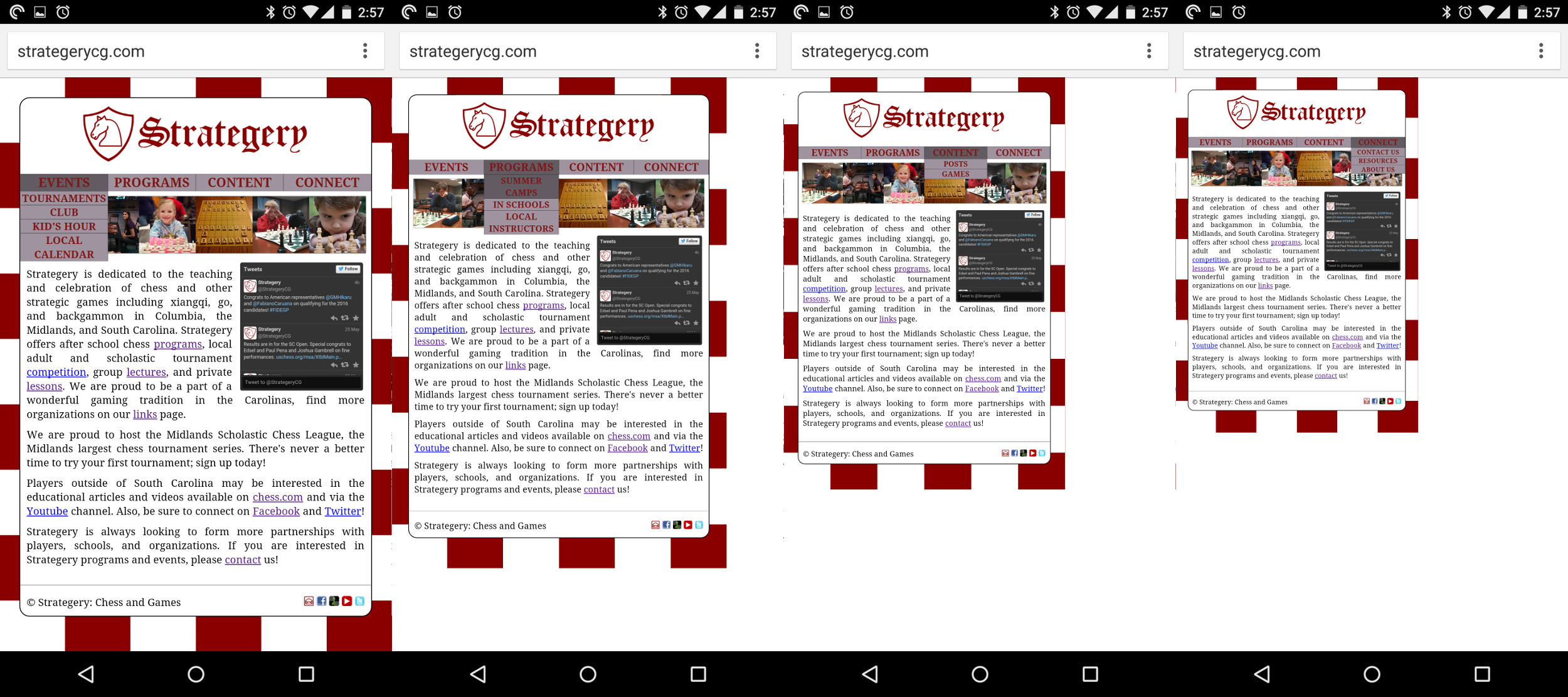
我的网站在移动设备上的 Android Chrome 浏览器中存在缩放问题。这不会发生在移动版 Firefox 或任何桌面浏览器中。当导航栏被选中并下拉时,它会缩放网页。请注意,根据选择的下拉列表,页面的缩放比例不同。导航栏似乎有不可见的内容,当下拉行为被激活时,这些内容正在打破框架。
我已经拼接了 4 个问题的屏幕截图。
非常感谢您提供修复或解决方法方面的帮助。
#NavigationBarList{
list-style-type:none;
padding:0;
}

li{
font-size:130%;
}

nav a{
display:block;
}

/* This customizes the presentation of the list elements (menu items) in the navbar. */
nav li{
display:block;
font-weight:bold;
font-size:200%;
color:#7F1717;
background-color:#9E939E;
width:25%;
text-align:center;
text-decoration:none;
text-transform:uppercase;
z-index:11;
-moz-box-shadow:    inset 0 0 1px #000000;
-webkit-box-shadow: inset 0 0 1px #000000;
box-shadow:         inset 0 0 1px #000000;
}

nav ul{
width:100%;
}

/* Hide the sub menu items. */
nav ul ul {
display:none;
}

nav ul ul ul {
display:none
}

/* When hovered over, the CSS menu will drop down. */
nav li:hover > ul {
text-align:center;
font-size:40%;
display:block;
}

/* Don't underline links in the list elements (menu items). */
ul a {
text-decoration:none;
color:#7F1717;
}

/* Change the background color of hovered list elements. This was both active and hover... */
nav li:hover{
background-color:#625C62;
}

/* This customizes the ul elements in the sub-menu. */
nav ul ul{
position:absolute;
padding:0;
width:100%
}

nav ul ul ul{
position: absolute;
width:400%;
left:100%;
top:0;
}

#totheleft{
left:-100%;
}

nav ul ul ul li{
text-align:center;
font-size:250%;
}

/* I think this refers to the dropdown navbar location and properties. */
nav ul ul li {
position:relative;
}
<nav>
<ul id="NavigationBarList">
<li style="float:left;">Events
<ul>
<li><a href="tournaments.html">Tournaments</a></li>
<li><a href="kids_hour.html">Kid's Hour</a></li>
<li><a href="calendar.html">Local Calendar</a></li>
</ul>
</li>
<li style="float:left;">Programs
<ul>
<li><a href="summer_camps.html">Summer Camps</a></li>
<li>In Schools
<ul>
<li><a href="schools.html">After School</a></li>
<li><a href="school_registration.html">Registration</a></li>
</ul>
</li>
<li><a href="instructors.html">Local Instructors</a></li>
</ul>
</li>
<li style="float:left;">Content
<ul>
<li><a href="posts.html">Posts</a></li>
<li><a href="games.html">Games</a>
</ul>
</li>
</li>
<li style="float:left;">Connect
<ul>
<li><a href="contact.html">Contact Us</a></li>
<li>Resources
<ul id="totheleft">
<li><a href="links.html">Chess</a></li>
<li><a href="go_links.html">Go</a></li>
<li><a href="xiangqi_links.html">Xiangqi</a></li>
<li><a href="shogi_links.html">Shogi</a></li>
<li><a href="backgammon_links.html">Backgammon</a></li>
</ul>
</li>
<li><a href="about us.html">About Us</a></li>
</ul>
</li>
</ul>
</nav>最佳答案
将此添加到所有页面的 head 部分。
<meta name="viewport" content="user-scalable=0">
Without a viewport, mobile devices will render the page at a typical desktop screen width, scaled to fit the screen.
因此,当您在移动设备上访问网页时, View 实际上会缩小以适合您的所有内容。当您触摸导航栏时,浏览器也会尝试放大。设置 user-scalable=0 可防止这种情况发生。
缺点是您的用户将无法再在移动设备上缩放网站,但唯一的选择是重写您的网站以使用流畅的布局。
关于google-chrome - 为什么我的导航栏在移动设备上缩放页面?,我们在Stack Overflow上找到一个类似的问题: https://stackoverflow.com/questions/30467241/