我正在运行一个 bootstrap ,以便更好地了解我从基于相对较少参与者的混合模型中得出的一些统计数据。对于两种情况,我正在绘制自举均值 ( link to data ) 的直方图。
问题是,当我将直方图绘制在彼此的顶部(一个面/面板)时,我会看到 B 处理的清晰双峰直方图,但是在为每个处理绘制一个面时,这个双峰峰消失了。
p <- ggplot(data=bstr3, mapping=aes(x=m, fill=treatment)) +
  geom_histogram(binwidth=1, alpha=0.4) +
  scale_fill_manual(values=c('A'='red', 'B'='blue'))
p + coord_cartesian(xlim=c(-60, 0))
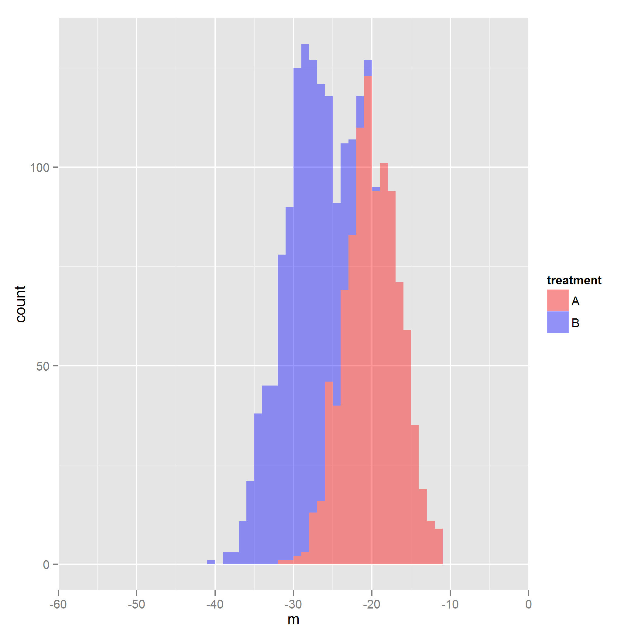
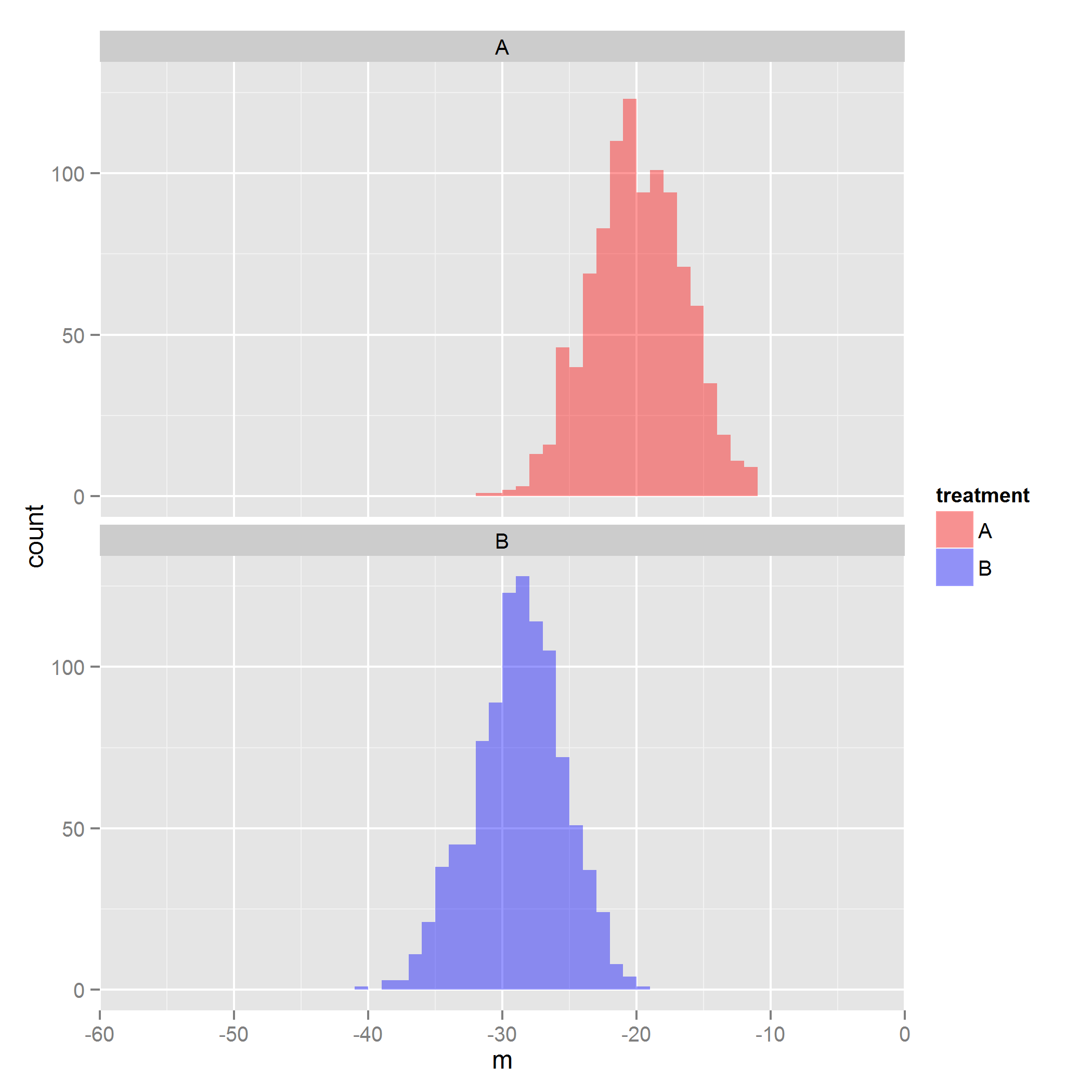
但是,当我将处理绘制为小平面时,双峰峰消失了。
p + facet_wrap(~treatment, ncol=1) + coord_cartesian(xlim=c(-60, 0))
基于 ggplot 书和互联网,我无法理解这是否/为什么是有意的或潜在的错误。我确实找到了 this question这暗示了一个错误,但该帖子已有一年历史,我有 R 和 ggplot2 的最新更新。
R version 3.0.1 (2013-05-16)
Platform: x86_64-w64-mingw32/x64 (64-bit)

locale:
[1] LC_COLLATE=English_United States.1252
[2] LC_CTYPE=English_United States.1252
[3] LC_MONETARY=English_United States.1252
[4] LC_NUMERIC=C
[5] LC_TIME=English_United States.1252

attached base packages:
[1] graphics  grDevices utils     datasets  stats     methods   base

other attached packages:
[1] plyr_1.8             reshape2_1.2.2       knitrBootstrap_0.6.5
[4] markdown_0.6.1       knitr_1.3            ggplot2_0.9.3.1

loaded via a namespace (and not attached):
 [1] colorspace_1.2-2   dichromat_2.0-0    digest_0.6.3       evaluate_0.4.4
 [5] formatR_0.8        grid_3.0.1         gtable_0.1.2       labeling_0.2
 [9] MASS_7.3-27        munsell_0.4.2      proto_0.3-10       RColorBrewer_1.0-5
[13] scales_0.2.3       stringr_0.6.2      tools_3.0.1
最佳答案
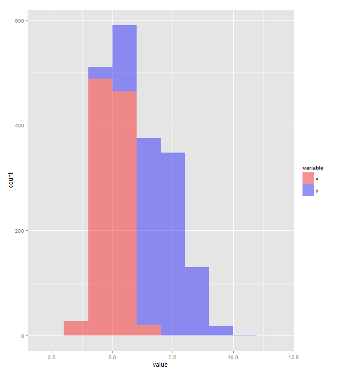
默认position geom_histogram 使用的调整是 position_stack (这对于直方图来说似乎是一个奇怪的默认值)。你要position_identity .
set.seed(42)
DF <- data.frame(x=rnorm(1000,5,0.5),y=rnorm(1000,7,1))
library(reshape2)
DF <- melt(DF)

library(ggplot2)
p <- ggplot(data=DF, mapping=aes(x=value, fill=variable)) +
  geom_histogram(binwidth=1, alpha=0.4) +
  scale_fill_manual(values=c('x'='red', 'y'='blue'))
print(p)
p <- ggplot(data=DF, mapping=aes(x=value, fill=variable)) +
  geom_histogram(binwidth=1, alpha=0.4, position="identity") +
  scale_fill_manual(values=c('x'='red', 'y'='blue'))
print(p)

关于r - 使用 ggplot2 绘制分面或非分面(即重叠)时的不同直方图,我们在Stack Overflow上找到一个类似的问题: https://stackoverflow.com/questions/17739997/