您好,我有一个 37x73 的矩阵,它代表一个变量 (moavg),网格化为 10x10 度间距 (-180< LON< 180 e -90 < LAT< 90)。我可以使用图像来绘制它
image(LON, LAT, moavg)
但我无法显示彩条。我想知道是否有另一个功能可以做到这一点(可能是 ggplot),它还允许我绘制颜色图例。
非常感谢
最佳答案
对于绘制网格化空间数据,raster 和 rasterVis 包也很有用。
这里有几个例子:
library(rasterVis) # this will also load the raster package
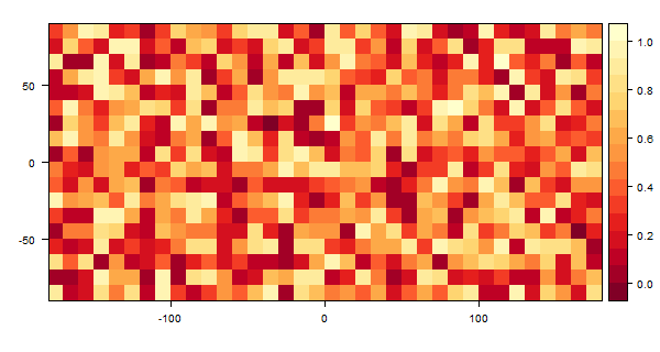
# Create a raster from a matrix of dummy data
m <- matrix(runif(36*18), ncol=36)
r <- raster(m)
# Set the extent of the object
extent(r) <- c(-180, 180, -90, 90)
# plot with raster
plot(r)
# plot with rasterVis
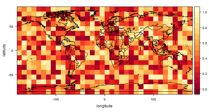
levelplot(r, margin=FALSE)
如果您的网格数据存在于文件中(例如 .asc、.tif 等),那么您可以通过为 raster() 提供文件路径来加载它,例如raster('C:/path/to/moavg.asc'),在这种情况下您不需要设置范围,因为文件应该包含此元数据。
请参阅 ?raster 和 ?levelplot 了解更多详情。
使用 raster 绘图

用 levelplot 绘图
编辑
为了解决评论中发现的这个问题的扩展,这里是一种覆盖多边形的方法:
library(maps)
levelplot(r, xlab='longitude', ylab='latitude', margin=FALSE,
            panel = function(x, y, ...) {
              panel.levelplot(x, y,  ...)
              mp <- map("world", plot = FALSE, fill=TRUE)
              lpolygon(mp$x, mp$y)
            })
关于r - 图像与 ggplot : how to plot color legend?,我们在Stack Overflow上找到一个类似的问题: https://stackoverflow.com/questions/21684942/