我需要像这样在我的应用中实现一个按钮

我使用了 SwitchCompat 按钮,但我最接近这一点,

有两个主要问题:
1 - 当屏幕尺寸改变时按钮的宽度没有正确调整(drawable 被切断,变得太小等),宽度正确占据父 View 很重要( a包围它的小线性布局)
2 - 我无法理解如何在 Switch Track 中获取字母
是否可以通过一个切换按钮来实现这个结果?如何? 我应该使用另一个 View 而不是切换按钮吗?哪个?
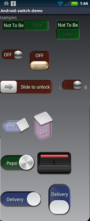
我偶然发现了这个项目,但它似乎有点过时了
https://github.com/pellucide/Android-Switch-Demo-pre-4.0/tree/master/
最佳答案
例如:
class SwitchCompatEx : SwitchCompat {

    companion object {

        val TRACK_COLOR = 0xFFFFFFFF.toInt()
        val TRACK_STROKE_WIDTH = 2f.dp2Px.toInt()
        val TRACK_STROKE_COLOR = 0xFF00A1FF.toInt()
        val TRACK_LABEL_COLOR = 0xFF00A1FF.toInt()
        val TRACK_LABEL_SIZE = 14f.sp2Px

        val THUMB_COLOR = 0xFF00A1FF.toInt()
        val THUMB_LABEL_COLOR = 0xFFFFFFFF.toInt()
        val THUMB_LABEL_SIZE = 14f.sp2Px

        fun drawLabel(canvas: Canvas,
                      bounds: Rect,
                      paint: Paint,
                      text: CharSequence?) {
            text ?: return

            val tb = RectF();
            tb.right = paint.measureText(text, 0, text.length)
            tb.bottom = paint.descent() - paint.ascent()
            tb.left += bounds.centerX() - tb.centerX()
            tb.top += bounds.centerY() - tb.centerY() - paint.ascent()

            canvas.drawText(text.toString(), tb.left, tb.top, paint)
        }

        private inline val Float.sp2Px
            get() = TypedValue.applyDimension(TypedValue.COMPLEX_UNIT_SP,
                    this,
                    Resources.getSystem().displayMetrics)

        private inline val Float.dp2Px
            get() = TypedValue.applyDimension(TypedValue.COMPLEX_UNIT_DIP,
                    this,
                    Resources.getSystem().displayMetrics)
    }

    private val trackLabelPaint = Paint().apply {
        isAntiAlias = true
        textSize = TRACK_LABEL_SIZE
        color = TRACK_LABEL_COLOR
    }

    private val thumbLabelPaint = Paint().apply {
        isAntiAlias = true
        textSize = THUMB_LABEL_SIZE
        color = THUMB_LABEL_COLOR
    }

    private val thumbLabel
        get () = if (isChecked) textOn else textOff

    constructor(context: Context?) : super(context)
    constructor(context: Context?, attrs: AttributeSet?) : super(context, attrs)
    constructor(context: Context?, attrs: AttributeSet?, defStyleAttr: Int) : super(context, attrs, defStyleAttr)

    init {
        background = null
        trackDrawable = TrackDrawable()
        thumbDrawable = ThumbDrawable()
    }

    override fun onSizeChanged(w: Int,
                               h: Int,
                               oldw: Int,
                               oldh: Int) {
        super.onSizeChanged(w, h, oldw, oldh)

        (trackDrawable as GradientDrawable).setSize(w, h)
        (thumbDrawable as GradientDrawable).setSize(w / 2, h)
    }

    inner class TrackDrawable : GradientDrawable() {

        private val textOffBounds = Rect()
        private val textOnBounds = Rect()

        init {
            setColor(TRACK_COLOR)
            setStroke(TRACK_STROKE_WIDTH, TRACK_STROKE_COLOR)
        }

        override fun onBoundsChange(r: Rect) {
            super.onBoundsChange(r)

            cornerRadius = r.height() / 2f

            textOffBounds.set(r)
            textOffBounds.right /= 2

            textOnBounds.set(textOffBounds)
            textOnBounds.offset(textOffBounds.right, 0)
        }

        override fun draw(canvas: Canvas) {
            super.draw(canvas)

            drawLabel(canvas, textOffBounds, trackLabelPaint, textOff)
            drawLabel(canvas, textOnBounds, trackLabelPaint, textOn)
        }
    }

    inner class ThumbDrawable : GradientDrawable() {

        private val thumbLabelBounds = Rect()

        init {
            setColor(THUMB_COLOR)
        }

        override fun onBoundsChange(r: Rect) {
            super.onBoundsChange(r)

            cornerRadius = r.height() / 2f

            thumbLabelBounds.set(r)
        }

        override fun draw(canvas: Canvas) {
            super.draw(canvas)

            drawLabel(canvas, thumbLabelBounds, thumbLabelPaint, thumbLabel)
        }
    }
}
...
<demo.sodemos.SwitchCompatEx
    android:layout_width="wrap_content"
    android:layout_height="wrap_content"
    android:layout_gravity="center"
    android:minHeight="40dp"
    android:textOff="M"
    android:textOn="F"
    app:switchMinWidth="100dp" />
...

另请查看此 Custom view components教程。
希望对你有帮助
关于android - 如何在 Switch/SwitchCompat 按钮中设置宽度和轨道文本并实现此结果? (附上图片和GIF),我们在Stack Overflow上找到一个类似的问题: https://stackoverflow.com/questions/52064205/